
Take Me To Tuscany: an ornate calligraphic script for luxury and heritage branding
Design style
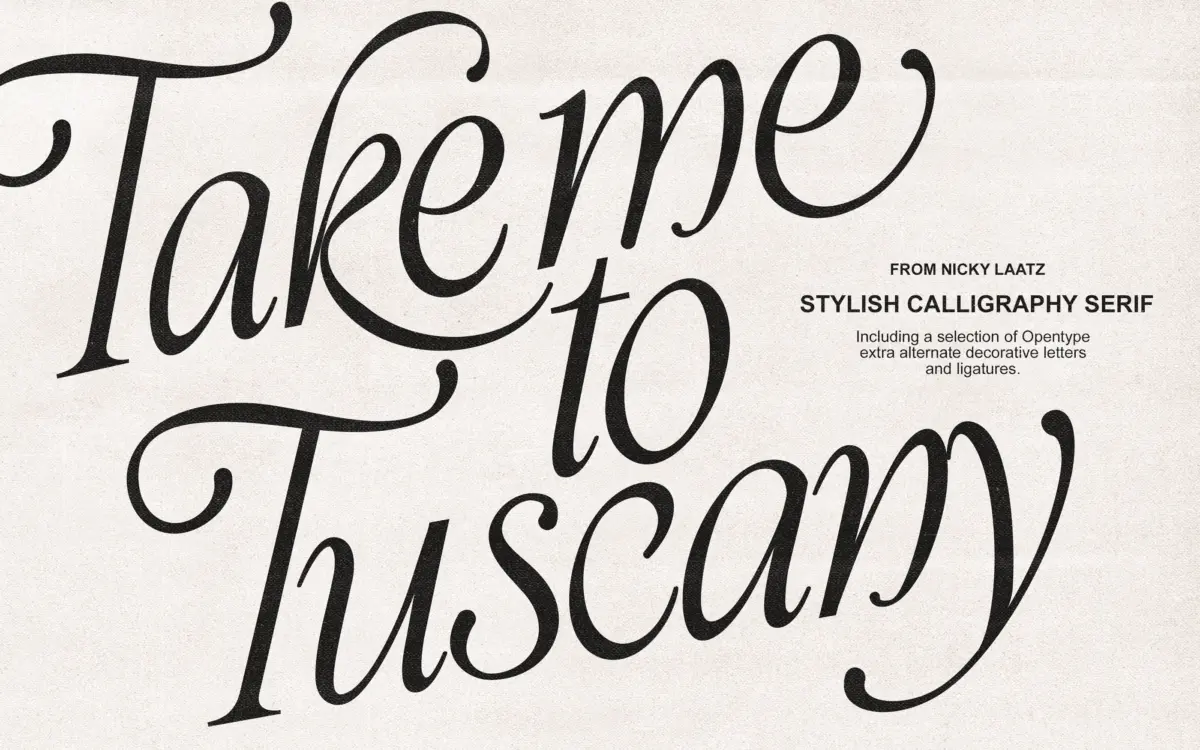
Take Me To Tuscany is an italicised calligraphic script built around extended strokes and exaggerated loops rather than the tighter, more restrained joins you’d find in a formal copperplate. Nicky Laatz has leaned into the ornamental side of the genre: entry and exit strokes stretch well beyond the letter body, ascenders curl back on themselves, and the swash capitals in particular carry a lot of extra ink. The contrast between thick and thin is pronounced, which gives the face its calligraphic feel, but it also means the letterforms depend on generous size to read as intended rather than as a smear of hairlines.
The slant is consistent and the baseline holds steady even as the strokes get busier, so the type doesn’t wobble the way some hand-lettered scripts do. That structural discipline is the thing keeping the ornamentation from tipping into illegibility. It’s a font with a clear point of view — romantic, a little theatrical — rather than a neutral workhorse, and it reads that way from the first glance.
Character set and features
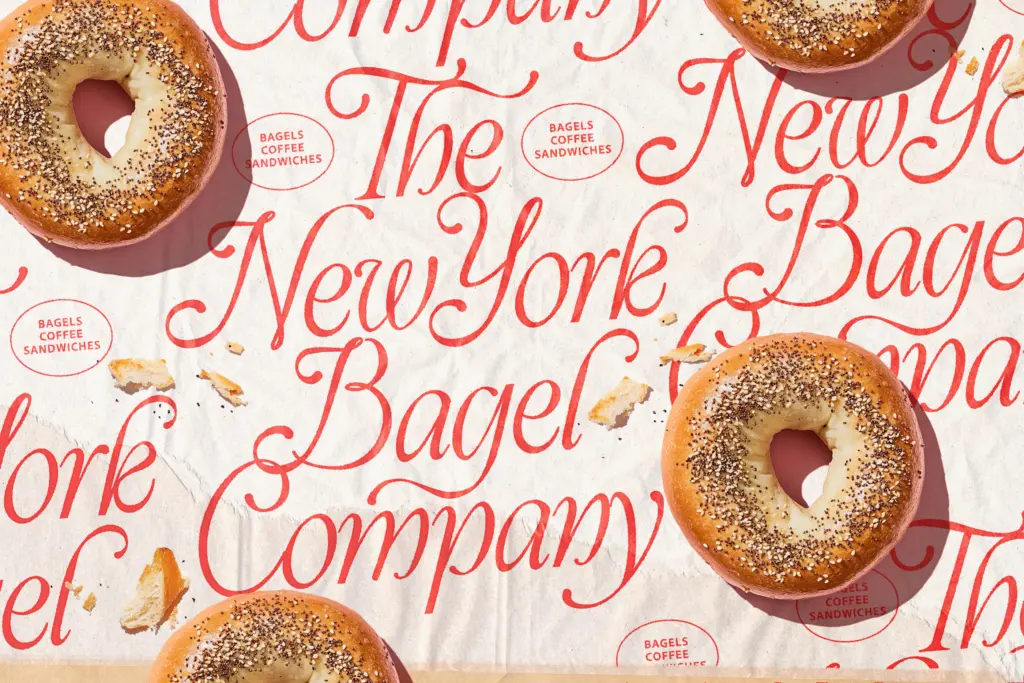
The seller notes several bonus variants that shift weight and slant slightly from the main style, which is useful in practice: rather than one fixed voice, you get small adjustments to make a heading sit better against a logo mark or a line of body text. The swash capitals are the standout feature — deep, looping, clearly meant for initials on invitations or monograms rather than for setting whole words in caps. Lowercase letters carry their own embellishments too, with looped ascenders and descenders that connect awkwardly if letterspacing is tightened, so this isn’t a face you want to compress to fit a box.
Because the strokes are so extended, kerning and spacing matter more here than in most scripts. Left with default spacing, some letter combinations will collide or feel cramped; a careful hand at the tracking slider is part of using this typeface well, not an afterthought.
Use cases
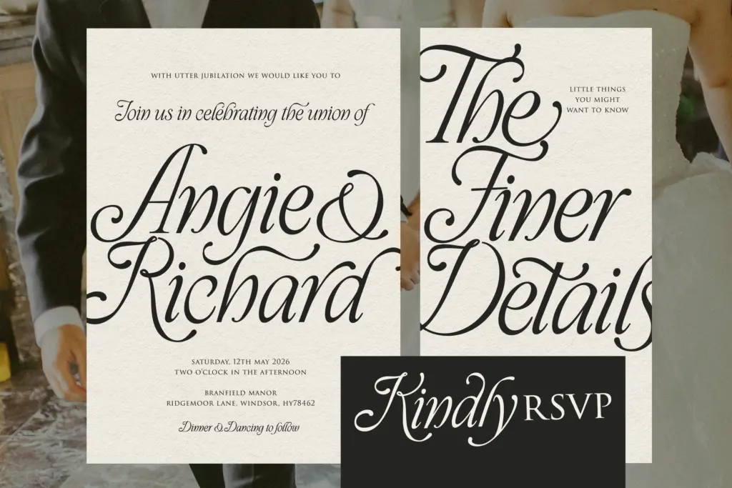
This is a display face, full stop — nobody should be setting paragraphs in it, and the brief doesn’t pretend otherwise. Where it earns its keep is in short, high-impact lines: a wedding invitation’s lead line, a perfume bottle’s wordmark, a book cover’s title treatment, a boutique’s logotype. The heritage, old-world feel suits fashion labels, historical fiction jackets, and event stationery aimed at a formal or celebratory occasion — anything trying to signal craft and old money rather than efficiency.
It’s a poor fit for anything utilitarian: signage, UI, small print, or contexts where the type needs to disappear behind the message. It also doesn’t suit brands after a stripped-back, contemporary look — the ornamentation is the whole point, and there’s no way to dial it down without losing what makes the face distinct. Used at the sizes it wants — a title, a monogram, a headline — it does its job with some genuine character.
What we liked, and what we didn’t
Strengths
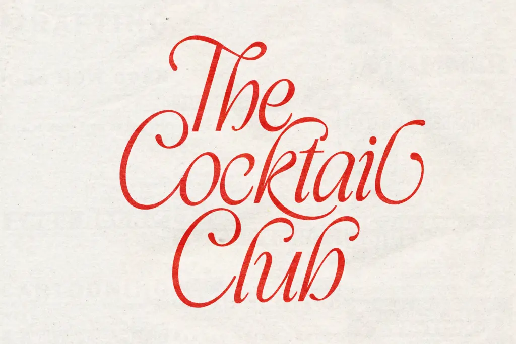
- Deep, distinctive swash capitals suited to monograms and initials
- Consistent baseline and slant keep the ornamentation from feeling unstable
- Bonus weight and slant variants give some flexibility for pairing headlines
Trade-offs
- Extended strokes require generous size and spacing, ruling out small or tight layouts
- The heavy ornamentation limits it to a narrow, formal aesthetic rather than broader branding work
Take Me To Tuscany is a decorative calligraphic script that commits fully to its romantic, old-world register, with deep swash capitals and extended strokes that need room to breathe. It's built for short lines — invitations, mastheads, monograms — not paragraphs, and demands careful spacing to avoid collisions. Buyers wanting a quieter or more contemporary script should look elsewhere.
Verdict

Tantype reviews typefaces in depth — every font is tested in real branding, editorial and screen layouts before a word gets written. 555+ fonts reviewed and counting.