
Space Fonts: 10 Best Space, Sci-Fi and Futuristic Fonts for Titles and Logos
Space fonts are display typefaces that make a design look like it belongs on a spaceship, a mission patch or a sci-fi film poster. Most are wide, geometric sans serifs with squared-off curves, a look that goes back to Microgramma and Eurostile, two Italian typefaces that sci-fi films keep returning to.
Our top three picks are Lightyear for 1950s space-age titles, Geom Graphic for a full Eurostile-style family, and Centauri for clean, extra-wide sci-fi logos. Every font in the main list is a commercial font sold on Creative Market. Three free Google Fonts are further down, and none of the fonts here is an official NASA or movie logo.
Browse space fonts on Creative Market Commercial fonts; prices depend on the licence you choose
What is a space font?
“Space font” is not a formal classification. It is the name people give to lettering they associate with rockets, mission control and science fiction, and three overlapping looks cover most of it.
The extended, squared sans. The classic space-age face is Microgramma, drawn by Alessandro Butti and Aldo Novarese for the Nebiolo foundry in Turin in 1952. URW calls it an improvement on the squared-off Bank Gothic capitals, and Fonts In Use notes the metal type had no lowercase at first. Ten years later Novarese reworked it into Eurostile, released by Nebiolo in 1962 according to Fonts In Use. Linotype describes its “big, squarish shapes with rounded corners that look like television sets from that era”. Our guides to the Microgramma font and the Eurostile font cover both in depth.
Eurostile on screen. Dave Addey, who writes Typeset in the Future, says Eurostile, “and in particular its Bold Extended variant, has appeared in countless sci-fi settings over the years”. His list runs from Silent Running to WALL·E, Pacific Rim and the titles of Apollo 13, and he flags lookalikes too: Moon uses Microstyle. In his study of 2001, he finds Eurostile Bold Extended on the Pan Am flight deck and HAL 9000’s screens; the titles are Gill Sans and Futura.
NASA-era type. Real space programmes used plainer type. Fonts In Use records that the Apollo 11 plaque left on the Moon is lettered in Futura, though commenters note some Apollo-era labels are Spartan, an American Futura copy. NASA’s famous red “worm” is not a font at all. Wikipedia describes it as a logotype designed by Richard Danne and Bruce Blackburn, introduced in 1975, retired in 1992 and brought back in 2020. NASA’s logo rules say its logos may not be used without explicit permission, and recommend Helvetica and Garamond as typefaces.
Techno and futuristic display. Newer space fonts add rounded tubes, angled cuts and missing crossbars, drawn more from game interfaces and sci-fi branding than from any one historical typeface.
Common traits:
- Wide proportions, often heavily extended.
- Squared rounds: O, C and D drawn as rounded rectangles, not circles.
- Even stroke weight, so letters look engineered rather than written.
- All caps or small-cap lowercase, since most space type is for short titles.
The best space fonts at a glance
- Lightyear: super-extended capitals with 1950s sci-fi roots.
- Geom Graphic: a squared geometric family in the Eurostile tradition, with italics.
- Centauri: minimal, extra-wide capitals for sci-fi titles and logos.
- Voyager: rounded futuristic letters for logos and game UI, in two weights.
- Equinox: a calmer futuristic face that also works outside sci-fi.
- Joyride Extended: a big extended family with 300+ alternates.
- Brigends Expanded: heavy, wide all-caps letters with a flat, industrial cut.
- Akido: an edgy minimal face for architecture and sci-fi branding.
- Automata: a bold sci-fi and sport font with upper and lowercase.
- Aquarium: sharp, all-caps tech lettering with stylistic alternates.
Best space fonts on Creative Market
Prices are the Creative Market desktop licence for one seat as listed in October 2026. Check the listing for current prices.
1. Lightyear
Lightyear, by Thomas Ramey, is the most space-age font here. The designer says it has “roots in the 1950’s space science-fiction era”, and it pairs super-extended capitals with a lowercase that is also drawn as capitals, so words mix two sizes of capitals. The listing mentions a few alternate letters (an alternate S in both cases and an alternate ampersand), a “/100” symbol and two sets of arrows. It is a single style: a headline face for retro posters, record sleeves and event flyers. The desktop licence was $15 in October 2026.
See Lightyear on Creative Market
2. Geom Graphic
Ryoichi Tsunekawa of Dharma Type drew it as a square geometric sans inspired by 1980s Japanese robot animation; the listing compares it to Eurostile, but squarer and with subtly rounded corners. There are four weights, each with a matching italic, and the designer claims extensive language support. That range covers a heavy title down to light labels, for games, film titles, tech brands and logos. It costs the most here: the desktop licence was $89 in October 2026.
See Geom Graphic on Creative Market · Read our Geom Graphic review
3. Centauri
Centauri, from Mehmet Tugcu’s Tugcu Design Co., has what the designer calls “minimalist, wide letters”. The listing says it includes English uppercase letters, alternate letters, numbers and basic punctuation, so it is for titles and logos, not text. The width does the work: a short word set in Centauri fills a banner the way mission names fill a patch. Creative Market’s space-font roundup calls it ultramodern. Use it for podcast covers, synth album art, start-up wordmarks and video intros. The desktop licence was $20 in October 2026.
See Centauri on Creative Market
4. Voyager
Voyager, also from Tugcu Design Co., has a rounded build. The designer calls it a futuristic font “great for sci-fi logos and UI elements”. The rounded corners suit console labels more than poster headlines. It comes in two weights, with uppercase letters, numbers, punctuation and some multilingual support, and alternate characters you switch on with Caps Lock. That makes them easy to reach in apps without a glyph panel. Use it for game menus, HUD mock-ups, esports graphics and space-themed kids’ products. The desktop licence was $24 in October 2026.
See Voyager on Creative Market
5. Equinox
Equinox is the restrained member of Tugcu’s sci-fi set: the listing says it is less futuristic than the designer’s other sci-fi fonts and more versatile outside science fiction. You get Regular and Bold, multilingual uppercase, numbers, punctuation and alternate letters through Caps Lock. Pick it when the brief is “future” but the client is an architect, an engineering firm or a skincare brand rather than a game studio. It can also carry subheads under a louder title font from this list. The desktop licence was $24 in October 2026.
See Equinox on Creative Market
6. Joyride Extended
Joyride Extended, by TypeJuice, is the largest package here. The listing describes an extended sans serif family of 16 fonts in four styles, with upper and lowercase, more than 4,000 glyphs, multilingual support and over 300 alternates that come in different widths. Those alternates let you stretch or tighten individual letters to fit a logo lockup, which suits motorsport graphics, streetwear and album covers where a space feel meets speed. The files are OTF and TTF. The desktop licence was $39 in October 2026.
See Joyride Extended on Creative Market · Read our Joyride Extended review
7. Brigends Expanded
Brigends Expanded, from Multype Studio, is heavy and wide, with flat terminals and little stroke contrast. It feels closer to lettering on a launch vehicle than a sleek sci-fi screen. The listing covers capitals, numbers and symbols with multilingual support, and the characters are PUA-encoded, so they work in Illustrator, Photoshop, InDesign and even Word on PC and Mac. It suits aerospace-themed merch, logos and poster titles where Centauri would look too light. The desktop licence was $29 in October 2026.
See Brigends Expanded on Creative Market · Read our Brigends Expanded review
8. Akido
Akido, by Alexandru Molnar, appears in Creative Market’s space-font roundup. The designer describes it as a modern, minimal and edgy family for futuristic, architectural and sci-fi projects. The listing doesn’t spell out weights or a glyph count, so check the preview images for the characters you need. It includes a bonus vintage badge template in PSD and AI. Use it for architecture studios, film titles and tech product names. The desktop licence was $20 in October 2026.
9. Automata
Automata, from Hamz Studio, is a bold futuristic sans aimed at sci-fi, sport, technology and action themes. Unlike most fonts here it has lowercase, so it can set mixed-case titles and slogans, and the listing promises futuristic alternates. Files come as OTF, TTF, WOFF and WOFF2. Its weight makes it closer to a sports or racing font than a NASA-style label, which is useful for esports teams, gaming channels and sci-fi action posters. The desktop licence was $19 in October 2026.
See Automata on Creative Market · Read our Automata review
10. Aquarium
Aquarium is a second Hamz Studio font, designed by Mariela Dwi Damayanti, with sharp, angular letters in a sans serif display style. The listing says it is all uppercase, with numerals, punctuation and accented characters for Western European languages, plus stylistic alternates for building different versions of a word. Formats are OTF, TTF, WOFF and WOFF2. The designer calls it highly legible, which suits tech branding, packaging and social graphics read at a glance. The desktop licence was $19 in October 2026.
See Aquarium on Creative Market · Read our Aquarium review
How to choose a space font
Pick an era. For a 1950s and 60s space-age feel, use extended capitals like Lightyear or Centauri. For the 1970s and 80s spaceship-screen look, Geom Graphic is closest to Eurostile. For modern game or tech work, try Voyager, Automata or Aquarium.
Check the character set. Many sci-fi fonts are caps only. For sentence case, choose Automata, Joyride Extended or Geom Graphic, and check the numbers if you are setting dates or mission codes.
Watch the width. Extended fonts eat space, so a long word in Centauri or Brigends Expanded may not fit a phone screen or badge. Test your real words first.
Keep body text plain. Use the space font for titles and a quiet sans for paragraphs; none of these is meant for long reading.
Cricut, vinyl and embroidery. Thin strokes can tear or vanish when cut or stitched small, so heavier letters like Brigends Expanded or Automata are safer.
Don’t copy logos. A font licence doesn’t cover NASA’s worm or a film logo.
Free space fonts
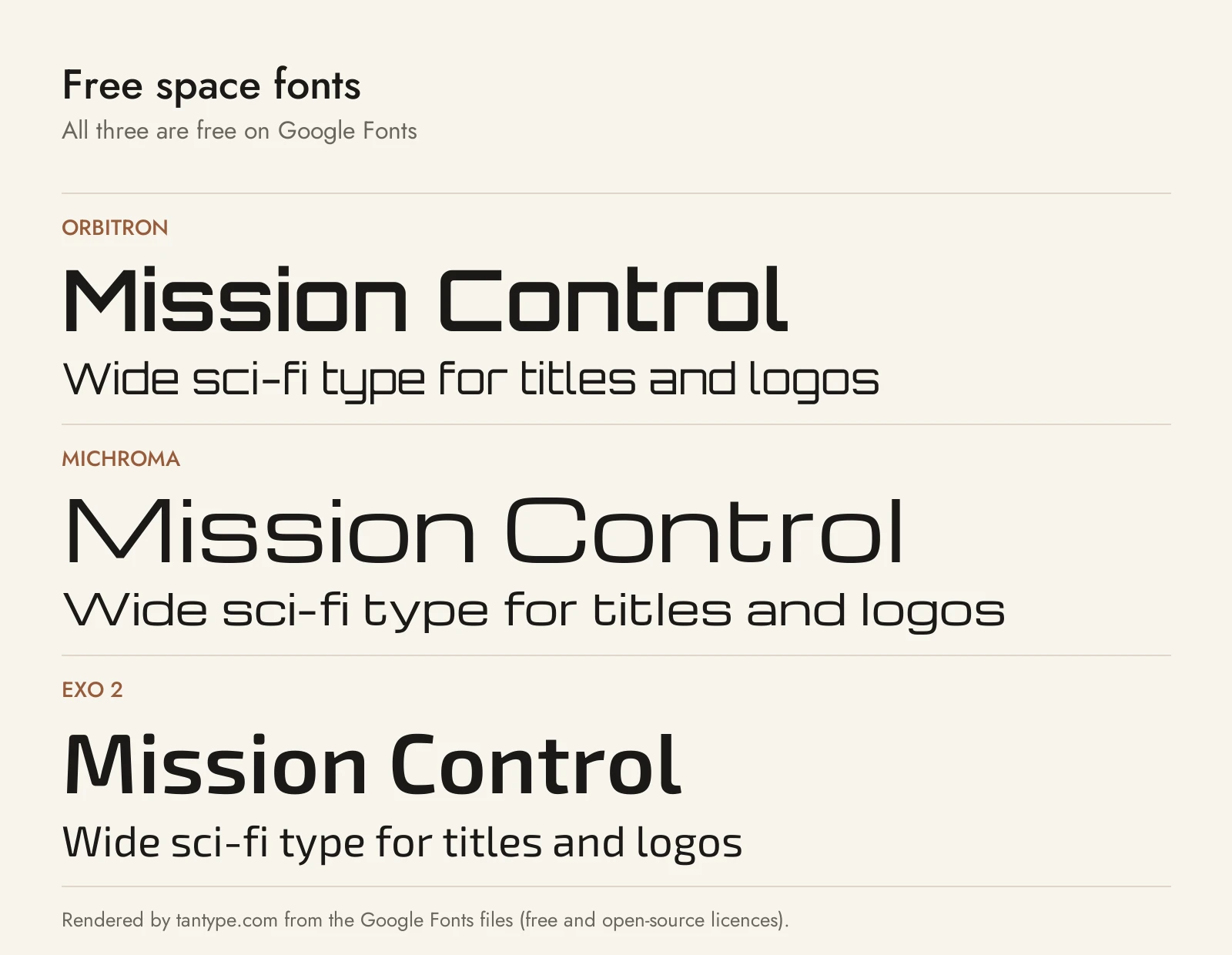
These three are on Google Fonts under the SIL Open Font License, which allows personal and commercial use. They have fewer extras than the paid picks.
- Orbitron: by Matt McInerney, first published by The League of Movable Type. Its Google Fonts description says it was designed as an alternative to Eurostile and Bank Gothic for “spaceship exteriors, spacestation signage” and similar. It is now a variable font from Regular to Black. It is less wide than Lightyear or Centauri and closer in mood to Voyager.
- Michroma: by Vernon Adams, a reworking of the rounded-square genre that, in its description, is tied directly to Microgramma and Eurostile. It is the closest free match to that classic extended look, but it has one weight only, where Geom Graphic has four plus italics.
- Exo 2: by Natanael Gama, a geometric sans that, according to its description, aims for a “technological/futuristic feeling” while staying readable. It has nine weights from Thin to Black with true italics, so use it for menus, interfaces and body text.
Licensing: personal vs commercial use
Creative Market’s font licences come in four types:
- Desktop: personal and commercial work, including products, social media, packaging and ads. On websites and in games the font can only appear in rasterized form, as an image. Teams need one seat per user.
- Webfont: embedding on your own websites, up to a pageview limit.
- App: embedding in one app or game, if the font can’t be extracted.
- E-pub: embedding in one ebook title.
Game makers need the App licence to embed a font in a HUD or menu; Desktop only covers text baked into images. For logos, Creative Market’s FAQ says a font can be part of a logo only if it is modified and not the dominant element, and you must disclaim the font if you register a trademark. Print-on-demand tools that let customers type their own text are not allowed when the end user is not the licensee. Listings can add their own terms. This is a summary, not legal advice.
Space font FAQ
What is the most popular space font?
Eurostile, especially Eurostile Bold Extended, is the classic sci-fi choice. Typeset in the Future lists dozens of films and shows that use it, from 2001: A Space Odyssey to Pacific Rim. Its predecessor Microgramma is hard to tell apart on screen.
What font does NASA use?
No single font. The red “worm” is a logotype drawn by Danne & Blackburn, not a font you can install, and the Apollo 11 Moon plaque is lettered in Futura according to Fonts In Use. NASA’s current brand page recommends Helvetica and Garamond.
What is the difference between space, sci-fi and futuristic fonts?
They overlap. “Space” usually means wide, Eurostile-style lettering; “sci-fi” adds film and game looks such as tubes and cut corners; “futuristic” is broadest and covers tech branding.
What is a galaxy font?
Usually a decorative alphabet filled with stars, nebulae or planets rather than a plain typeface. Creative Market’s space-font roundup includes a galaxy-themed vector letter set where each letter holds planets and comets. For typed text, use a font above with a galaxy texture as a clipping mask.
Are there free space fonts for commercial use?
Yes. Orbitron, Michroma and Exo 2 are free on Google Fonts under the SIL Open Font License. Many “free” sci-fi fonts elsewhere are personal-use demos, so read the licence first.
Which space font is best for a logo?
Centauri and Lightyear give a wordmark the most width and character; Geom Graphic is better if the brand needs a full type system. Follow Creative Market’s logo rule in the licensing section.
