
Ratio: a geometric sans with inktraps for corporate and editorial work
Design style
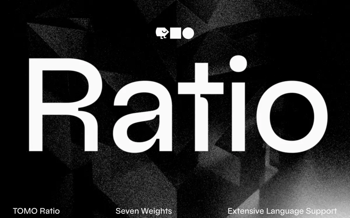
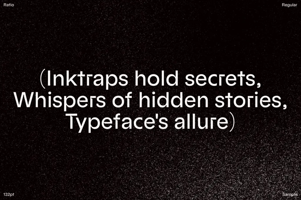
Ratio sits in the geometric sans tradition — circular bowls, low-contrast strokes, the kind of skeleton that traces back through Futura and its Bauhaus-era relatives. What distinguishes it from the dozens of other geometric revivals on the market is the inktrap treatment worked into the joins. Instead of the usual clean intersections, Ratio carves small notches where strokes meet, a detail borrowed from text faces designed for poor print conditions. Here it’s used decoratively rather than functionally, and at larger sizes it reads as a deliberate stylistic signature rather than a printing accommodation.
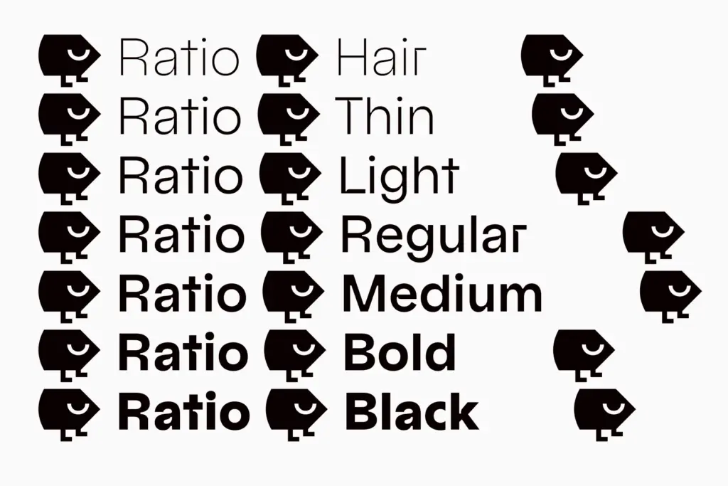
The lowercase leans on spurless terminals, which keeps letters like a, u and n looking pared-back and slightly severe even with the inktraps softening the geometry elsewhere. It’s a combination that could easily feel fussy, but the drawing keeps the two ideas in balance — the geometric bones stay legible under the ornamental cuts. Across seven weights the inktrap detail scales sensibly: subtle in the lighter weights, more pronounced and almost architectural as the strokes thicken toward the black end of the range.
Character set and features
The seven-weight range gives Ratio a genuine range of jobs, from fine-lined captions to heavy display settings, all built on the same structural logic. Stylistic alternates are included through OpenType stylistic sets, offering variant letterforms for designers who want to dial the inktrap effect up or down, or swap in more conventional shapes where the decorative cuts feel like too much. This is a sensible way to hedge the font’s most distinctive feature — it means the same family can serve a brand that wants the inktraps as a signature and one that just wants a solid geometric sans with an option to add flair later.
The geometric skeleton means x-height and counters follow familiar patterns for the genre: open apertures, rounded bowls, consistent stroke weight. Numerals and punctuation appear to follow the same restrained, systematic drawing as the letters, which is what you’d expect from a family built around a consistent structural idea rather than expressive quirks.
Use cases
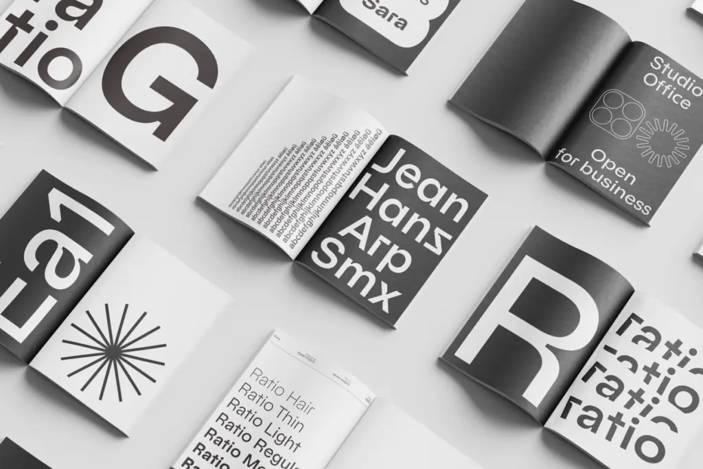
Ratio’s natural home is branding and identity work where a geometric sans is the starting brief but a plain one feels too safe. The inktraps give logotypes and headline treatments a texture that photographs and screenshots well — the notches read clearly even when a mark is shrunk down, which is not always true of decorative details. It also suits editorial mastheads and section headers where a display typeface needs to hold a page without competing with body text.
Where it gets more delicate is body copy. The inktrap detail is a display-weight idea; at small sizes across long paragraphs it risks vanishing into noise or, at low resolution, just registering as slightly uneven type rather than intentional design. The middle weights can carry short paragraphs and captions reasonably, but this isn’t a family to set a novel in. Treat the lighter weights as supporting text next to the more distinctive display weights, and it earns its keep as a flexible, opinionated alternative to the usual geometric sans defaults.
What we liked, and what we didn’t
Strengths
- Inktrap detailing gives an otherwise standard geometric sans a real point of view
- Seven weights provide a workable range from caption to black display sizes
- Stylistic alternates let designers dial the decorative effect up or down
Trade-offs
- The inktrap detail loses clarity at small sizes and long text settings
- Its distinctive look can feel more novelty than neutral in conservative corporate contexts
Ratio takes a familiar geometric sans structure and gives it a genuinely distinctive detail in its inktraps, which works well in branding and display contexts. It's less convincing as a body-text workhorse, so it's best treated as a display-forward family with usable supporting weights rather than an all-purpose system font.
Verdict

Tantype reviews typefaces in depth — every font is tested in real branding, editorial and screen layouts before a word gets written. 555+ fonts reviewed and counting.