
Benzin: a geometric sans built to run from body text to posters
Design style
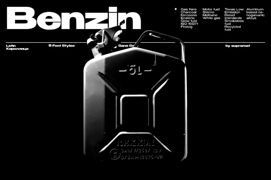
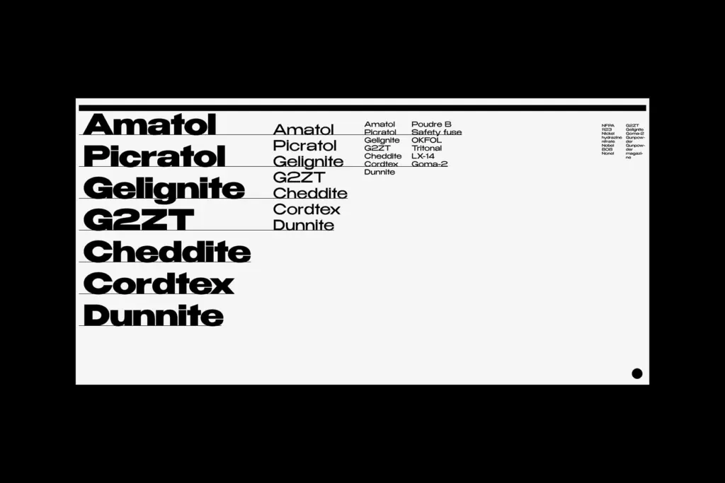
Benzin sits in the geometric sans tradition: circular bowls, even stroke widths, a construction that looks like it started from a compass rather than a pen. That lineage is well-worn territory, but Benzin doesn’t try to disguise it with quirky details or forced personality. Instead it leans on proportion and spacing discipline. The five weights move from a light that reads almost technical to a bold that has real poster weight, and the transitions between them feel considered rather than mechanically interpolated — the bold doesn’t just thicken the stems, it tightens the whole rhythm of the line.
What’s notable is the kerning approach: Supremat built different spacing densities for the light and bold ends of the family, looser in the thin weights, tighter in the bold. That’s an unusual bit of craft for a geometric sans at this price point, and it shows the designer was thinking about how the font actually gets used rather than just how it looks in a specimen.
Character set and features
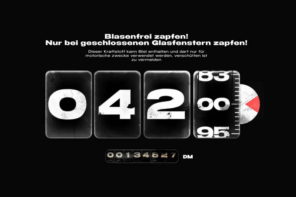
Language support runs across Western and Central/Eastern Europe, Baltic, Turkish, Romanian and Cyrillic, which makes this a genuinely multilingual family rather than one dressed up with a few extra accents. That’s a meaningful point in its favour if your work touches European or Cyrillic markets, since geometric sans families often treat Cyrillic as an afterthought with mismatched proportions — worth checking the Cyrillic glyphs against your specific language needs before committing, as the brief doesn’t detail how those forms were adapted.
The five-weight range gives you a reasonable spread for building hierarchy within a single family, light for captions or fine print, regular and medium for body copy, bold and whatever sits above it for headlines. There’s nothing here suggesting italics, so if your project needs an oblique for emphasis or editorial contrast, you’ll need to simulate it or look elsewhere.
Use cases
The pitch is that one family can do both headline and paragraph duty, and the kerning work genuinely supports that. For editorial layouts where you want a single sans to carry a masthead, subheads, and running text without swapping families, Benzin is a sensible choice. It’ll do fine in branding work that wants a clean, neutral geometric voice, think product packaging, tech-adjacent identity, or signage, where geometric sans families are the default reach.
Where it’s less convincing is anywhere that wants warmth or idiosyncrasy. Geometric sans faces like this one read as efficient and slightly cool; they don’t carry the character of a humanist sans or the texture of something hand-finished. If your brief calls for personality over neutrality, this isn’t the tool. But as a workhorse family that covers headline and body with minimal fuss, and with multilingual reach most buyers won’t need to think twice about, it earns its place in a practical type library.
What we liked, and what we didn’t
Strengths
- Kerning is tuned separately for light and bold weights, so headline and body settings both feel correctly spaced
- Five-weight range gives real headroom for hierarchy within one family
- Multilingual character support covering Cyrillic, Baltic and Turkish extends its reach beyond typical geometric sans families
Trade-offs
- No italic or oblique style is mentioned, limiting options for emphasis
- The geometric construction keeps things neutral and slightly cool, with little personality for projects wanting warmth
Benzin is a competent geometric sans that does the unglamorous work of unifying headline and body type in one family, helped by kerning that's been tuned separately for light and bold weights. It won't surprise anyone stylistically, but it's dependable and genuinely multilingual.
Verdict

Tantype reviews typefaces in depth — every font is tested in real branding, editorial and screen layouts before a word gets written. 555+ fonts reviewed and counting.