
Cocogoose Classic: a geometric sans built for oversized, confident headlines
Design style
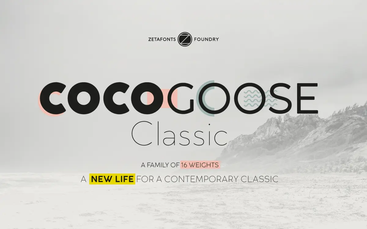
Cocogoose Classic is the more restrained sibling in a family that started life in 2012 as an unapologetically heavy display face. Where the original Cocogoose leans on an extreme x-height and near-ultrabold weight even at its lightest setting, the Classic variant keeps the geometric bones and rounded corners but redraws the lowercase with a smaller x-height and rounder dots. The uppercase stays close to the source design: even strokes, low contrast, corners eased just enough to soften the geometry without turning soft or friendly. It reads as confident rather than cute.
The low contrast and consistent stroke widths give it a stencil-adjacent, almost architectural feel at large sizes. It’s not trying to be neutral in the way a workhorse grotesque is neutral — it has a distinct roundness and a squared-off geometric logic that will stamp its personality on anything it touches. That’s a feature for branding work and a limitation for anyone wanting a face that disappears into the background.
Character set and features
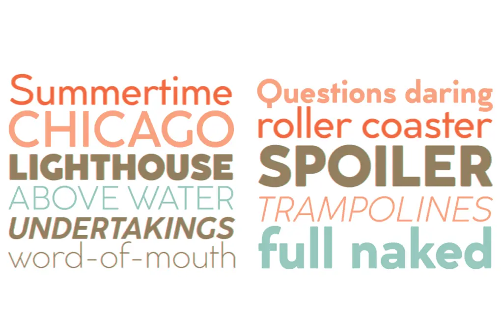
Eight weights with matching italics is a genuinely useful range, running from a workable light through to a weight heavy enough for the punchy display use the original Cocogoose was known for. The OpenType feature set is where Classic earns its keep beyond the letterforms themselves: positional numerals, alternate character forms, and extended ligatures push the glyph count past a thousand, which is a lot of typeface to have in one family. Cyrillic and Greek support, added by Andrea Tartarelli in later revisions of the broader Cocogoose project, extends its reach beyond Latin-only jobs, though buyers should confirm coverage against their specific language needs rather than assume full parity across every weight.
The redrawn lowercase is the real story of Classic versus the original: smaller x-height, rounder dots, more restrained proportions. It makes the face usable at body-copy-adjacent sizes in a way the original display cut never really was, though it’s still not a face I’d reach for in dense running text — the geometric roundness starts to feel repetitive across a full paragraph.
Use cases
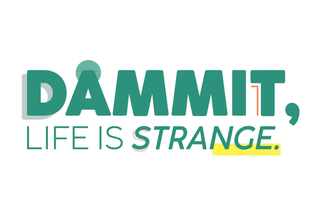
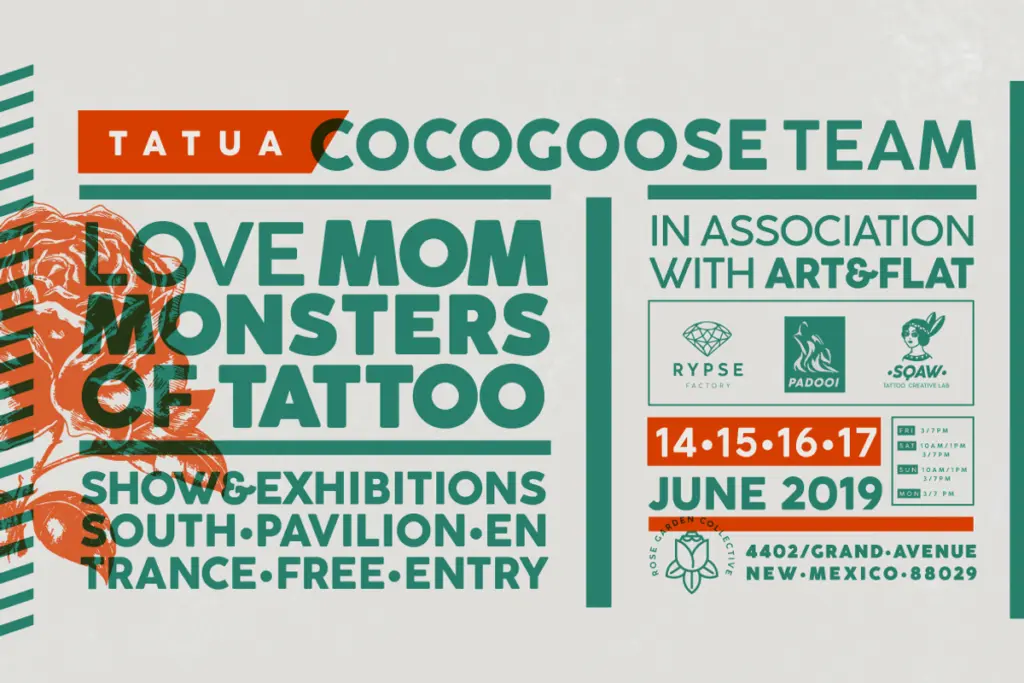
This is a headline and branding typeface first. The combination of low contrast, rounded geometry, and a wide weight range makes it well suited to logotypes, packaging typography, poster headlines, and editorial display work where a few words need to carry visual weight. The lighter weights work for subheads and short editorial callouts; the heavier weights do the job the original Cocogoose was built for — big, blunt, attention-grabbing type.
It’s less suited to long-form text or anything that needs to feel quiet. The personality that makes it good at headlines is the same personality that will fight you in a paragraph of body copy. Treat it as a display and branding family with unusually deep OpenType support, not as an all-purpose text face, and it performs well within that brief.
What we liked, and what we didn’t
Strengths
- Eight weights with matching italics give real range for branding and display hierarchy
- Redrawn lowercase with a smaller x-height makes it more usable than the original at smaller display sizes
- Deep OpenType feature set with positional numerals, alternates, and extended ligatures
Trade-offs
- The rounded geometric character becomes repetitive across longer stretches of text
- Language coverage varies by weight, so multilingual projects need checking rather than assuming
Cocogoose Classic trades some of the original's brashness for a more usable lowercase and a genuinely deep feature set. It's a strong pick for logotypes, packaging, and display headlines, but it's not built for long-form text and its rounded geometric personality won't suit every brand.
Verdict

Tantype reviews typefaces in depth — every font is tested in real branding, editorial and screen layouts before a word gets written. 555+ fonts reviewed and counting.