Serif
3.7
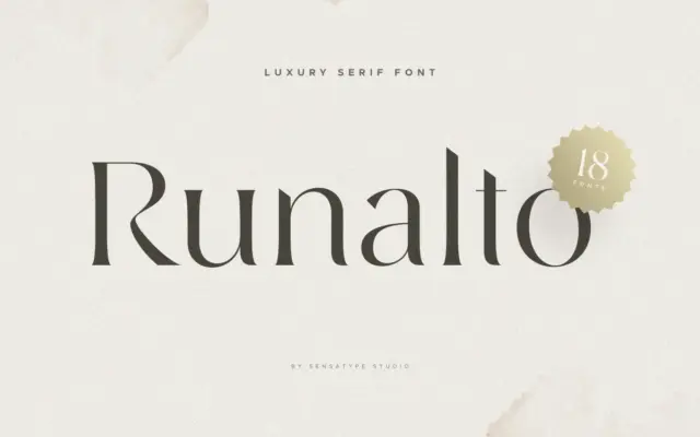
Runalto: a luxury display serif for branding and editorial headlines
Design style Runalto sits in the well-populated field of “luxury” display serifs: high contrast strokes, sharpened serifs, and a general…
 Tantype

Serif fonts carry the authority of print — bracketed feet, refined contrast and a bookish confidence that suits editorial design, branding and packaging. Every serif typeface here is reviewed in depth: design style, character set, best use cases and where to download it.
Design style Runalto sits in the well-populated field of “luxury” display serifs: high contrast strokes, sharpened serifs, and a general…
Tantype
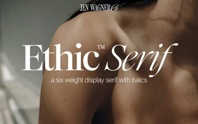
Design style Ethic Serif is a high-contrast serif built for scale rather than for reading in bulk. The thick-thin transitions…
Tantype
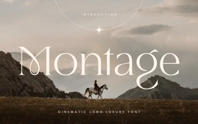
Design style Montage sits in the high-contrast display serif tradition, the kind of letterform built for a marquee rather than…
Tantype
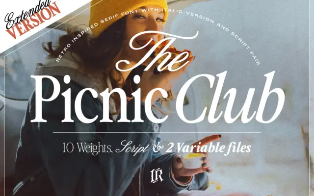
Design style The Picnic Club reads as a display serif with its roots firmly in late-1970s and 1980s lettering: slightly…
Tantype
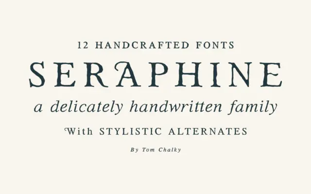
Design style Seraphine sits in the well-populated territory of the warm, handcrafted serif — the kind of face that wants…
Tantype
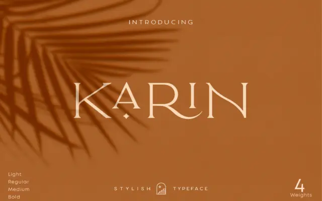
Design style Elegant Karin is an all-caps serif built around a narrow, upright skeleton. The contrast is moderate rather than…
Tantype
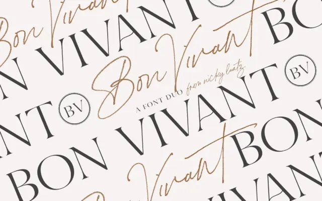
Design style Bon Vivant is a two-part collection: a brush-style script and a companion serif, both pitched at the hand-finished…
Tantype
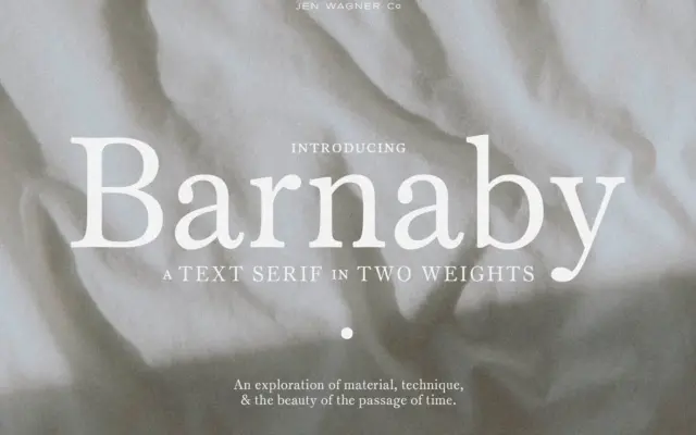
Design style Barnaby sits firmly in the restrained camp of contemporary text serifs. The contrast between thick and thin strokes…
Tantype
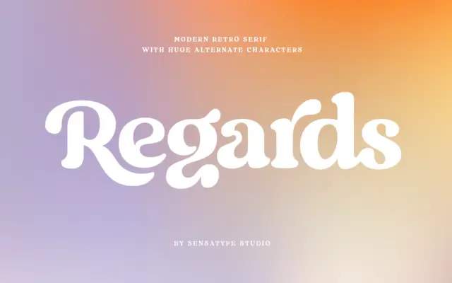
Design style Regards sits in that well-populated corner of type design where a serif skeleton gets bent toward something warmer…
Tantype