
White Wisteria: a nine-weight serif with vintage warmth and real range
Design style
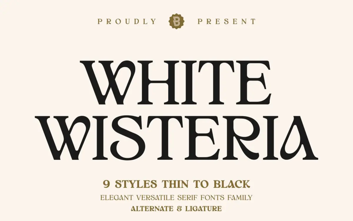
White Wisteria is a serif built around soft, rounded corners rather than sharp bracketed serifs, which gives it a warmer, less formal presence than most classical text serifs. The curves are generous — bowls open a touch wider than expected, and the terminals ease into their strokes instead of stopping abruptly. That softness is the whole personality of the family: it reads as vintage and a little romantic without tipping into anything overtly decorative. Stroke contrast is moderate, enough to give the letters some rhythm on a page but not so much that the thin strokes disappear at small sizes.
What’s notable is the range: nine weights running from Thin to Black. Most serif families marketed as “vintage” ship as a single display cut. Here the same curved, soft-cornered structure holds up from the lightest weight to the heaviest, which means the character of the typeface doesn’t shift dramatically as you move through the family — it just gets bolder. That consistency is a genuine strength of the drawing.
Character set and features
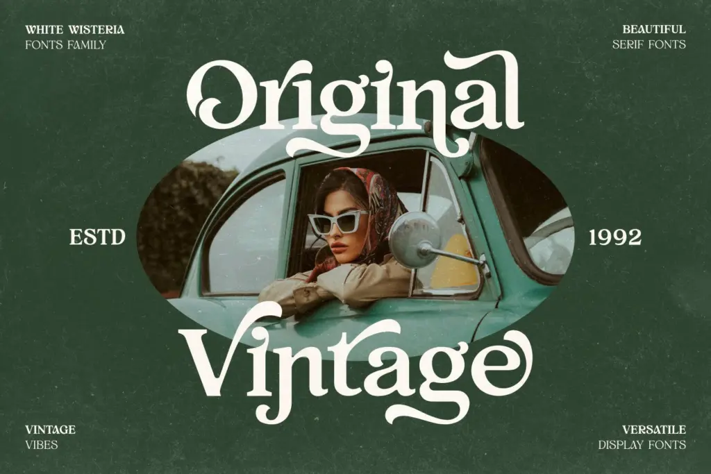
The family includes kerning, a ligature style, an alternate style, numerals, symbols, and stated multilingual support, all packaged as OpenType. The ligatures and alternates matter more than they might in a plainer serif, because they let you soften the more mechanical-looking letter pairs and swap in a few flourished forms for headline settings without changing the whole face. Used sparingly, they reinforce the vintage-label feeling; used everywhere, they’ll start to fight the calm of the regular letterforms, so it’s worth treating them as accents rather than defaults.
The heavier weights — Bold through Black — are where the rounded corners earn their keep, producing a chunky, confident serif that still feels friendly rather than aggressive. The lighter weights (Thin, Extra Light) lean more toward elegance, with the curves reading as delicate rather than soft. Between the two extremes sits a genuinely usable text-weight option in Regular and Medium, though anyone planning long-form body copy should test it at their actual point size — soft-cornered serifs like this one can lose crispness in dense paragraphs, especially at small sizes on screen.
Use cases
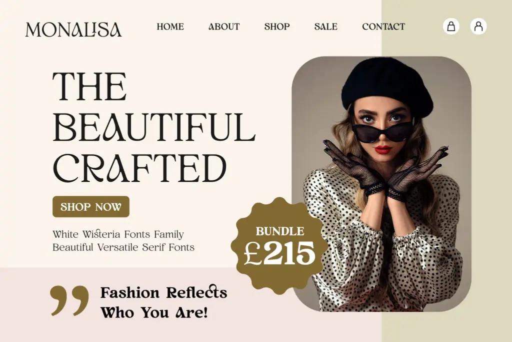
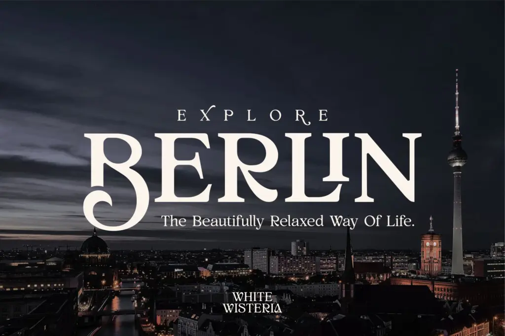
This is a family built for identity work more than editorial systems, and it performs best where you can give the letterforms room: logotypes, packaging, labels, fashion branding, album covers, posters. The lighter weights suit anything asking for restrained luxury — perfume labels, boutique signage, invitation suites. The bolder end works for headline typography on packaging or posters where you want warmth without cartoonishness.
It’s less suited to dense text-heavy layouts like long-form editorial or body-copy-driven web pages, where the rounded terminals and moderate contrast won’t hold up as well as a more neutral text serif. Pair it with a plain sans for the supporting copy in any project and let White Wisteria carry the headline and brand mark — that’s where the curved, soft character actually shows.
What we liked, and what we didn’t
Strengths
- Nine weights keep the same soft-cornered character from Thin through Black
- Ligatures and alternates give headline settings extra texture without needing a second font
- Rounded terminals give heavier weights warmth instead of bulkiness
Trade-offs
- Soft corners and moderate contrast lose crispness in dense small-size text
- Alternates can overpower the regular letterforms if used too liberally
White Wisteria is a well-drawn vintage serif whose soft, rounded corners stay consistent across an unusually full weight range. It's built for branding and display work rather than text, and it does that job with real warmth. Test the mid-weights carefully before committing to any body-copy use.
Verdict

Tantype reviews typefaces in depth — every font is tested in real branding, editorial and screen layouts before a word gets written. 555+ fonts reviewed and counting.