
Montmartre: a thin romantic serif for quotes and delicate branding
Design style
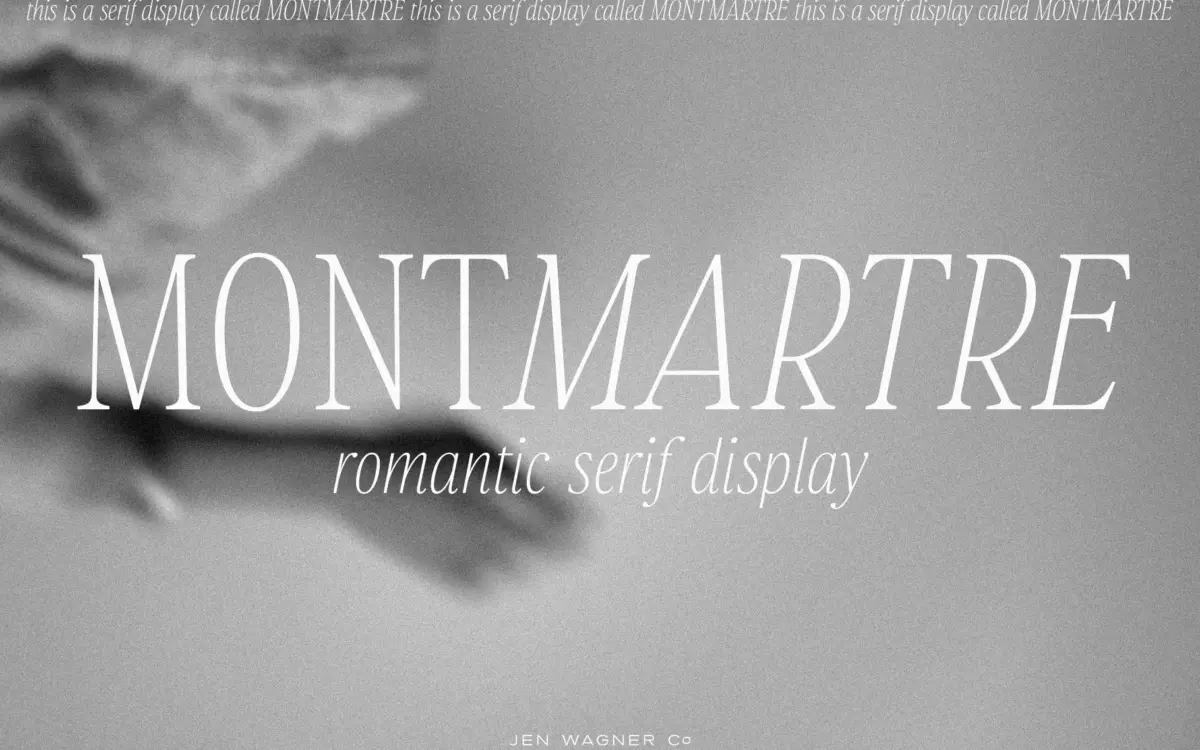
Montmartre is a light-weight serif built around a quiet, feminine mood rather than raw legibility at small sizes. The strokes are thin throughout, with contrast that leans on hairline transitions rather than heavy thick-thins, and the serifs are small, almost bracketless flicks rather than structural feet. Letters sit with generous, airy spacing, which reinforces the delicate feel but also means the face wants room to breathe rather than being packed tight.
The italic is where the design earns its ‘romantic’ label — it has a looser, more calligraphic rhythm than the upright, with entry strokes that suggest a pen rather than a chisel. Paired together, regular and italic read as a matched set rather than two unrelated styles, which is useful if you want to mix a headline in one and a supporting line in the other without the pairing feeling accidental.
It’s not a face with a strong personality quirk — no unusual ligatures, no eccentric letter — it’s more a mood than a statement. That restraint is deliberate, but it also means Montmartre blends into a fairly crowded field of thin editorial serifs rather than standing apart from it.
Character set and features
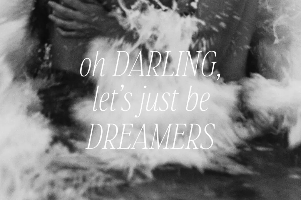
The set covers uppercase and lowercase, numerals, and extended punctuation, along with support for Western and Central European languages, so accented characters are included rather than an afterthought. That’s a practical plus if your quotes or brand copy run beyond basic English.
What’s notably absent from the brief is any mention of ligatures, alternates, or swash capitals — features that thin script-adjacent serifs like this often lean on to add flourish. Without them, Montmartre stays plain in a good way for body-adjacent use, but designers looking for the kind of ornamental variation that makes a quote font feel handcrafted may find the set a little thin on personality-building extras.
Weight-wise, this reads as a single light weight plus its italic — there’s no indication of a bold or a family of weights, so anyone needing a full typographic system for headlines through captions will need to bring in a second, sturdier typeface to do that heavier lifting.
Use cases
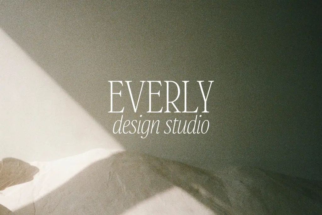
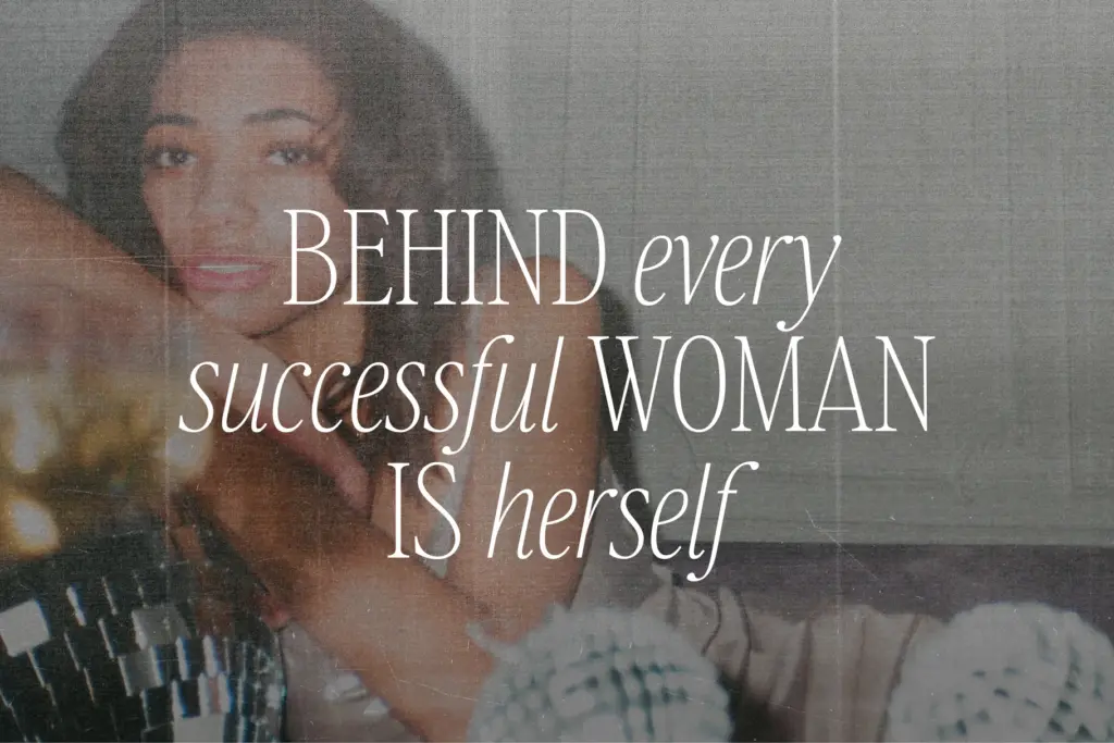
Montmartre’s natural home is short-form: pull quotes, Instagram and Pinterest graphics, invitation wording, and logotypes for brands chasing a soft, romantic register — think stationery, beauty, bridal, or lifestyle branding. At display sizes, generously kerned, it has the quiet confidence those contexts call for.
It’s less suited to body copy or anything read in long stretches — the light weight and airy spacing that make it charming as a headline will strain at paragraph sizes, especially on screen or in print at low resolution. It’s also not a face for loud, high-contrast branding; its whole appeal is restraint, so pushing it into bold, attention-grabbing contexts works against the design.
For designers building a quote graphic, a wedding suite, or a small feminine logotype, Montmartre does a specific job cleanly. For anyone needing a workhorse serif across a full brand system, it will need a heavier companion to carry the load it wasn’t built for.
What we liked, and what we didn’t
Strengths
- Regular and italic feel genuinely matched, not just two separate styles bolted together
- Central European character support makes it usable beyond basic English text
- Airy, restrained spacing suits quote graphics and soft branding without extra styling
Trade-offs
- Single light weight with no bold option limits its use across a full brand system
- No alternates, ligatures or swashes to add flourish beyond the base letterforms
Montmartre does one thing well: soft, romantic display type for quotes and delicate branding. It's not built for body copy or bold statements, and the lack of alternates or extra weights limits how far it stretches, but within its lane it's a clean, well-matched regular-italic pairing.
Verdict

Tantype reviews typefaces in depth — every font is tested in real branding, editorial and screen layouts before a word gets written. 555+ fonts reviewed and counting.