
Quarterly: a hand-drawn serif with weight and a bit of mischief
Design style
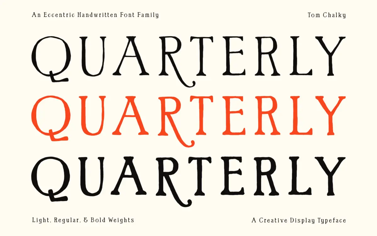
Quarterly sits at the intersection of hand lettering and serif structure, and it wears that tension well. The strokes are bold and slightly irregular, as if drawn with a chisel-tip marker rather than built in a vector grid, but the underlying skeleton is classical enough that the letters never tip into novelty. Serifs are stubby and asymmetric, curves bulge unevenly, and the baseline has a gentle wobble that gives it a handmade rhythm without looking sloppy. It reads as confident rather than fussy — a font that knows it’s imperfect on purpose.
Where it earns the ‘quirky’ billing is in the small inconsistencies: a terminal that flares more on one letter than its neighbour, a bowl that’s slightly lopsided. These aren’t flaws so much as the point. It’s the kind of face that looks like it came from a single hand in one sitting, which is exactly what gives it personality that a cleaner, more uniform serif wouldn’t have.
Character set and features
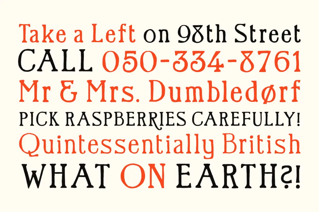
The family comes in three weights — Light, Regular, and Bold — which is a sensible spread for a display face like this. The Light keeps the handcrafted texture but eases off the density, useful for body-adjacent settings where Bold would overwhelm. Bold, unsurprisingly, is where the character really shows: thick strokes, assertive curves, and enough contrast between light and dark weights that you could pair them within a single layout without it feeling like two unrelated fonts.
Multilingual support covers Latin 1 glyphs, so it’ll handle most Western European languages without hunting for missing accents. The inclusion of a full set of fraction numerals is a nice, slightly unusual touch — genuinely handy for packaging or recipe work where you need to set 1/2 cup or 3/4 inch cleanly rather than faking it with a slash and superscript.
What’s missing, at least from what’s described, is any mention of swash alternates or ligatures — features that a font this expressive might benefit from, since hand-lettered faces often rely on alternates to avoid repetition in longer headlines. Without them, watch for the same letter shape repeating too often in a word like ‘llama’ or ‘coffee’, which can undercut the handmade illusion.
Use cases
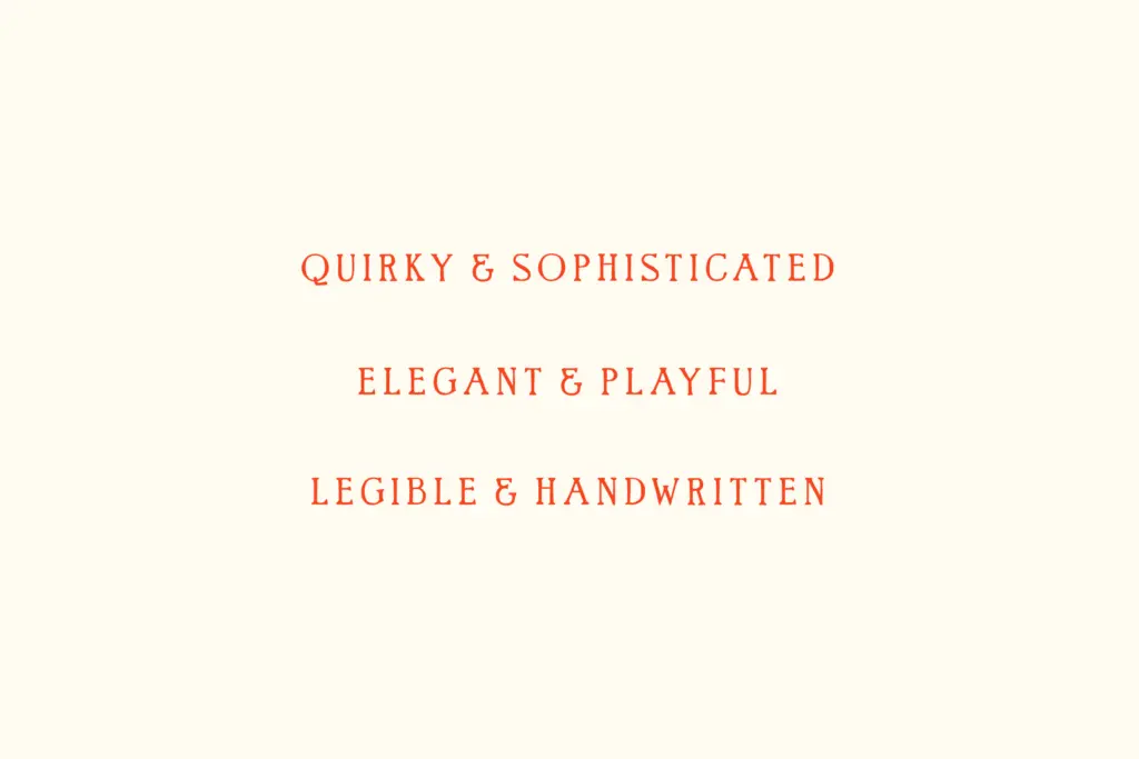
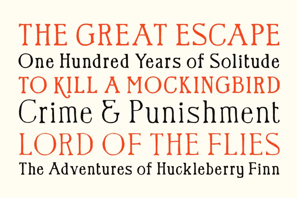
Quarterly is built for short-form, high-impact type: logotypes, packaging headers, book cover titles, and branding where a bit of warmth and irregularity is the goal. It has real presence at large sizes — headlines, signage, product labels — where its bold curves and uneven serifs read as craft rather than noise. The fraction set makes it a genuine option for food and packaging work, not just an afterthought feature.
It’s not a body-text font, and shouldn’t be pushed there — the irregularity that makes it charming at 60pt will fatigue a reader at 10pt. Three weights give it some flexibility for hierarchy within a single piece, pairing a Bold headline with a Light subhead, but it stays firmly in the display and branding lane rather than editorial or long-form use.
What we liked, and what we didn’t
Strengths
- Bold weight has real presence and craft-like texture for logos and packaging
- Three weights give some hierarchy flexibility within one family
- Fraction numerals are a genuinely useful, uncommon inclusion for packaging work
Trade-offs
- No mention of swash or stylistic alternates, so repeated letters can feel monotonous in longer words
- Not suited to body text or small sizes — the irregularity works against legibility there
Quarterly is a confidently drawn hand-lettered serif with real personality at display sizes, especially in its bolder weight. It's limited to short-form, headline-scale work, and the lack of stated alternates is a missed opportunity for a font built on irregularity.
Verdict

Tantype reviews typefaces in depth — every font is tested in real branding, editorial and screen layouts before a word gets written. 555+ fonts reviewed and counting.