
Loren Blake: a classic serif and companion script for branding work
Design style
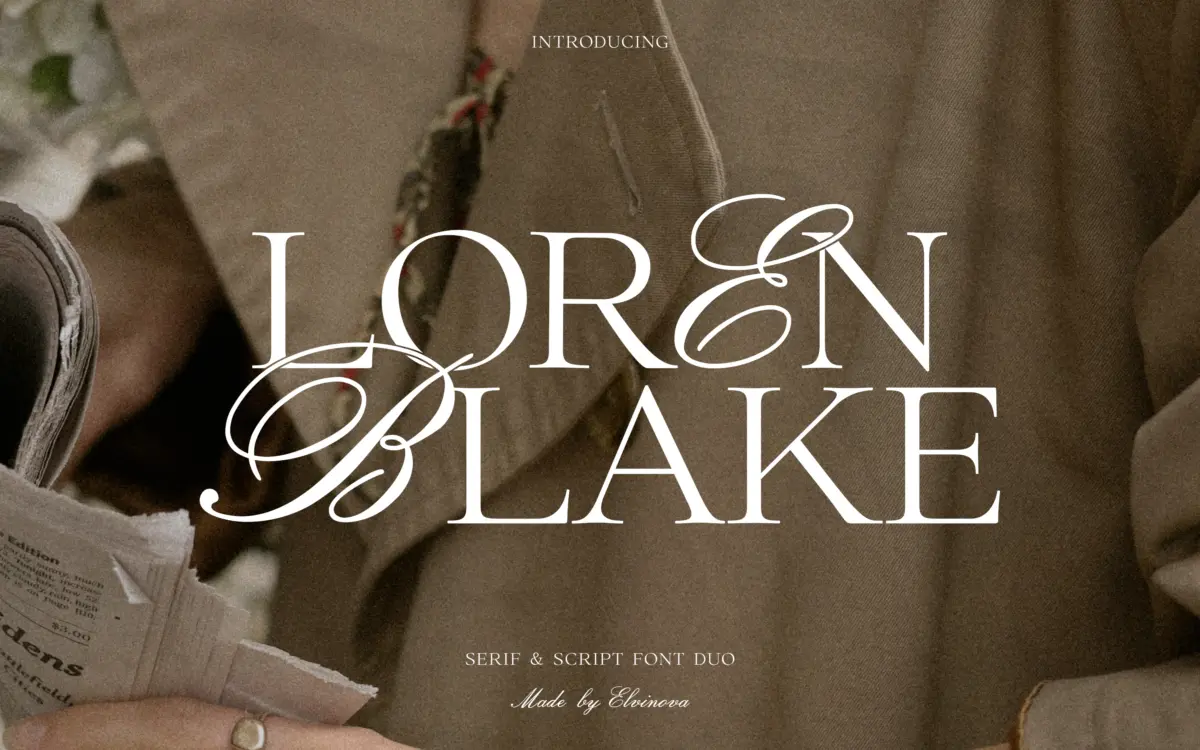
Loren Blake is built as a pair: a serif and a script that are meant to be read together rather than as two unrelated files bundled for convenience. The serif is the quieter of the two — upright, evenly weighted, with the kind of restraint you associate with editorial or legacy branding rather than anything trendy. It doesn’t chase a period or a mood; it just sits there being legible and slightly formal, which is exactly the job a companion serif is supposed to do.
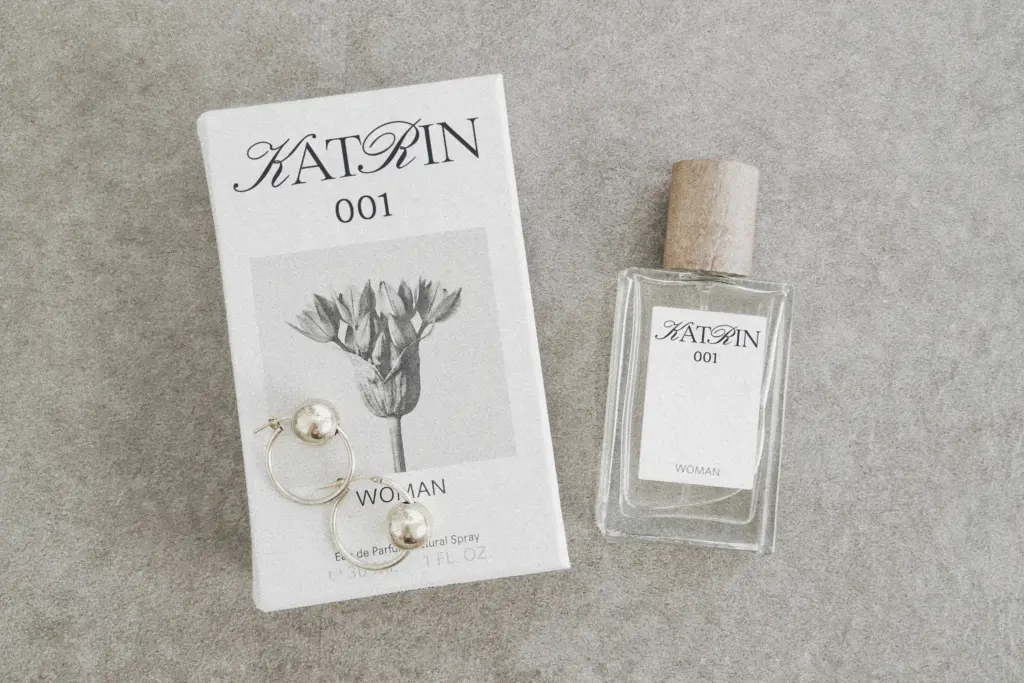
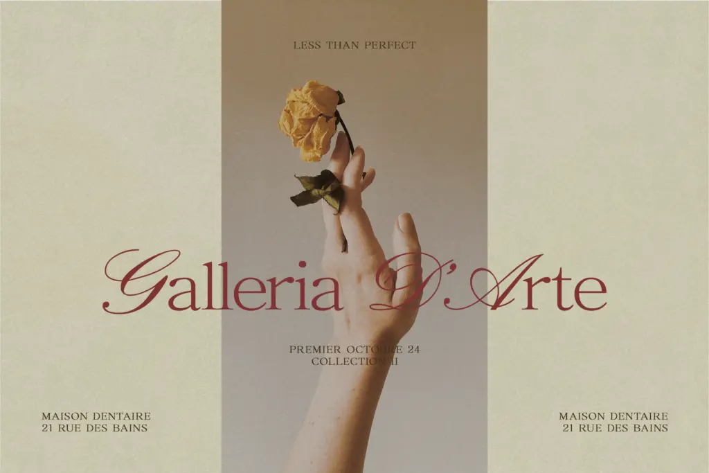
The script is where the personality lives. Its capitals are drawn noticeably large and confident relative to the lowercase, which gives words an off-balance, almost theatrical entrance — a word like ‘Loren’ reads as a flourish followed by a settle. That size contrast is the defining move of the family, and it’s handled with enough consistency that it reads as a decision rather than an accident. The joins are fairly traditional, connected script rather than a loose hand-lettered feel, which keeps it closer to formal invitation work than to anything casual.
A third file, labelled Hybrid, appears to sit between the two, mixing serif structure with script flourish in single letterforms. It’s the file most likely to get overused if you’re not careful — one hybrid word per layout tends to land better than a whole paragraph of it.
Character set and features
Between the three files you get enough range to build a full lockup: a workhorse serif for body copy and supporting lines, a script for the emotional lead, and a hybrid for accent words that need to bridge the two. The oversized script capitals are the feature worth planning around — they need generous line spacing above them or they’ll collide with whatever sits on the line before. The brief notes that letter spacing is worth adjusting deliberately in the serif to get the more polished, upscale feel the family is aiming for; left at default tracking, the serif reads a touch plain.
There’s no indication here of extended language support or a large number of weights, so treat this as a set of display and short-text tools rather than a system built for long-running body copy in multiple scripts. Test any diacritics or extended characters your project needs before committing.
Use cases
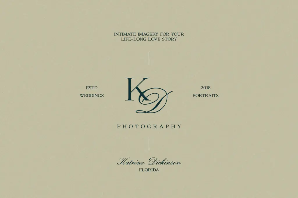
This is a duo built for the front of a design, not the inside. Wedding invitations are the obvious fit — the script’s large capitals are made for a name or a date, with the serif handling venue details and fine print underneath. It also has a natural home in packaging headers, boutique branding, and title treatments on editorial or web pages where you want one elegant word to carry the layout.
Where it will strain is anywhere that needs sustained reading: paragraphs, long captions, or dense product copy. Keep the script to short phrases, let the serif do the supporting text, and use the hybrid sparingly as an accent rather than a workhorse, and the pairing does what it’s designed to do.
What we liked, and what we didn’t
Strengths
- Oversized script capitals give short words a distinctive, confident entrance
- Serif companion is calm enough to support the script without competing with it
- Three-file structure (serif, script, hybrid) covers title, support text and accent needs
Trade-offs
- Not suited to long-form body copy or dense paragraphs
- Hybrid style risks looking gimmicky if used beyond single accent words
Loren Blake is a competent, well-matched serif and script pairing with one genuine idea — oversized script capitals — that gives it some visual character. It's not a system for long-form typesetting, but for invitations, packaging headers and branding titles it does a clear, specific job.
Verdict

Tantype reviews typefaces in depth — every font is tested in real branding, editorial and screen layouts before a word gets written. 555+ fonts reviewed and counting.