
Cringe Serif: a distressed serif family for gritty, textured branding work
Design style
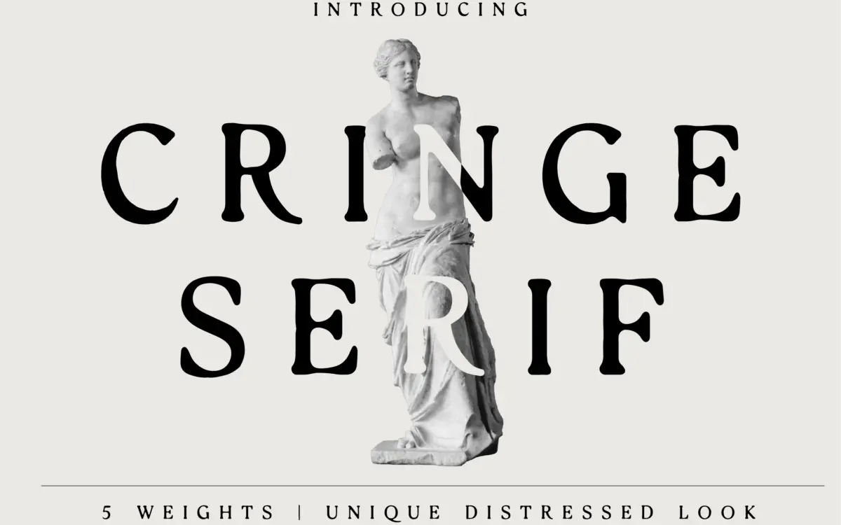
Cringe Serif is built on a fairly conventional serif skeleton, then roughed up with distressing: broken strokes, ink traps that look accidental rather than drawn, and edges that fray instead of terminate cleanly. The seller calls each glyph individually crafted, and there is variation glyph to glyph, but it reads more as controlled noise applied across a system than as bespoke lettering. That is not a knock so much as a description of what distressed type generally is.
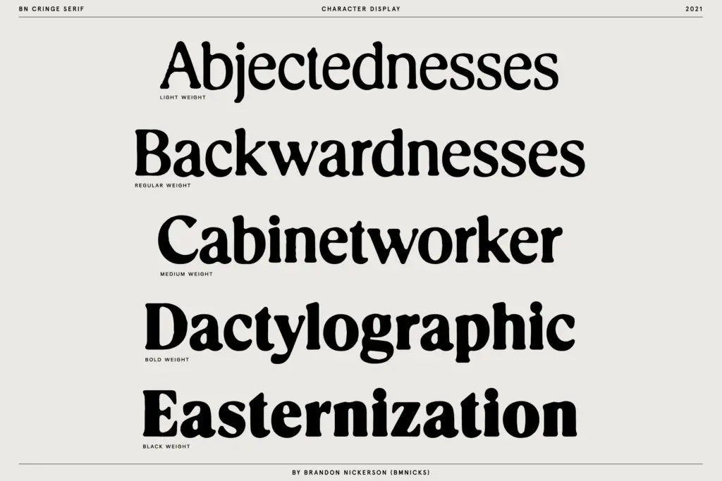
The five weights move from a light cut that keeps the texture subtle to heavier weights where the distressing becomes the dominant visual event rather than a decoration on top of the letterforms. At the lighter end the serif structure is still legible as a serif; by the heavier end you are mostly reading a texture with serif-shaped edges. That range is useful if you know which weight you actually need, but it also means the five weights don’t behave like a single typeface at different densities — they behave like different degrees of damage applied to the same base.
Character set and features
The letterforms carry uneven stroke weight and cracked serifs consistently enough that body text holds together as a family trait rather than random noise, which is the main technical achievement here. Where it gets harder to judge is anything the seller doesn’t specify — there’s no detail on alternates, ligatures, or language coverage beyond the base Latin set, so treat the five weights as the core offering and nothing more until you’ve opened the file yourself.
Distressed serifs live or die on whether the wear reads at the size you’re using it. At small sizes, the broken strokes tend to fight against the eye’s ability to resolve the letter — this is common to the genre, not a specific fault of this release, but it means the lighter weights are the ones doing the actual reading work, while the heavier weights are closer to display texture than to text.
Use cases
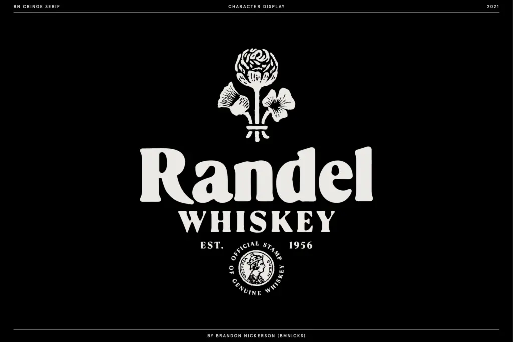
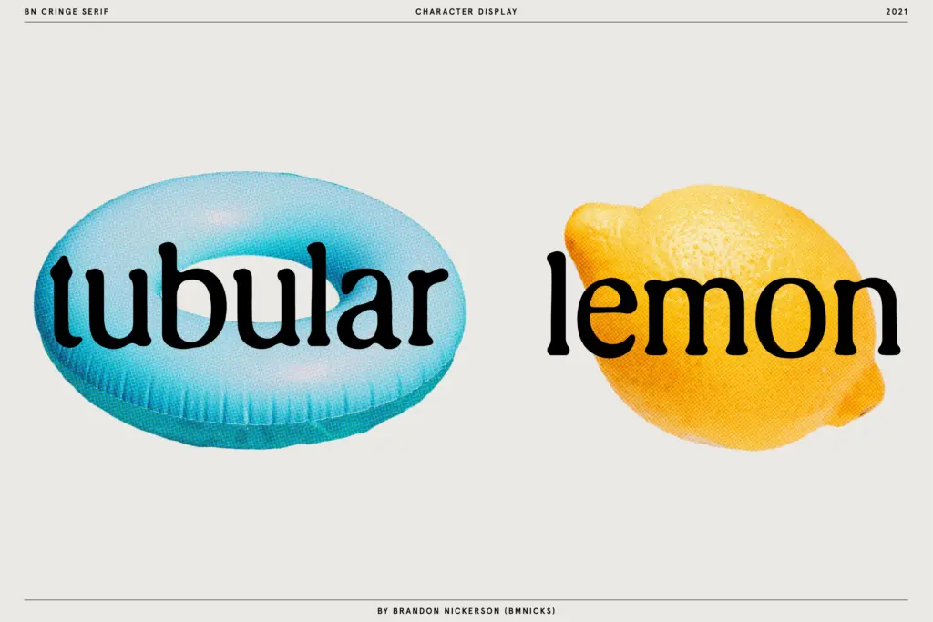
This sits comfortably in packaging design and branding work that wants a worn, printed-decades-ago feel — labels, badges, stamps, anything trying to look like it’s been through a warehouse rather than a design studio. It also suits editorial or poster headlines where a single distressed word can carry a page without needing to be read letter by letter.
It is a poor choice for anything that needs to stay crisp under compression: small print, UI text, or dense paragraphs will all struggle against the texture. Wedding stationery and luxury branding briefs that want a clean, elegant serif should look elsewhere — this family is doing the opposite job, leaning into wear rather than polish. Used at the right size, on the right weight, for the right kind of grit, it does what a distressed serif is supposed to do.
What we liked, and what we didn’t
Strengths
- Five weights give real range from subtle wear to heavy texture
- Distressing feels consistent across the family rather than randomly applied
- Well suited to packaging and stamp-style branding work
Trade-offs
- Legibility drops sharply in the heavier weights, limiting them to short display use
- No documented alternates, ligatures, or extended language support
Cringe Serif does one job — a worn, damaged serif look — reasonably well, especially in its lighter weights where the letterforms still read clearly. Heavier weights lean so far into texture that legibility drops off fast, and there's no documented feature set beyond the five weights themselves. Good for packaging and badge-style branding, not for anything that needs to stay readable at small sizes.
Verdict

Tantype reviews typefaces in depth — every font is tested in real branding, editorial and screen layouts before a word gets written. 555+ fonts reviewed and counting.