Serif
3.9
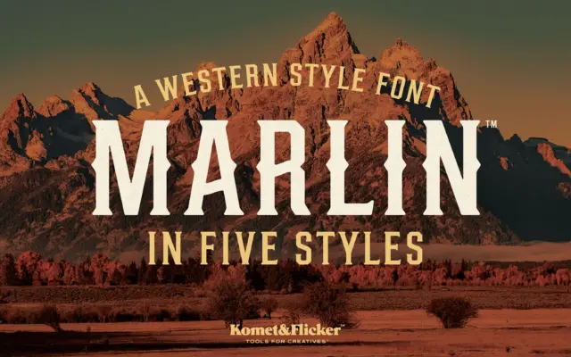
Marlin: a condensed Western slab for saloon signs and label work
Design style Marlin sits squarely in the old-west signage tradition: condensed slab serifs, heavy vertical stress, and slightly worn edges…
 Tantype

Serif fonts carry the authority of print — bracketed feet, refined contrast and a bookish confidence that suits editorial design, branding and packaging. Every serif typeface here is reviewed in depth: design style, character set, best use cases and where to download it.
Design style Marlin sits squarely in the old-west signage tradition: condensed slab serifs, heavy vertical stress, and slightly worn edges…
Tantype
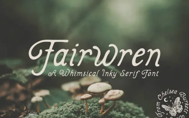
Design style Fairwren is a bold serif built on solid, slightly irregular strokes with inky edges that suggest a nib…
Tantype
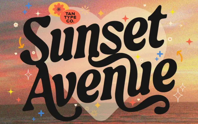
Design style TAN-SUNSET sits in serif territory but leans hard into personality rather than restraint. The strokes carry noticeable contrast,…
Tantype
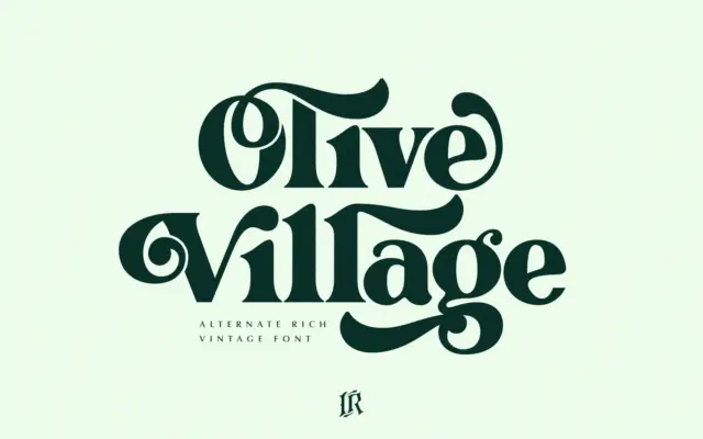
Design style Olive Village leans into a very specific decade. The curves are rounded and slightly bulbous, the contrast is…
Tantype
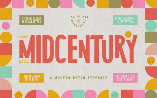
Design style MidCentury Typeface is an uppercase-only display face pitched squarely at the poster-and-book-jacket look of the 1950s. The letters…
Tantype
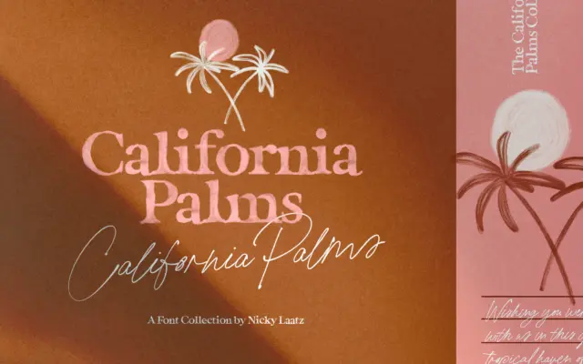
Design style California Palms is less a single typeface than a small collection built around one seasonal mood. There are…
Tantype
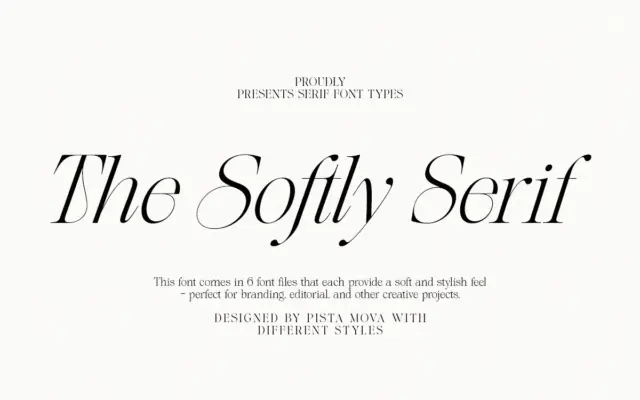
Design style The Softly Serif is an italic-only serif built around the kind of high-contrast strokes that read as fashion-editorial…
Tantype
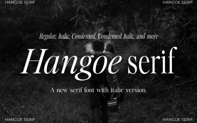
Design style Hangoe sits in the old-style serif tradition, with the kind of restraint that reads as confident rather than…
Tantype
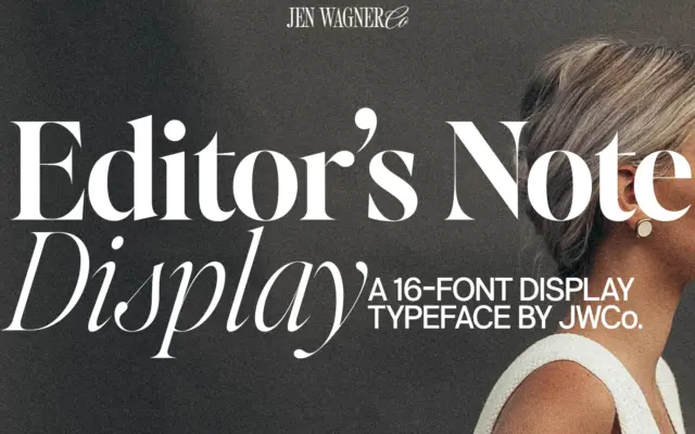
Design style Editor’s Note Display is a companion to a text-oriented family, and it reads that way: the letter skeletons…
Tantype