
Quine: a high-contrast modern serif for editorial and luxury branding
Design style
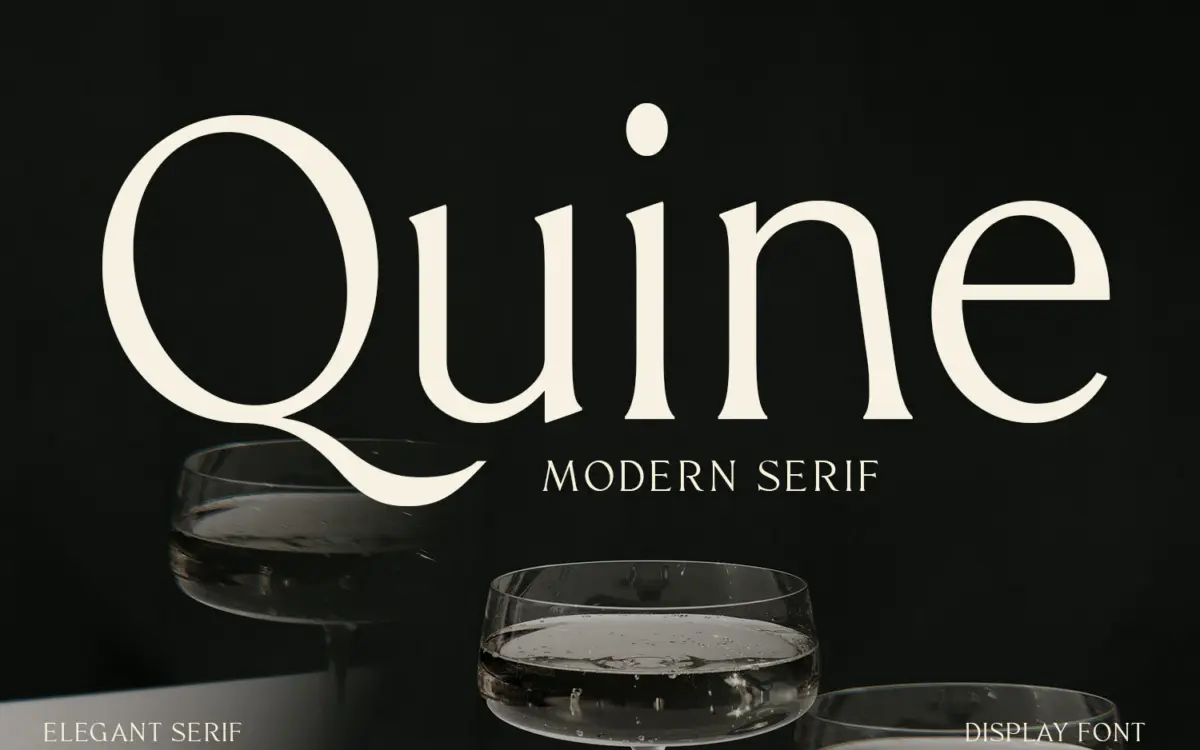
Quine sits in the modern serif tradition that runs through fashion mastheads and premium packaging: high stroke contrast, sharp transitions from thick to thin, and terminals that come to a deliberate point rather than a soft curve. The proportions lean classical, but the drawing has a tightness to it — narrower apertures, closer spacing defaults — that pushes it toward the contemporary end of that lineage rather than the historical one. It reads as confident without being showy, which is a harder balance than it sounds.
The contrast is the defining feature and also the thing to watch. At larger sizes it gives the letters real presence, especially in capitals, where the hairline strokes and thicker stems create a rhythm that photographs well and holds up in a logotype. That same contrast is what limits the typeface elsewhere, and worth understanding before you commit to it for a whole layout.
Character set and features
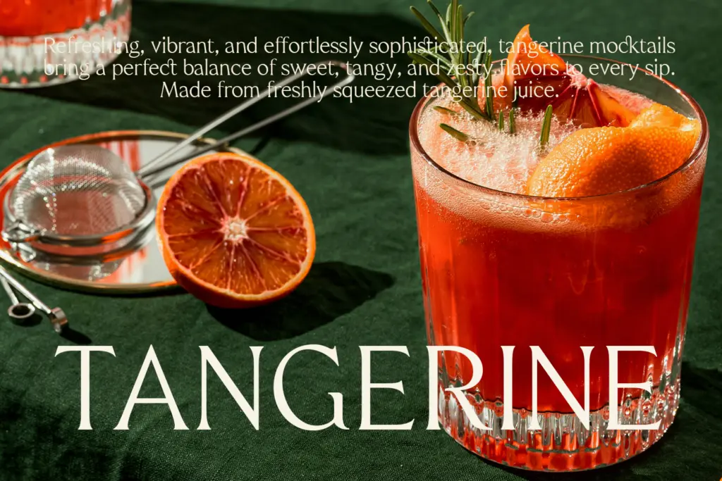
The seller doesn’t specify exact glyph counts, OpenType features, or language coverage, so treat those as unknowns rather than assumptions — check the specimen sheet before you build multilingual or heavily accented copy around it. What’s evident from the drawing itself is a fairly conventional character set built for headline and short-copy work rather than for typesetting long passages: the italic, where present, carries more of the personal, calligraphic touch than the roman does, and the numerals and punctuation follow the same high-contrast logic as the letters rather than being simplified for small sizes.
This is a typeface designed to be looked at, not skimmed. The finer hairlines are the part most likely to disappear or vibrate at small sizes or on low-resolution screens, so anyone testing it should do so at the actual size the final piece will run — not just at the display size in the marketing image.
Use cases
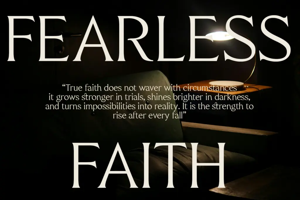
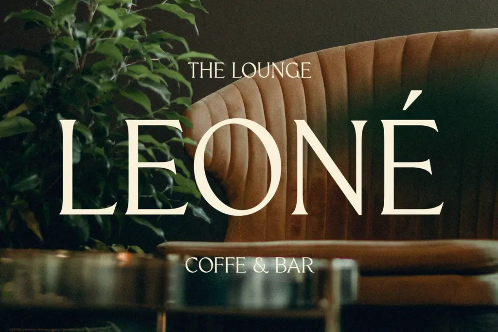
Quine’s natural home is short-form and high-visibility: a wordmark, a magazine cover line, a product label, an invitation. In these contexts the contrast and the distinctive terminals do real work, giving a brand or a headline a sense of finish that a plainer serif wouldn’t. Wedding stationery and premium packaging are reasonable uses on the strength of the drawing alone — the letters have enough presence to carry a card or a label without extra ornament.
Where it will strain is body copy and dense editorial text. The same hairlines that look sharp in a headline get fragile in a paragraph, and at typical reading sizes the contrast can start to flicker rather than read smoothly. Pair it with a plain, sturdy text face for anything longer than a pull quote or a caption, and reserve Quine itself for the moments where a reader is meant to stop and look rather than read straight through.
What we liked, and what we didn’t
Strengths
- Sharp stroke contrast gives headlines and logotypes genuine presence
- Terminals and letter details are distinctive enough to work as a standalone brand mark
- Well suited to packaging, invitations and editorial cover lines
Trade-offs
- Hairline strokes can thin out or vibrate at small text sizes
- Glyph coverage and language support aren't specified, so multilingual projects need testing first
Quine is a confident, high-contrast modern serif that earns its keep in headlines, wordmarks and short display copy. It's not built for body text, and the finer strokes need care at small sizes, but as a display and branding face it has real personality.
Verdict

Tantype reviews typefaces in depth — every font is tested in real branding, editorial and screen layouts before a word gets written. 555+ fonts reviewed and counting.