
Amberfall: a worn-in vintage serif for cozy, storytelling brands
Design style
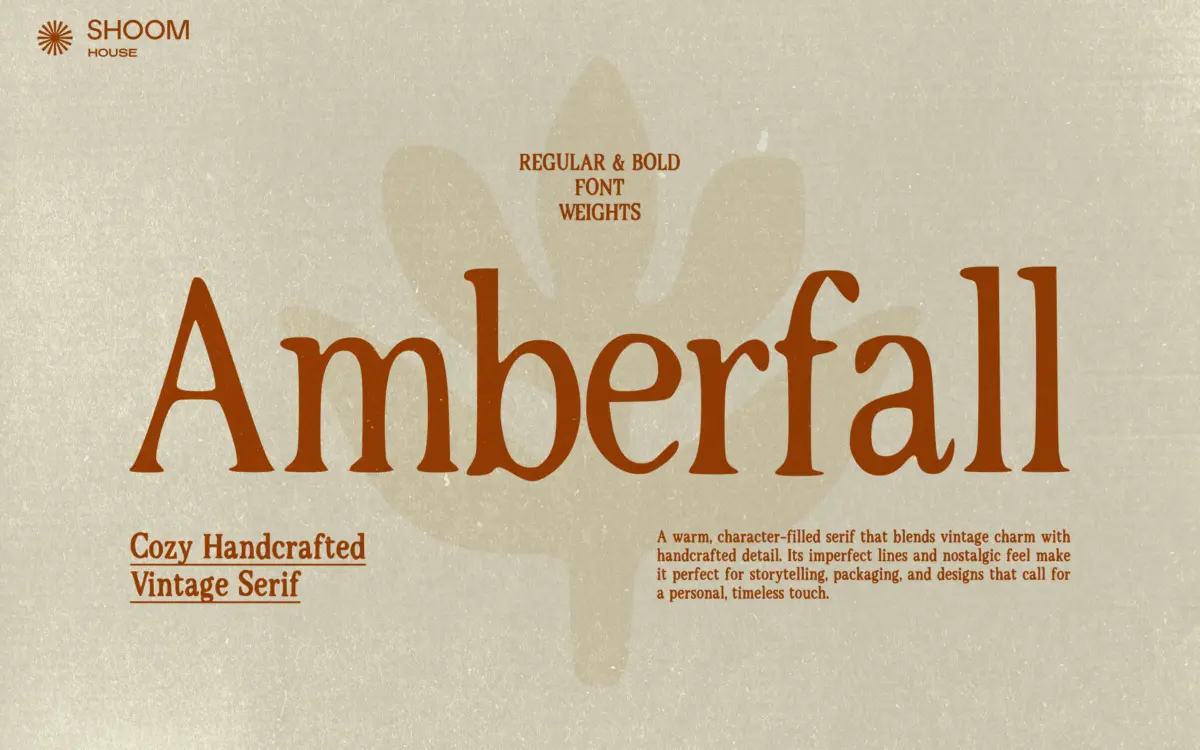
Amberfall belongs to the growing family of serifs that trade crispness for texture. Its strokes carry slightly irregular edges, its curves wobble just enough to suggest a stamp or an old letterpress run, and its terminals blunt off rather than snapping to a clean point. The overall effect is warm and handmade rather than mechanical — closer to a page from a well-loved cookbook than a corporate report.
The proportions lean traditional: moderate contrast between thick and thin strokes, serifs that are bracketed and unbothered by geometric precision, and a x-height that sits comfortably mid-range. It doesn’t try to be a display showstopper on its own; the personality comes from the roughened edges and the slightly uneven baseline feel rather than from exaggerated flourishes. That restraint is a good instinct — a font this textured could easily tip into novelty, and Amberfall mostly avoids that by keeping its skeleton conventional underneath the surface treatment.
Character set and features
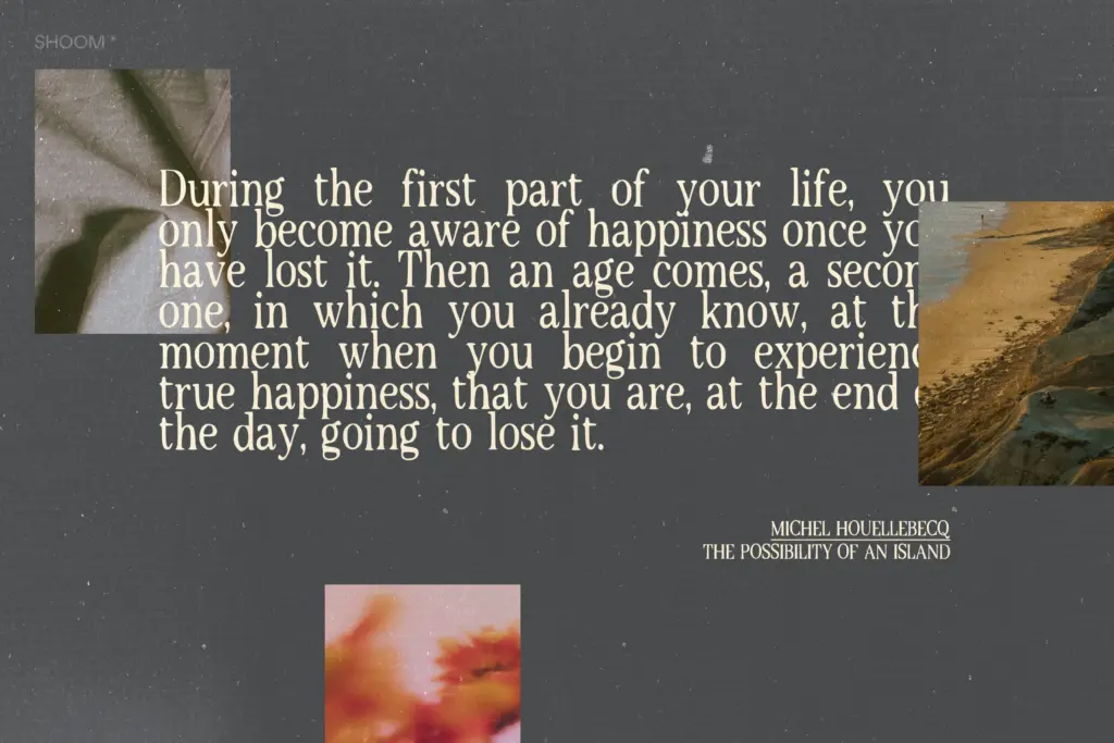
The family ships as Regular and Bold, covering uppercase and lowercase English letters, numerals, and standard punctuation, in TTF, OTF, and WOFF formats. That’s a workable but not expansive toolkit — there’s no light or black weight to stretch the family across a full hierarchy, and no mention of alternates, ligatures, or extended language support, so anyone needing accented characters or a wider glyph set should check before committing.
The two weights do their jobs distinctly: Regular reads soft and approachable at body-copy sizes, while Bold pushes the roughened texture harder, making it more suitable for short headlines or emphasis than for setting paragraphs. Because the texture is baked into the letterforms rather than applied as a separate layer, it holds up reasonably well when scaled, though very small sizes will blur the intentional imperfections into something that just reads as low-resolution rather than handcrafted — worth testing before finalising a packaging label at tiny print sizes.
Use cases
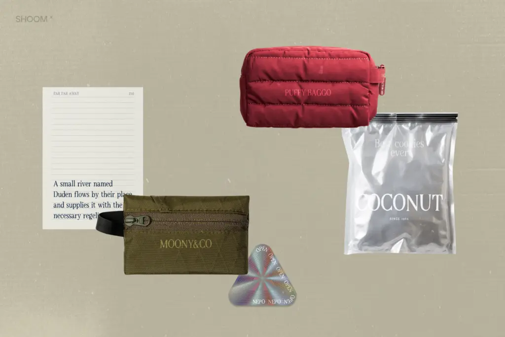
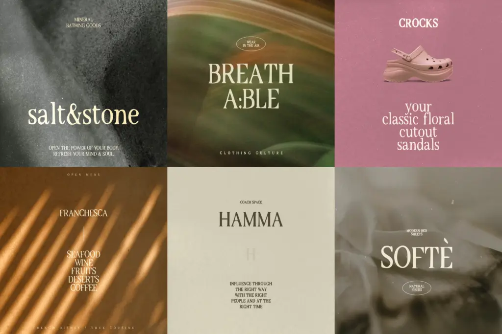
Amberfall is built for warmth over neutrality, and it earns that brief. It suits packaging for food, drink, and craft goods where a nostalgic, small-batch feel matters — think jam labels, bakery signage, coffee bags. It also works for editorial and storytelling contexts: book covers, zines, personal essays, anything that wants to feel like it was set by hand rather than pulled from a template.
Branding work for seasonal, autumnal, or heritage-leaning identities will find it a natural fit, and it can carry short wedding stationery pieces — save-the-dates, menu cards — where a lived-in classic tone is wanted over polished elegance. It is less suited to long-form digital reading, dense UI, or any brand aiming for sleekness and precision; the texture that gives it character will fight against that goal. Pair it with a plain sans for supporting text and reserve Amberfall for headlines, labels, and moments where its handmade quality can actually be seen.
What we liked, and what we didn’t
Strengths
- Roughened, letterpress-like texture feels handcrafted without becoming a gimmick
- Traditional serif skeleton keeps it legible under the surface treatment
- Well suited to packaging and heritage-style branding where warmth matters more than polish
Trade-offs
- Only two weights limits how far the family can stretch across a hierarchy
- No mention of alternates or extended language support, so multilingual or detailed projects need checking first
Amberfall does one thing well: a warm, textured vintage serif that suits packaging and storytelling work without tipping into novelty. It's held back by a limited two-weight family and glyph set, and its texture works against it at small sizes or in long-form text.
Verdict

Tantype reviews typefaces in depth — every font is tested in real branding, editorial and screen layouts before a word gets written. 555+ fonts reviewed and counting.