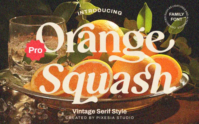
Orange Squash Pro: a bold vintage serif built for headlines, not paragraphs
Design style Orange Squash Pro leans into the chunky, slightly retro serif look that’s become shorthand for 70s-inflected branding —…
Serif fonts carry the authority of print — bracketed feet, refined contrast and a bookish confidence that suits editorial design, branding and packaging. Every serif typeface here is reviewed in depth: design style, character set, best use cases and where to download it.
Design style Orange Squash Pro leans into the chunky, slightly retro serif look that’s become shorthand for 70s-inflected branding —…
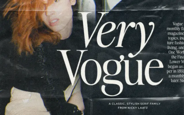
Design style The Very Vogue Serif Family draws from the high-contrast serifs that ran across fashion magazine covers from the…
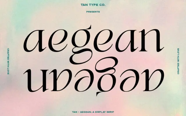
Design style TAN Aegean sits in that familiar territory of high-contrast display serifs built on classical proportions, but it doesn’t…
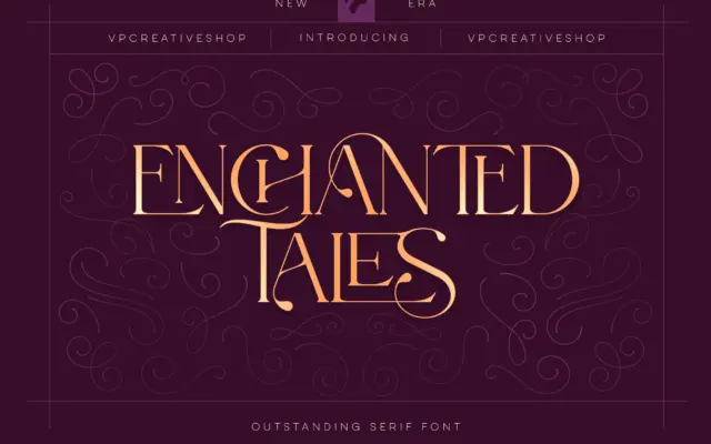
Design style Enchanted Tales sits in the decorative end of the serif family — closer to vintage lettering and storybook…
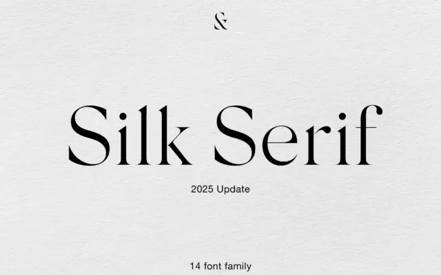
Design style Silk Serif belongs to the family of high-contrast serifs that have become shorthand for fashion and luxury branding…
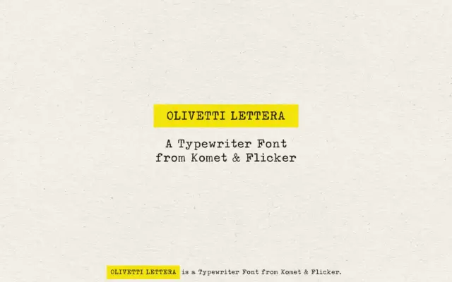
Design style Olivetti Lettera takes its cue from the mechanical typeface of a mid-century portable typewriter, and it commits to…
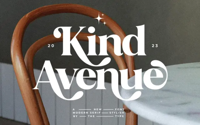
Design style Kind Avenue sits in that familiar territory of retro serifs pulling from mid-century signage and print — the…
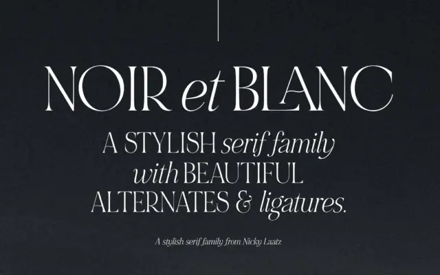
Design style NOIR et BLANC is built around a deliberate mismatch: bold, high-contrast uppercase serifs paired with a slanted, lower-contrast…
Design style Vintage is a serif built around the idea of layering rather than a single confident letterform. The base…