
Cravelo: a condensed vintage serif with rounded charm for headlines
Design style
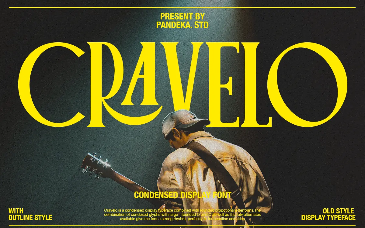
Cravelo sits in that familiar but useful territory of vintage condensed display serifs, except it softens the usual severity with rounded terminals and notably large, circular bowls on the O and C. That single decision changes the whole temperament of the face. Condensed serifs can read as stern or industrial, borrowed from old badge lettering and cramped newspaper mastheads. Cravelo instead feels approachable, almost friendly, because the round counters push back against the tight lateral compression everywhere else.
The rhythm across a word is the strongest thing about it. Narrow stems, tight side bearings, and then those wide round letters punctuating the line — it creates a syncopation that’s genuinely engaging to look at, closer to hand-lettered signage than to a typeset serif family. A handful of alternate letterforms are included, and they lean further into that lettered, non-mechanical feel rather than offering neutral swaps. The drawing is confident and consistent; there’s no sense of a typeface still finding its rules.
Character set and features
The set runs past 300 glyphs, covering standard Latin punctuation and numerals alongside multilingual characters for a wide spread of European languages, including several less commonly supported ones like Friulian, Romansh, and Gusii. That breadth matters if a project touches European markets beyond the usual English/French/German trio.
Two styles are provided, a solid Regular and an Outline companion, which is a sensible pairing for a display face like this — the outline version gives you a lighter, layerable option for stacking type or adding a second colour pass without needing a whole separate weight. There’s no true text weight and no italic, which is expected at this end of the market but worth flagging: this is a one-register typeface built to do one job well rather than to flex across a hierarchy.
Files come in TTF, OTF, and WOFF, and the foundry notes it works in Canva as well as standard design software, which lowers the bar for anyone not working in Illustrator or InDesign day to day.

Use cases
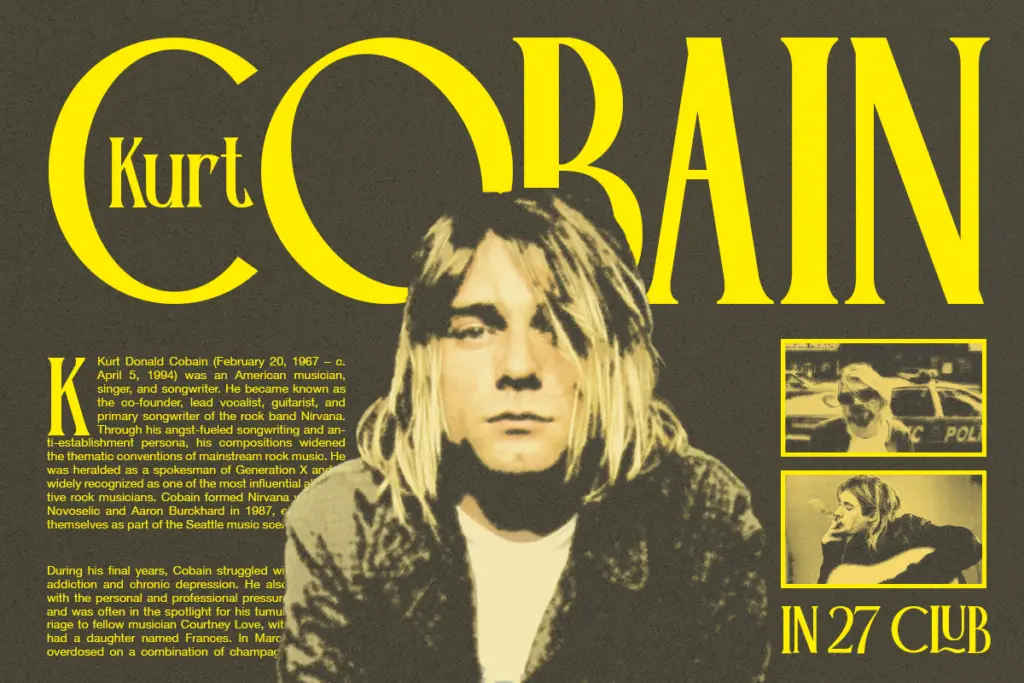
Cravelo’s natural home is short-form display work: logotypes, badge and stamp-style marks, packaging headers, market or café signage, and editorial headlines where a vintage mood is wanted without tipping into the heavier, more masculine register that a lot of condensed serifs default to. The rounded geometry gives it a slightly softer, more feminine-adjacent feel that suits wedding stationery, boutique branding, and fashion-adjacent identity work as well as it suits retro Americana.
It’s not built for body copy or anything set smaller than a headline — the condensed proportions and tight spacing that make it lively at large sizes will simply collapse into a grey smudge at paragraph sizes. Pair it with a plain, open sans or a workhorse text serif for supporting copy, and let Cravelo do the shouting at the top of the page. Used sparingly, at a size where its rounded letters can breathe, it earns its keep.

What we liked, and what we didn’t
Strengths
- Rounded O and C shapes give the condensed letterforms a distinct, hand-lettered rhythm
- Outline companion style makes it easy to layer or add a second colour pass without extra weights
- Broad multilingual character support covers several less common European languages
Trade-offs
- No text weight or italic, so it can't carry anything beyond short headline-length copy
- Tight condensed spacing means it loses clarity fast below display sizes
Cravelo is a well-drawn condensed vintage serif whose rounded bowls give it a friendlier, more distinctive rhythm than most badge-lettering fonts. It's a display specialist through and through, strong at headline sizes and useless below them, so plan on pairing it with a plain workhorse for body text.
Verdict

Tantype reviews typefaces in depth — every font is tested in real branding, editorial and screen layouts before a word gets written. 555+ fonts reviewed and counting.