Serif
3.6
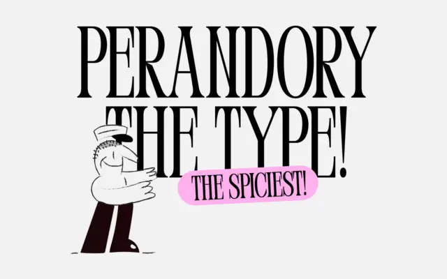
Perandory: a sharp-edged vintage-inspired serif for display work
Design style Perandory is a display serif built around tension rather than comfort. The brief describes it as inspired by…
 Tantype

Serif fonts carry the authority of print — bracketed feet, refined contrast and a bookish confidence that suits editorial design, branding and packaging. Every serif typeface here is reviewed in depth: design style, character set, best use cases and where to download it.
Design style Perandory is a display serif built around tension rather than comfort. The brief describes it as inspired by…
Tantype
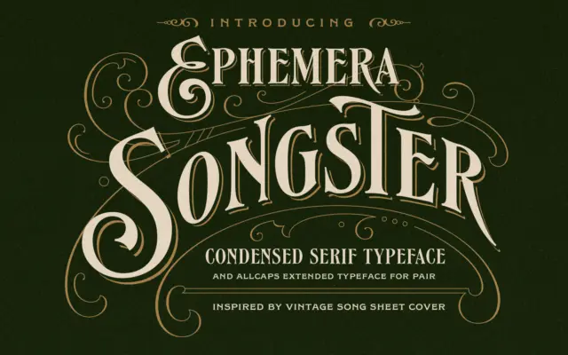
Design style Songster pulls from the lettering found on 19th-century song sheet covers, and it shows in the details rather…
Tantype
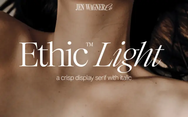
Design style Ethic Light sits in the lineage of high-contrast display serifs, the kind that look like they were cut…
Tantype
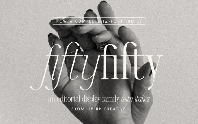
Design style Fifty Fifty sits in the editorial serif category, which usually means one of two things: a workhorse text…
Tantype
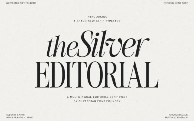
Design style The Silver Editorial is a high-contrast serif built for attention rather than for reading paragraphs. Its debt to…
Tantype
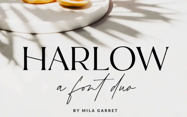
Design style Harlow is a two-part release: a pared-back serif and a casual handwritten script meant to sit alongside it.…
Tantype
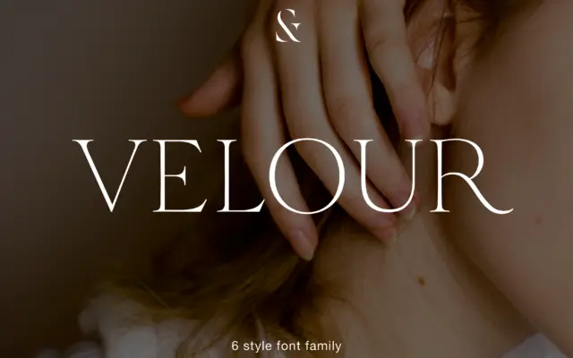
Design style Velour sits in that familiar territory of thin, bracketed serif display faces built for headlines rather than paragraphs.…
Tantype
Design style Heartbreak Eighties Retro Serif sits at the thicker end of the slab-serif family, with the rounded, slightly inflated…
Tantype
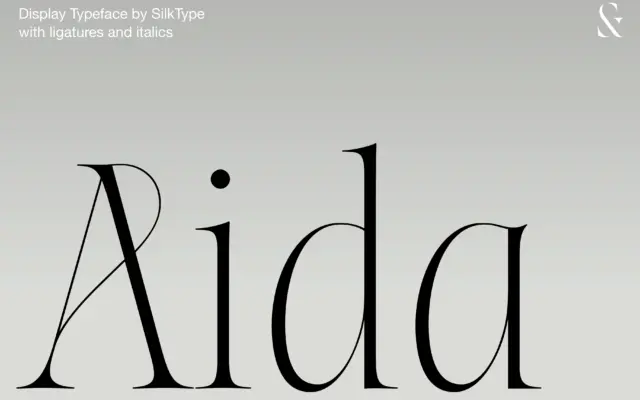
Design style Aida sits at the extreme end of the contrast scale: thick stems that thin out into hairline serifs…
Tantype