
Palace Serif: a flourish-heavy classical face for vintage-leaning branding
Design style
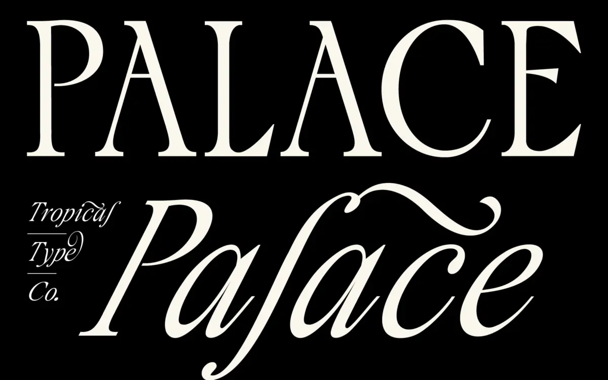
Palace sits in that familiar territory of classical serifs dressed up for display work rather than reading. The caps are tall and narrow, drawn with the kind of formality you’d expect from a face aiming at old-world elegance, and the flourishes attached to the italics push it firmly into ornamental rather than workhorse territory. The contrast between thick and thin strokes is pronounced enough to give the letters some drama at large sizes, but it also means the design leans on that drama rather than on any particular structural cleverness.
It reads as a mood board font before it reads as a text font. The vintage feel the designer is going for comes through mostly in the swashes and the catchwords rather than in the base letterforms, which are competent but not especially distinctive on their own. Strip away the flourishes and alternates and what’s left is a fairly standard classical serif skeleton. That’s not a criticism exactly — plenty of successful display serifs work this way — but it does mean the ornamentation is doing most of the personality work here.
Character set and features
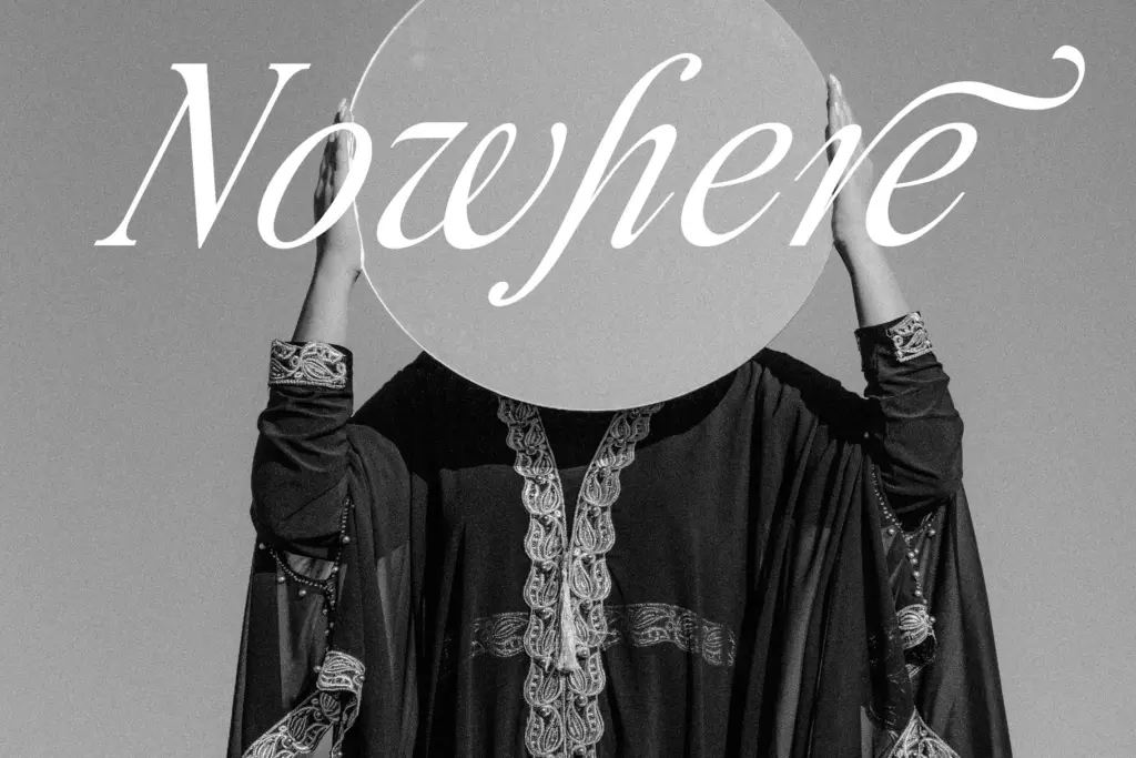
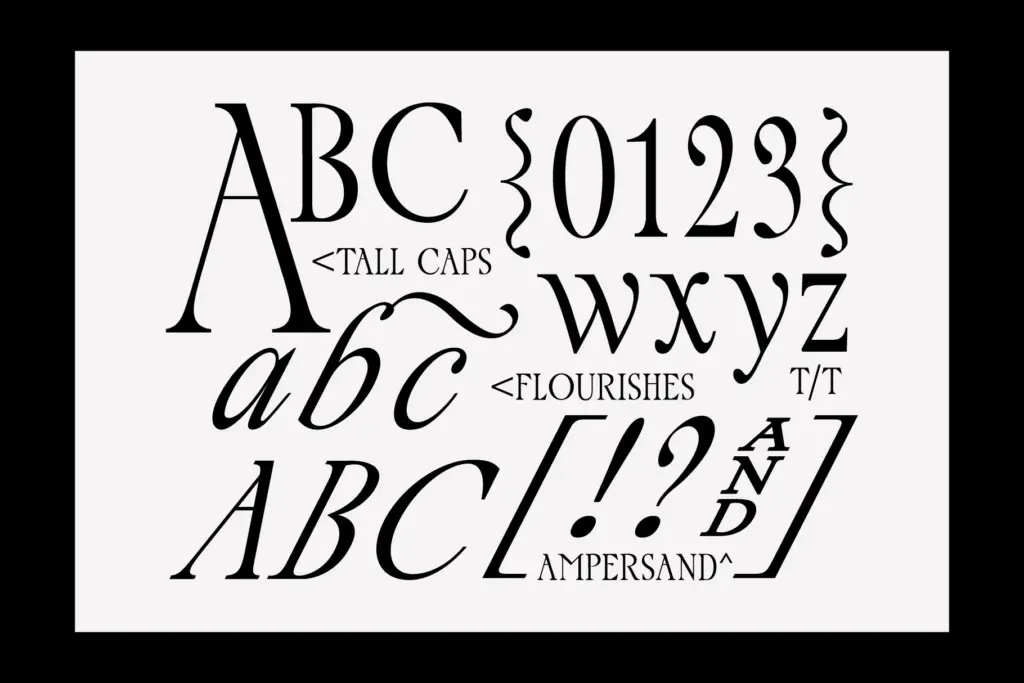
The glyph set is the real selling point. Multiple ampersands, catchwords, and a run of stylistic alternates give you room to vary a headline or a monogram without repeating the same letter twice in a row, which matters a lot for anyone building wedding suites or packaging where a single word gets used across several pieces. The italic set carries the flourishes, while the upright caps stay relatively restrained, so you can mix the two for contrast within one line of type.
Extended Latin support covers a decent range of accented characters — Polish, French, Scandinavian and a few others — which is useful if your client list isn’t strictly English-speaking, though it’s worth checking your specific language needs against the glyph list before committing to a layout that depends on it. There’s no indication of multiple weights here, so this is a one-weight, alternates-driven system rather than a full family with a range of options for body copy or hierarchy.
Use cases
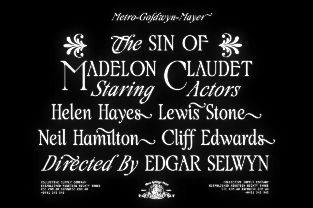
This is a font for short bursts of text: logotypes, monograms, wedding invitation headers, packaging labels, the occasional editorial drop cap or pull quote. The flourishes and catchwords make it well suited to anything that wants a vintage or old-world signal — think perfume labels, boutique hotel signage, or wine and spirits branding — where a few ornamented words carry the whole visual argument.
It’s not built for paragraphs. The stroke contrast and swash-heavy italic will fight you at small sizes and in dense settings, so pair it with a plainer sans or serif for body text rather than asking Palace to do both jobs. Anyone doing a lot of multilingual or long-form work should also budget time to test the accented glyphs at the sizes they’ll actually use, since ornamental serifs like this can get fussy once diacritics enter the picture.
What we liked, and what we didn’t
Strengths
- Generous alternates and catchwords let you vary repeated words without redundancy
- Extended Latin glyph support handles several European languages out of the box
- Flourish-heavy italics give strong vintage signal for branding and packaging work
Trade-offs
- High stroke contrast and swashes make it unreliable at small or dense settings
- Base letterforms are fairly conventional once the ornamentation is stripped away
Palace Serif is a solid choice when you need a handful of ornamented words to carry a vintage or classical mood — logos, monograms, wedding headers. It's not a text face and shouldn't be asked to be one, but within its lane the alternates and catchwords give real flexibility.
Verdict

Tantype reviews typefaces in depth — every font is tested in real branding, editorial and screen layouts before a word gets written. 555+ fonts reviewed and counting.