Script
3.6
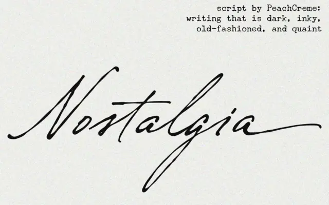
Nostalgia: an inky connecting script for wedding and vintage-styled work
Design style Nostalgia belongs to the crowded family of connecting scripts built to imitate a fountain pen or dip nib…
 Tantype

Design style Nostalgia belongs to the crowded family of connecting scripts built to imitate a fountain pen or dip nib…
Tantype
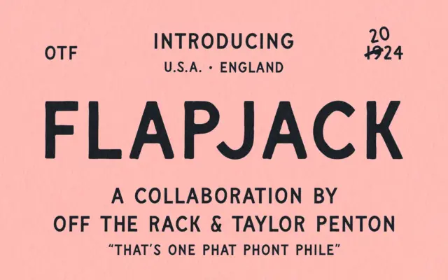
Design style Flapjack sits closer to signwriting than it does to conventional sans serif design, though that’s the category it…
Tantype
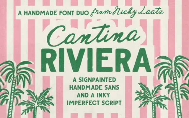
Design style Cantina Riviera is built around a simple pairing logic: a sturdy, roughed-up sans for structure, and a fluid…
Tantype
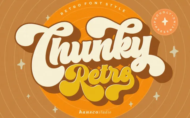
Design style Chunky Retro Font sits squarely in the bold, rounded display tradition that pulls from mid-century signage and packaging…
Tantype
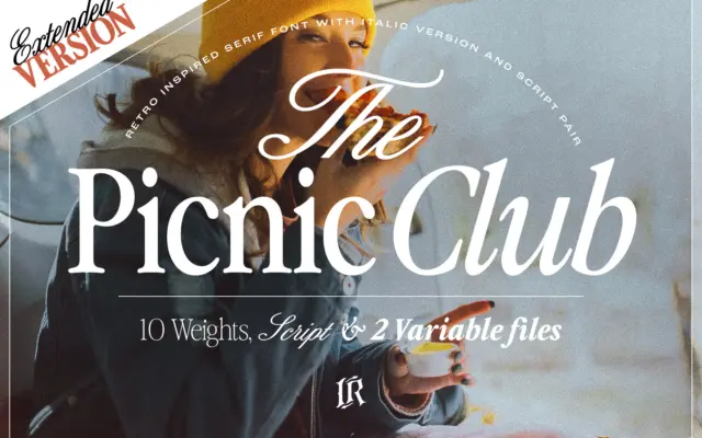
Design style The Picnic Club reads as a display serif with its roots firmly in late-1970s and 1980s lettering: slightly…
Tantype
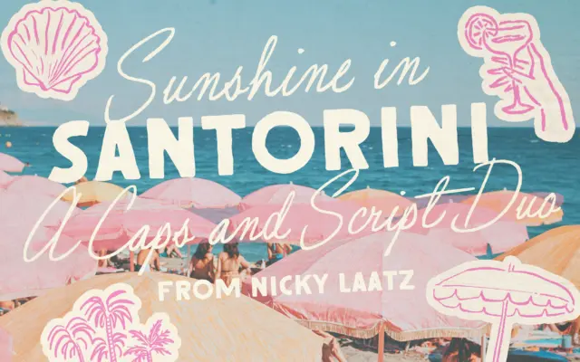
Design style Santorini Sunshine is a two-part family: a loose, imperfect script paired with a rough-edged all-caps sans built to…
Tantype
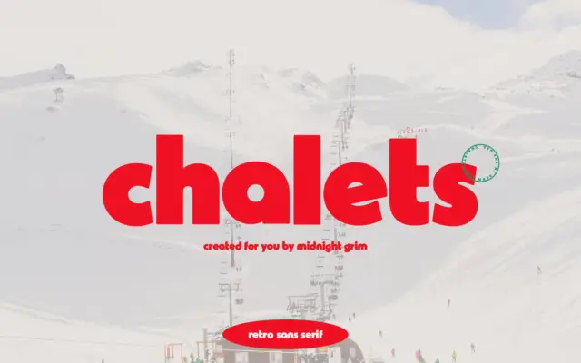
Design style Chalets pulls from mid-century ski resort signage — the kind of lettering you’d find painted on a lodge…
Tantype
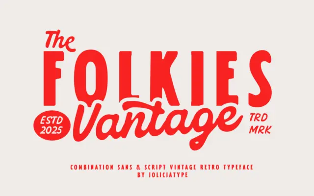
Design style Folkies Vantage pairs two faces built around one idea: age. The sans half carries the weight of the…
Tantype
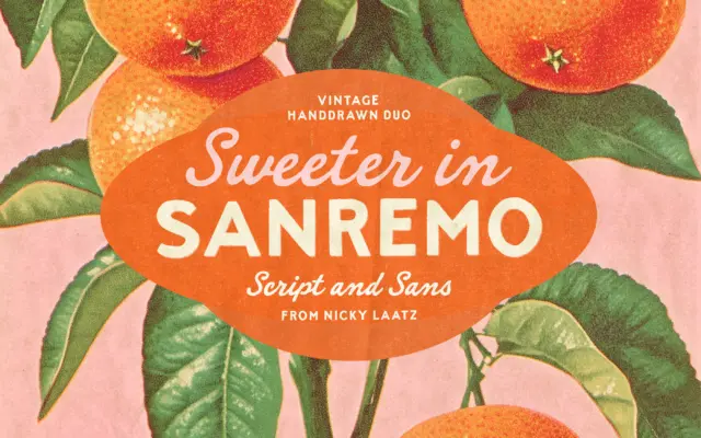
Design style Sanremo takes its cues from hand-painted signage and old matchbook printing — the kind of lettering you’d find…
Tantype