
Santorini Sunshine: a retro script and sign-paint sans duo for summer branding
Design style
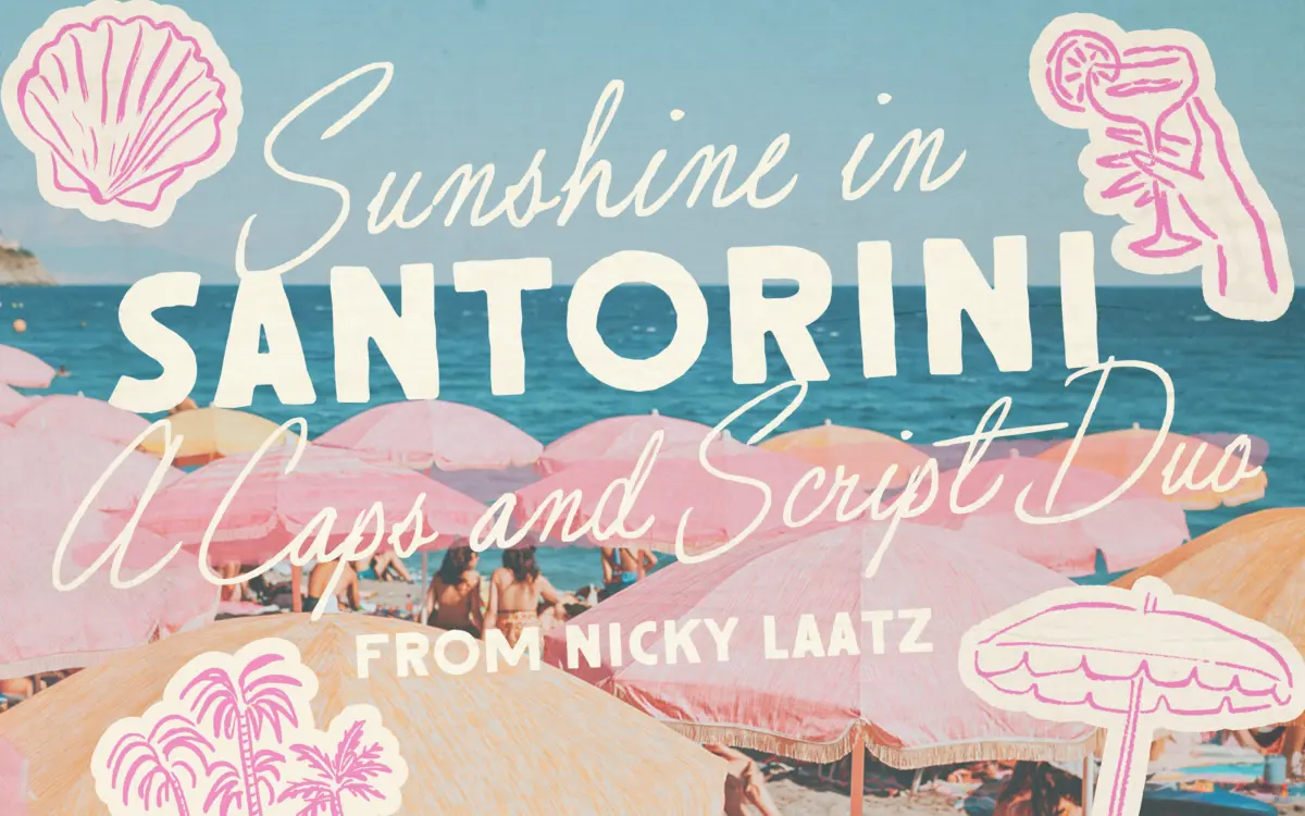
Santorini Sunshine is a two-part family: a loose, imperfect script paired with a rough-edged all-caps sans built to look sign-painted. The script leans on mid-century glamour rather than casual brush lettering — it has a swing to it, joins that don’t quite line up mechanically, and a slant that varies by variant rather than staying fixed. The sans is the workhorse counterpart: blocky caps with inked, slightly chewed edges that read as hand-painted signage rather than a vector shape run through a distress filter, though the effect is clearly a designed one rather than a scan of an actual sign.
The two don’t try to match stroke weight or formality, and that’s the point. The script carries the warmth, the sans carries the structure. It’s a duo built around contrast, not harmony, which is a legitimate way to build a pairing but means neither face works quite as well fully on its own.
Character set and features
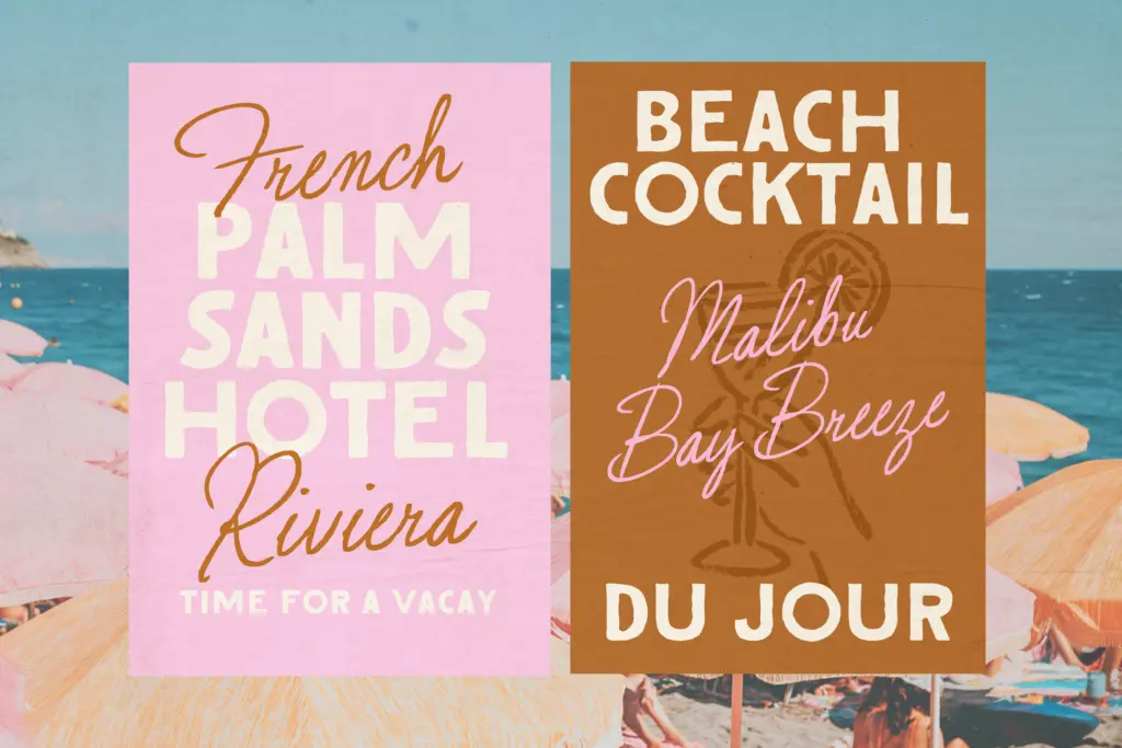
The script comes in Regular and Wider widths, each with two slant options, which gives you four script variants to move between depending on how much space you’re filling and how upright you want the tone to feel. The sans ships in a lighter weight alongside the main one, plus outlined versions of both. That’s a reasonable spread of options for a display duo, though it’s worth noting none of this is a true weight axis — you’re choosing between named cuts rather than dialling anything in.
Language support covers a solid list of Western European languages including French, German, Italian, Spanish, Portuguese and the Nordic languages, so accented setting in those languages should hold up. There’s no mention of extended Central or Eastern European coverage, so check specific diacritics before committing to a project that needs them.
Being a hand-drawn, sign-painted style, both faces are built for short bursts of text — a word, a line, a headline — rather than paragraphs. The imperfections that make the sans look inked also mean tight tracking at small sizes will start to clot the letterforms together.
Use cases
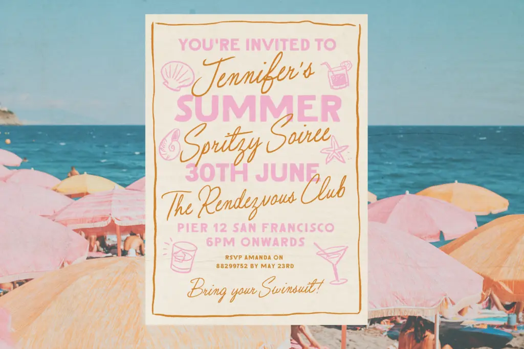
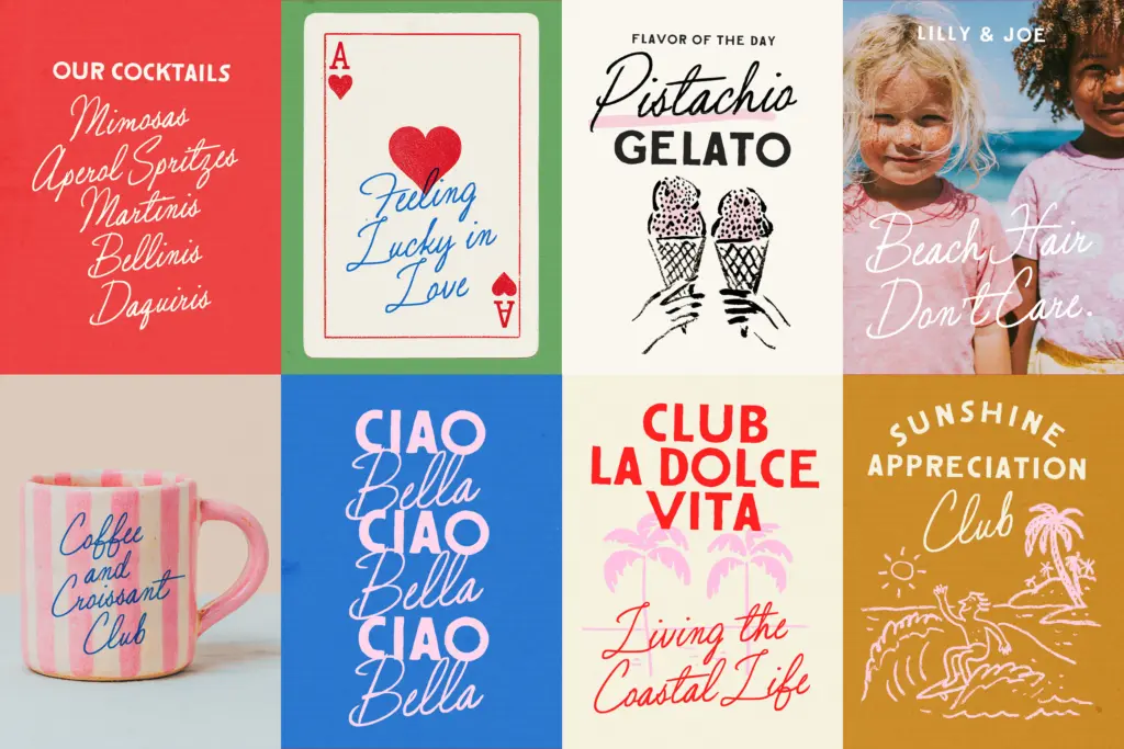
This is a font for the surface of a brand, not its body copy: labels, packaging fronts, social graphics, event stationery, merch, signage mockups. The 50s-glamour-meets-coastal-retro mood is specific — it suits boutique food and drink labels, summer event invites, travel-themed graphics, and anything trying to evoke an Italian or Spanish seaside without literally saying so. It’s less suited to corporate or minimal branding, where the roughness and slant variation would read as noise rather than character.
Use the script for a hero word or signature line, the outlined sans for a supporting tagline or all-caps header, and keep both large. Push either into small print or dense paragraphs and the handmade texture that makes them appealing starts working against readability instead of for it.
What we liked, and what we didn’t
Strengths
- Four script variants (two widths, two slants) give real flexibility for headline shaping
- The sign-painted sans has convincing inked, chewed edges rather than a generic distress filter look
- Outlined versions of the sans add a layering option without needing extra software
Trade-offs
- No true weight axis — just fixed named cuts rather than adjustable weights
- Legibility drops fast at small sizes or tight tracking, limiting it to short display text
Santorini Sunshine is a well-drawn mood piece rather than a flexible workhorse — the script and sign-paint sans lean hard into a specific 50s-coastal-retro feeling and do it convincingly. It's best kept to short, large-scale display use; push it into body text or tight tracking and the imperfections start to fight legibility.
Verdict

Tantype reviews typefaces in depth — every font is tested in real branding, editorial and screen layouts before a word gets written. 555+ fonts reviewed and counting.