
Cantina Riviera: a rough-edged sans and inky script duo for vintage signage looks
Design style
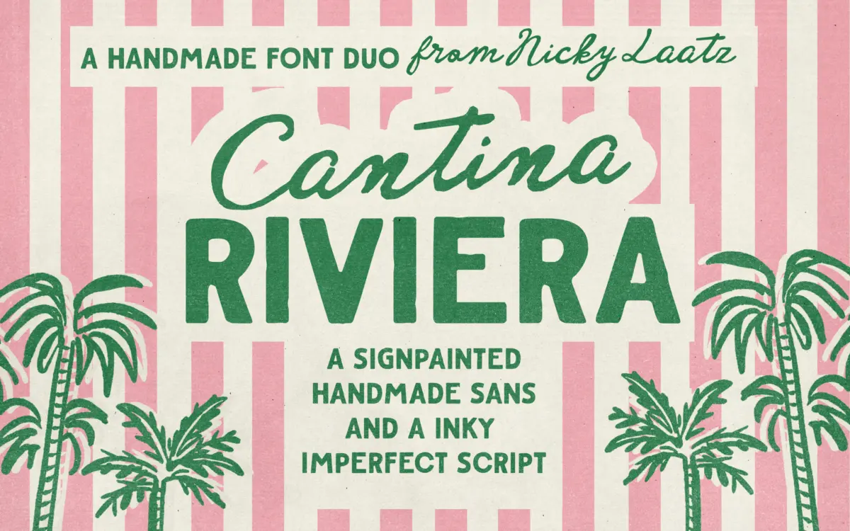
Cantina Riviera is built around a simple pairing logic: a sturdy, roughed-up sans for structure, and a fluid inky script for warmth. The sans draws on old sign-painting conventions, thick strokes with slightly worn edges, as if painted with a wide brush that’s starting to run dry. It has the squat, confident proportions you’d expect from 1950s matchbook lettering rather than anything drawn on a grid. The script leans into imperfection deliberately, with variable pressure, looping connections and a handwritten looseness that avoids feeling mechanical.
The pairing works because the two halves don’t compete. The sans is blunt and geometric enough to hold a layout together, while the script supplies the personality. Neither pretends to be a refined revival; both wear their roughness openly, which is either the appeal or the limitation depending on the job.
Character set and features
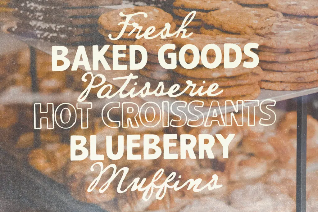
The sans comes in a few finish options: the standard rough version, a smoother alternative for when the texture feels like too much, an outline cut, and a lighter weight. That’s a reasonable spread for building hierarchy within a single family without reaching for a different typeface. The script includes several variants with small shifts in slant and weight, useful for breaking up repetition when the same word appears more than once in a layout, plus double-letter ligatures aimed at keeping repeated characters from looking stamped rather than written. PUA encoding is included for designers who need to access the extra glyphs directly.
Language support covers English, French, Danish, Spanish, Swedish, German and Swiss German, which is a decent range for European retail and hospitality work but worth checking against any project with broader diacritic needs.
The rough texture on both faces is baked into the outlines rather than applied as an effect, so it holds up consistently across sizes and export formats, but it does mean the letterforms carry more visual noise than a clean sans or script would. At small sizes, especially in the sans, the worn edges can blur into the counters and reduce clarity, so this pair is better suited to display use than body copy.
Use cases
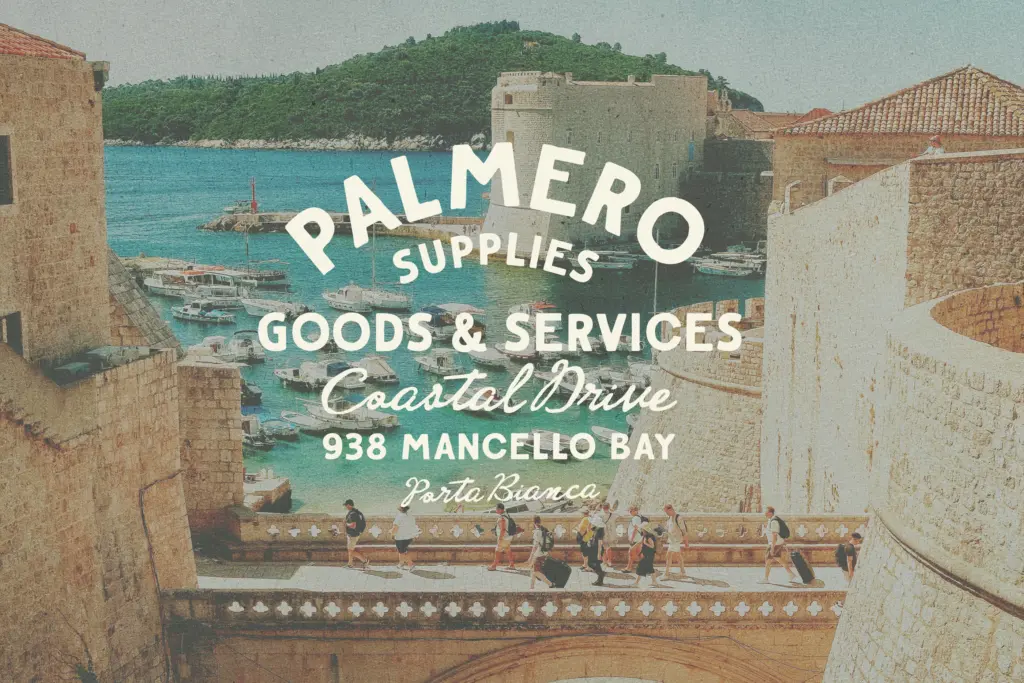
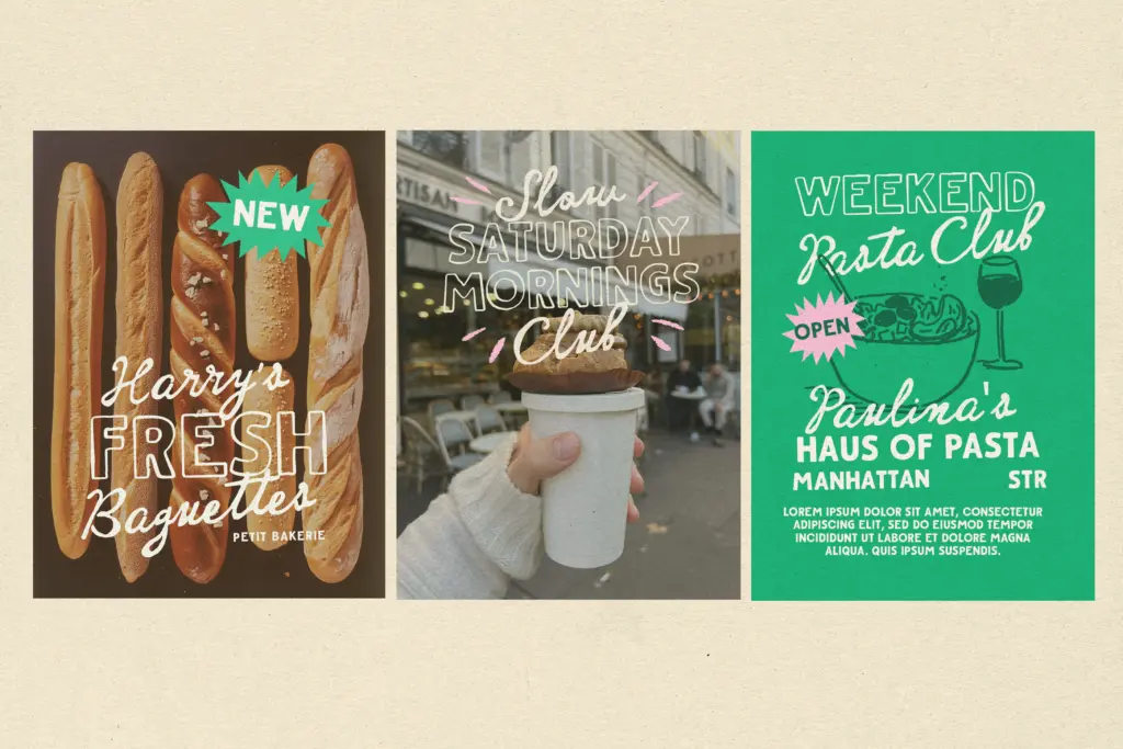
This duo sits comfortably in the vintage-Americana-meets-coastal-Europe space: think seaside cafe signage, retro packaging for food and drink, matchbook-style branding, and posters that want a handmade, slightly weathered feel. The script’s warmth makes it a reasonable fit for wedding invitations and greeting cards where a looser, personal touch is wanted, and the sans’s boldness carries headlines and logotypes without needing much support from other elements.
It’s less suited to anything requiring crisp legibility at small sizes, dense text setting, or a polished corporate tone. This is a display pairing built for a specific mood, not a general-purpose workhorse, and it earns its keep when that mood is the brief.
What we liked, and what we didn’t
Strengths
- The rough texture is drawn into the letterforms, not applied as a filter, so it holds up in different export sizes
- Multiple sans finishes (rough, smooth, outline, light) give real hierarchy options within one family
- Script ligatures and slant variants prevent repeated letters and words from looking stamped
Trade-offs
- The worn edges reduce clarity at small sizes, limiting the pair to display and headline use
- The retro, weathered character is fixed rather than adjustable, so it won't suit a cleaner or more contemporary brief
Cantina Riviera does one mood well: worn, coastal, mid-century sign painting, and the sans-script pairing is thoughtfully built with enough variants to avoid monotony. It's a display duo through and through, so don't expect it to carry small text or a clean corporate brief.
Verdict

Tantype reviews typefaces in depth — every font is tested in real branding, editorial and screen layouts before a word gets written. 555+ fonts reviewed and counting.