Serif
3.9
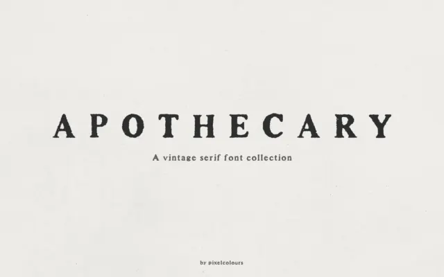
Apothecary Serif: a textured vintage-print serif for labels and headings
Design style Apothecary Serif takes its cues from old letterpress and antique print work, the kind of serif you’d find…
 Tantype

Design style Apothecary Serif takes its cues from old letterpress and antique print work, the kind of serif you’d find…
Tantype
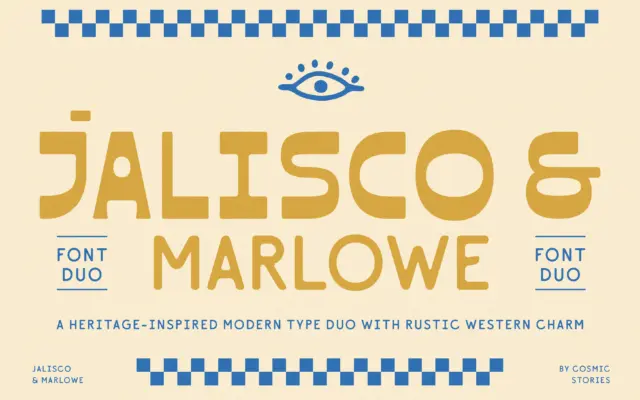
Design style Jalisco is the headline act here, a bold all-caps display face that leans on high-contrast strokes and a…
Tantype
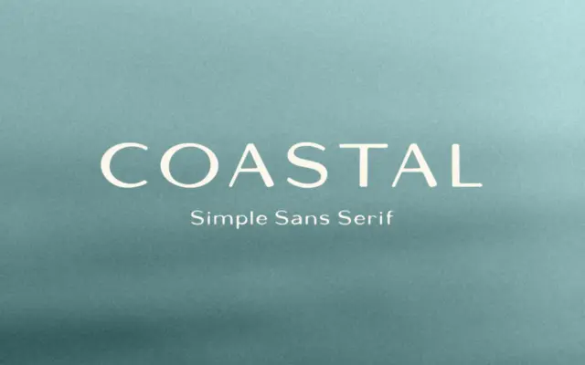
Design style Coastal is a sans serif with a hand-built feel rather than a strict grid-drawn one. The strokes carry…
Tantype
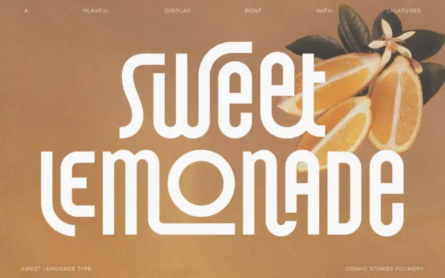
Design style Sweet Lemonade is a condensed, tall-set sans with a retro lean rather than a full period pastiche. The…
Tantype
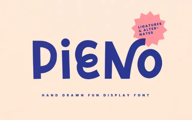
Design style Pieno is a bold, hand-drawn display face with a mid-century wink to it. The strokes are thick and…
Tantype
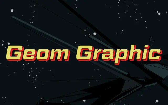
Design style Geom Graphic works the same territory as the square-geometric sans faces that came out of the Eurostile lineage,…
Tantype
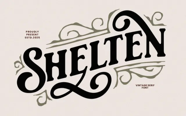
Design style Shelten Font Vintage sits in the well-worn tradition of American vintage lettering — the kind you see stamped…
Tantype
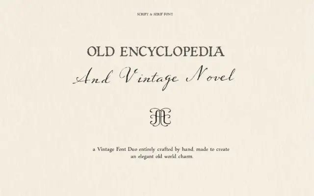
Design style This is a two-font pairing built around a single idea: paper that has been written on, not printed…
Tantype
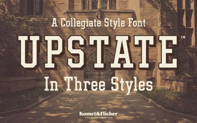
Design style Upstate is built on the vocabulary of mid-century athletic lettering: thick slab serifs, squared-off proportions, and a slight…
Tantype