
Chalets: a bold vintage sans built for ski-lodge branding and headlines
Design style
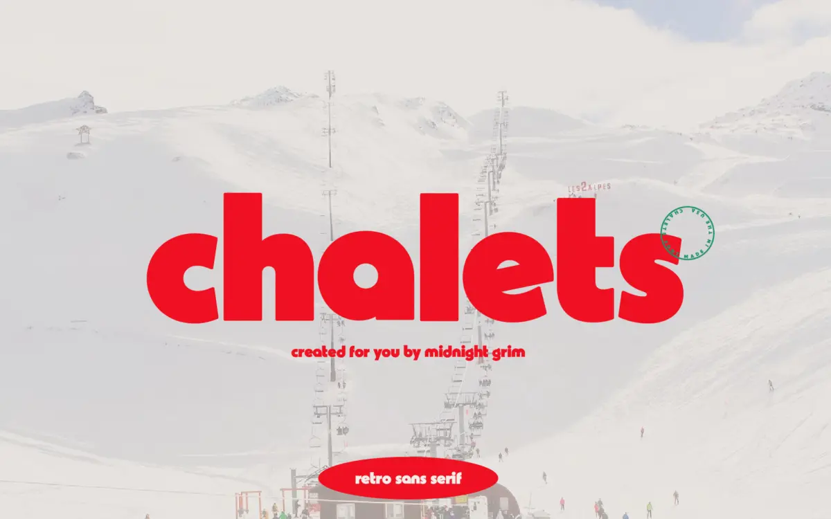
Chalets pulls from mid-century ski resort signage — the kind of lettering you’d find painted on a lodge window or stitched onto a patch. It’s a bold, chunky sans with a retro backbone: thick strokes, squared-off terminals, and a general sturdiness that reads as handcrafted rather than engineered. The letterforms feel carved more than drawn, with a slight roughness to the edges that keeps it from looking like a generic geometric sans wearing a costume.
The vintage angle is convincing at a glance. There’s a warmth to the proportions that avoids the trap of looking like a modern grotesque with rounded corners bolted on. It commits to a look and doesn’t hedge — this isn’t a font trying to be neutral.
Character set and features
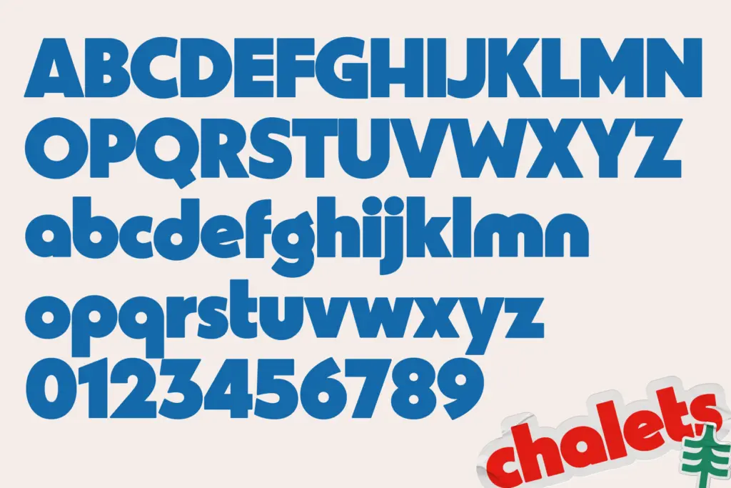
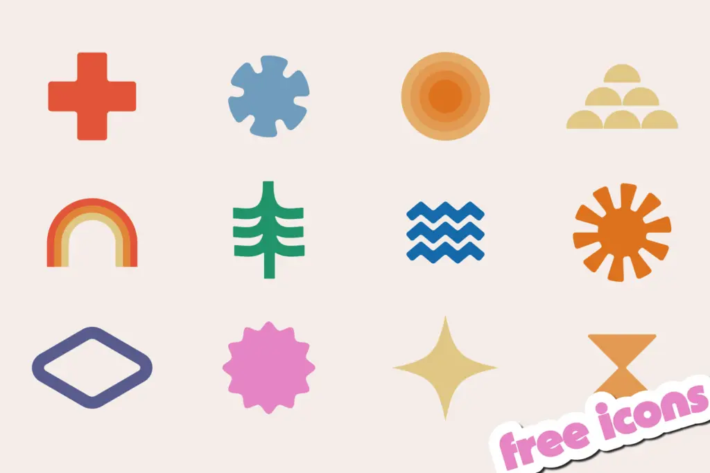
The package includes 12 icons in various formats, which points at a companion set of ski-themed marks — snowflakes, mountains, that sort of thing — rather than a deep icon library. Beyond that, the brief doesn’t specify weight variations, so it’s safest to treat Chalets as a single-weight display font rather than a flexible family. That matters for how you plan a layout: there’s no lighter sibling to fall back on for body copy or secondary information, so pairing decisions rest entirely on you.
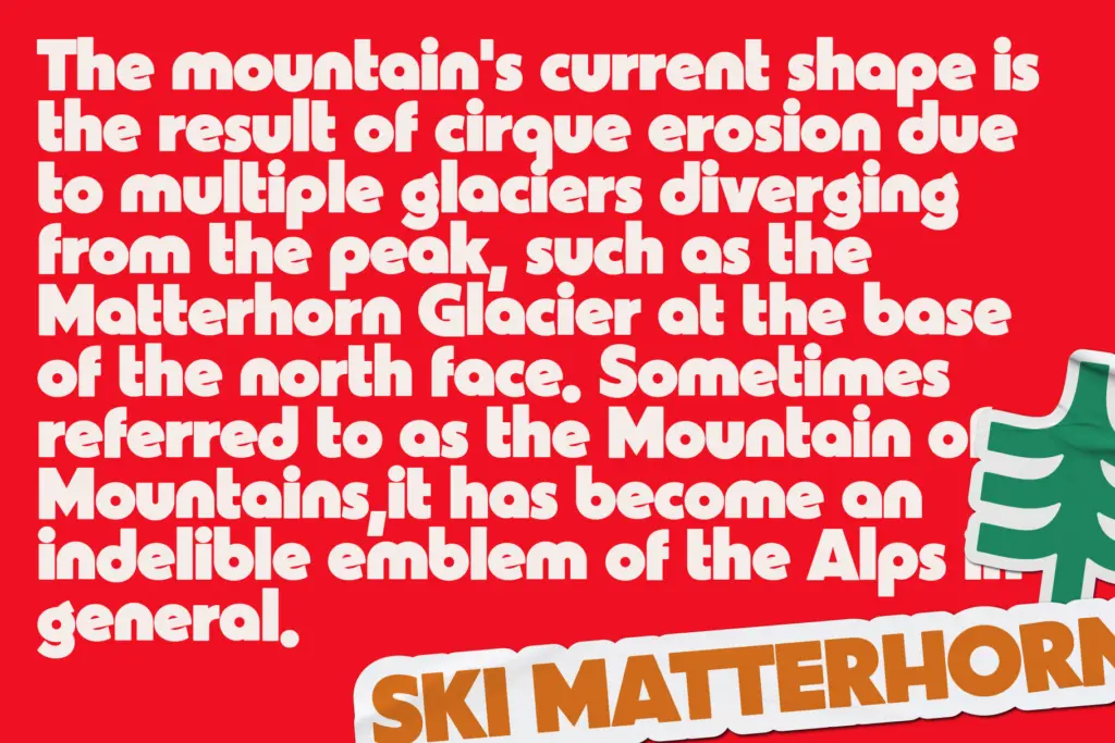
As a bold vintage face, it’s built to be looked at, not read in bulk. The heaviness that gives it character at large sizes is exactly what will work against it if pushed into a paragraph or a caption. This is a headline tool, and it knows it.
Use cases
Chalets earns its keep on logos, badge marks, and short headline treatments for anything with a retro-outdoors or ski-resort angle — apparel graphics, cabin and lodge branding, seasonal posters, menu boards for a bar with exposed beams and a fireplace. The included icon set suggests the designer had exactly this kind of branding kit in mind: wordmark plus a couple of supporting marks, not a full editorial system.
It will also do fine work on merchandise — patches, labels, t-shirt fronts — where a few bold words need to carry a whole vibe. Where it struggles is anywhere that calls for restraint or long-form reading: body text, dense signage systems, or a brand that needs to flex between formal and casual registers. Because there’s no confirmed weight range or extended language support, treat it as a specialist rather than a workhorse, and budget for a separate text font to sit underneath it.
What we liked, and what we didn’t
Strengths
- Strong, cohesive vintage ski-lodge character that doesn't feel generic
- Bold weight gives logos and badge marks real presence at small sizes
- Comes with a small matching icon set for quick branding kits
Trade-offs
- Appears to be a single weight, limiting layout flexibility
- Too heavy and stylised for body copy or dense information design
Chalets is a confident, chunky vintage sans that nails a specific ski-lodge, retro-outdoors mood for logos and headlines. It's not built for anything beyond display use, and without a range of weights it needs a text font partner for real projects.
Verdict

Tantype reviews typefaces in depth — every font is tested in real branding, editorial and screen layouts before a word gets written. 555+ fonts reviewed and counting.