
Sanremo Vintage Font Duo: hand-drawn sans and script for retro labels
Design style
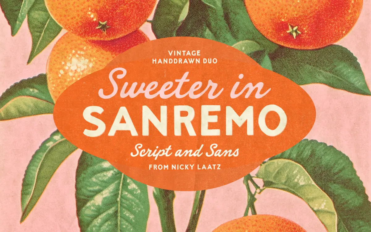
Sanremo takes its cues from hand-painted signage and old matchbook printing — the kind of lettering you’d find stenciled on a seaside kiosk or stamped on a 1950s soda label. It’s a two-part duo: a bold, hand-drawn all-caps sans, and a companion script that leans loose and slightly wobbly rather than polished. Neither style pretends to be a clean digital construction. Strokes vary in width along their length, corners round off unevenly, and the overall texture reads as printed-by-hand rather than plotted-by-vector.
The sans is the workhorse of the pair. Letters are chunky, upright, and confident, with a slight roughness at the stroke edges that keeps it from feeling like a generic geometric cap face. The script sits close to informal handwriting — connected, a bit erratic in baseline, with entry and exit strokes that add motion. Paired together, the contrast between blocky caps and a cursive companion is the whole design idea, and it’s executed with enough restraint that the two don’t fight each other.
Character set and features
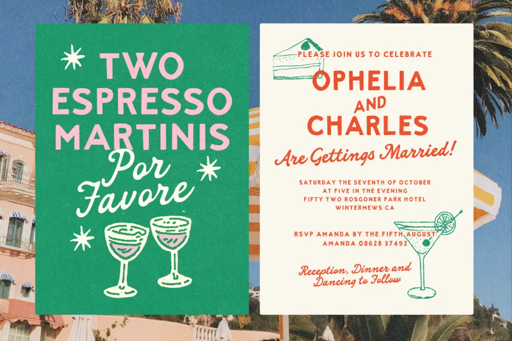
As a duo, the value is in having two related-but-distinct voices drawn by the same hand, which keeps texture consistent when you combine a headline in the sans with a flourish of script underneath. The rough, imperfect edges are a deliberate feature rather than a flaw in the rendering — every letterform carries some hand-drawn irregularity, so setting the same word twice will show subtle variation depending on which characters and ligatures you land on.
The script side leans on connected forms, so it wants generous tracking and a light hand with kerning adjustments rather than tight, mechanical spacing. The sans caps are more forgiving — they can be set tighter and still hold their shape at small sizes, though the roughness does start to blur below a certain point, as any distressed face will. This is not a typeface built for dense paragraph text; it’s built for short bursts of copy that need personality.
Use cases
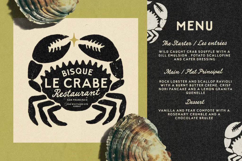
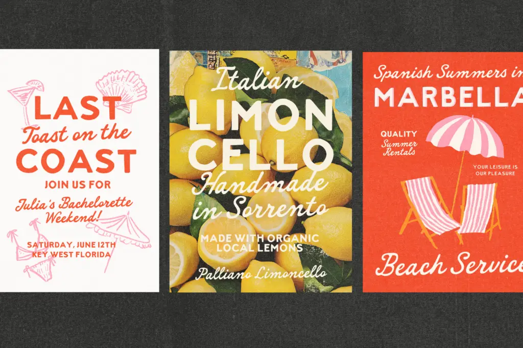
This duo is happiest doing the job its references suggest: labels, signage, packaging for food and drink, market stalls, beach-town branding, anything that wants a nostalgic, slightly imperfect hand rather than a slick modern one. The sans works well as a headline or logotype element on its own — bold enough to anchor a package front — while the script is better used sparingly, as a tagline, a signature-style flourish, or a secondary line under the caps.
It suits cafés, small-batch producers, coastal and travel-themed branding, and invitation work that wants warmth without going fully calligraphic. It’s less suited to corporate or minimal branding contexts, where the roughness would read as noise rather than character, and it’s not a font for long-form reading — body copy, editorial text, or anything set small and dense will lose the charm and gain fatigue. Used within its lane — short copy, generous space, a project that wants some grain in the ink — it does its job cleanly.
What we liked, and what we didn’t
Strengths
- The bold sans holds up well as a standalone logotype or headline element
- Script and sans share a consistent hand-drawn texture that makes the duo feel designed together, not bolted on
- Strong fit for the vintage label and coastal packaging work it was clearly built for
Trade-offs
- The script's connected, wobbly forms lose clarity at small sizes or tight tracking
- Not built for body copy or dense paragraph settings — it's a display-only pairing
Sanremo delivers exactly what its vintage-signage brief promises: a bold hand-drawn sans and a loose companion script with genuine printed-by-hand texture. It's most useful in short bursts on labels and packaging, and least useful anywhere near long text or a minimal brand.
Verdict

Tantype reviews typefaces in depth — every font is tested in real branding, editorial and screen layouts before a word gets written. 555+ fonts reviewed and counting.