
The Picnic Club: a groovy serif system for retro-leaning branding
Design style
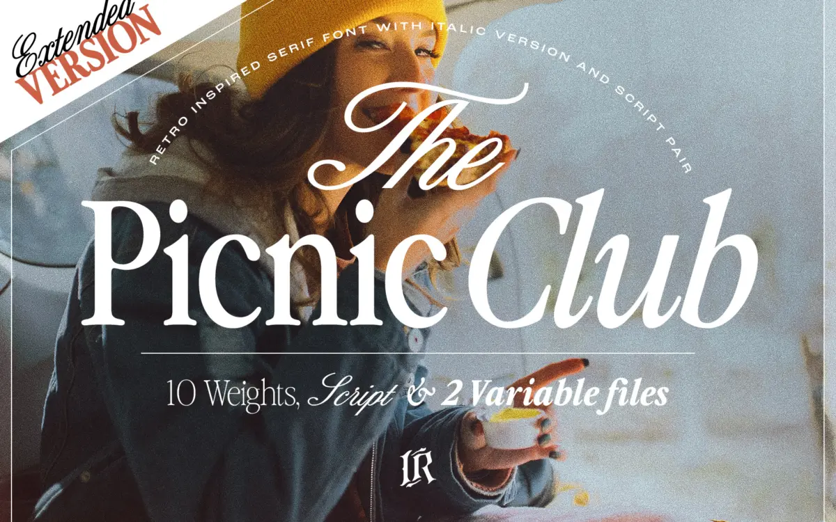
The Picnic Club reads as a display serif with its roots firmly in late-1970s and 1980s lettering: slightly bulbous terminals, a warm, rounded contrast, and a general looseness that avoids the stiffness of a revival-style text serif. It doesn’t try to pass as a historical reissue. Instead it leans into a groovy, hand-shaped quality that feels more illustrated than engineered, which is exactly the point of a family pitched at nostalgic branding rather than long-form typesetting.
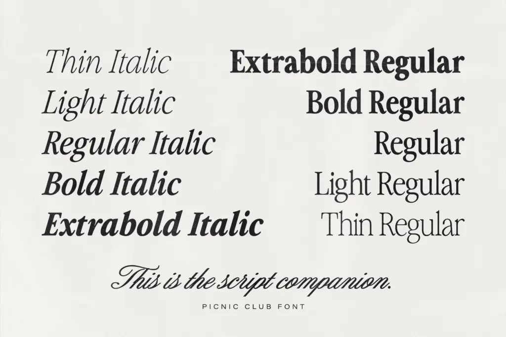
What’s notable is the range it now covers. Ten weights running from a hairline Thin to a heavy ExtraBold is a lot of ground for a font built around personality rather than neutrality, and the family holds its shape reasonably well across that span — the lighter weights thin out the curves without losing the retro roundness, and the heaviest weights get chunky enough for poster-scale headlines without curdling into blobs. The included script companion picks up the same loose, warm energy in a handwritten register, giving the family an internal pairing option rather than leaving buyers to hunt for one elsewhere.
Character set and features
Regular and italic are available across the full weight range, plus variable font files for anyone building interpolated animation or responsive type systems. That’s a genuinely useful inclusion for a display face — being able to dial in a custom weight between, say, Medium and Bold, rather than settling for whatever’s shipped, is the kind of practical flexibility that display families often skip.
The letterforms carry enough idiosyncratic detail — flared serifs, a slightly wobbly baseline feel in places, ball terminals that don’t quite match each other — that the font is clearly meant to be read as a voice, not a workhorse. That’s fine at display sizes, where the character reads as charm. It’s worth testing before dropping it into anything smaller than a subhead; the quirks that make it distinctive at 72pt start to blur at 14pt, and this isn’t a family built for body copy regardless of how many weights it offers.
Use cases
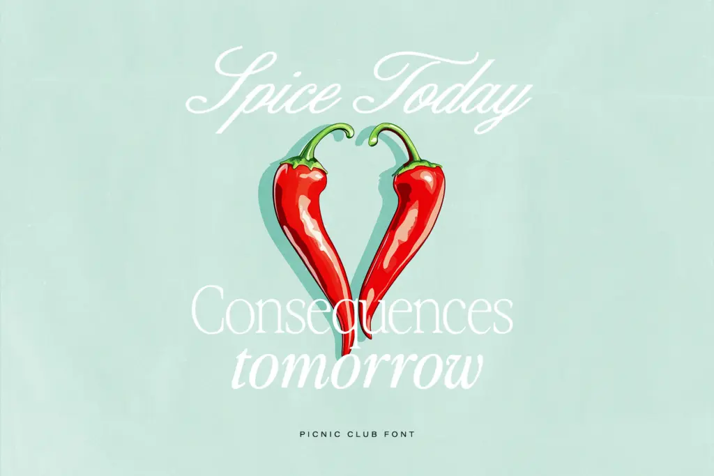
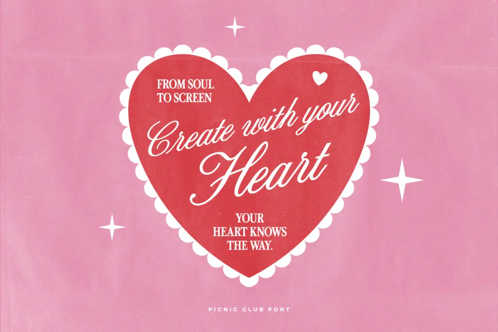
This is a font for the front door of a project, not the whole house. Logotypes for cafés, markets, and lifestyle brands chasing a warm, retro-but-not-costume feel will get good mileage from it, especially with the script paired in for a secondary line or tagline. Packaging headlines, editorial titles, and social graphics — the kind of Instagram-native, poster-style layouts the seller’s tags gesture at — are squarely in its lane.
The ten-weight range means it can do more structural work than a typical one-off display face: a masthead in ExtraBold, a strapline in Light, a pull-quote in the script, all from one family. That’s a real advantage for anyone building a small brand system without a type budget for multiple purchases. Just don’t ask it to set paragraphs or dense information — that’s not the job it’s drawn for, and pushing it there will expose the looseness that reads as charm at large sizes as inconsistency at small ones.
What we liked, and what we didn’t
Strengths
- Ten weights plus italics give a wide tonal range from delicate to heavy without losing the retro character
- The bundled script companion offers a built-in pairing rather than leaving designers to source one
- Variable font files add practical flexibility for animation or custom-weight work
Trade-offs
- The loose, idiosyncratic terminals that read as charm at display size blur at smaller text sizes
- It's a display-only family — not suited to body copy or dense information design
The Picnic Club is a confident, warm-toned display serif that leans hard into a retro, hand-shaped character rather than aiming for neutrality. The ten-weight range and companion script give it real structural flexibility for building a small brand system, but its personality-first drawing limits it to headline and display roles rather than text setting.
Verdict

Tantype reviews typefaces in depth — every font is tested in real branding, editorial and screen layouts before a word gets written. 555+ fonts reviewed and counting.