
Flapjack: a hand-painted sign font for logos and vintage branding
Design style
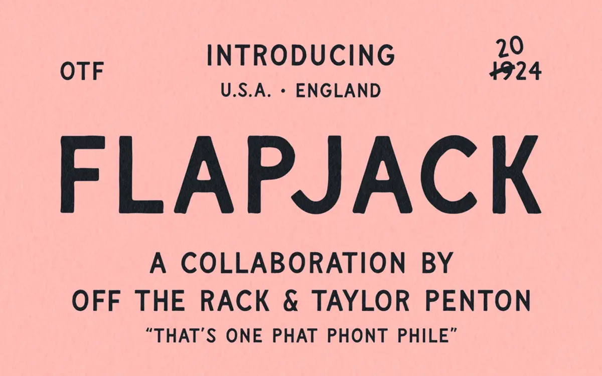
Flapjack sits closer to signwriting than it does to conventional sans serif design, though that’s the category it gets filed under. The reference point is old painted shop signage and hand-lettered billboards from the early twentieth century: uppercase-only letters with the slightly wobbly, brush-built structure of something drawn by a person with a steady but not mechanical hand. Strokes swell and taper in places you wouldn’t expect from a drawn vector font, and corners round off unevenly, which is the whole point.
It reads as a display face first. The letterforms are wide, confident, and built for attention rather than density. There’s a warmth to it that comes from imperfection — no two curves are quite identical, which is what separates this from the slicker, more uniform hand-lettered fonts that dominate the same shelf. It won’t suit anyone after a clean retro look; this is scruffier and more characterful than that.
Character set and features
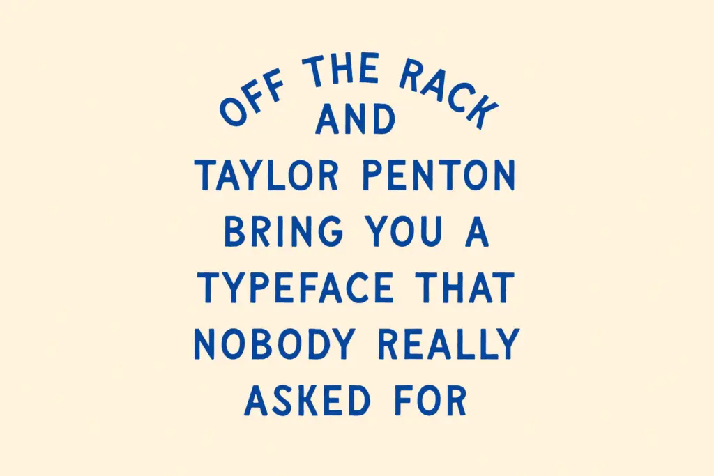
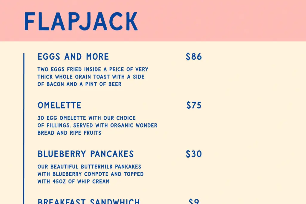
The set is uppercase only, with alternate glyphs supplied to break up repetition — useful given how often signage-style faces get exposed by repeated letters sitting too close together in a headline. Punctuation and digits are included, and the alternates extend to numerals too, which is a nice touch for anything date-stamped or priced, like a menu or a product label. Language support is broad, covering accented characters across a wide range of European languages, so it’s not limited to English-only branding work.
What’s missing is a lowercase. That’s a real constraint, not a minor one — it means Flapjack can’t carry body copy or do the quiet workhorse jobs a font family with both cases can. Everything set in it will read as a shout, which is fine for a wordmark but limits how far it stretches into a full identity system without a second typeface to lean on for supporting text.
Use cases
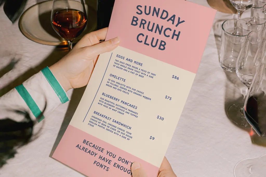
This is a logo and packaging font before it’s anything else. Its natural home is a wordmark, a badge, a beer label, a market stall sign — anywhere a brand wants to borrow the credibility of hand-painted signage without commissioning an actual sign-writer. The alternates make it usable for short repeated words like a product name across multiple SKUs, where you don’t want every jar to look identical.
It also works for merch — the kind of bold, slightly rough-edged type that looks right screen-printed on a tote bag or a t-shirt. Stretching or distressing it further, which the drawing style already invites, tends to help rather than hurt, since the letters are built to look imperfect at the source.
Where it struggles is longer-form use. Any kind of running text, editorial layout, or multi-line paragraph will fight the all-caps, high-contrast structure — it gets tiring fast and the hand-drawn wobble that reads as charming in a headline becomes visual noise in a paragraph. Pair it with a plainer serif or sans for body copy and keep Flapjack itself to headlines, logotypes, and short display lines where its personality has room to work rather than crowd the page.
What we liked, and what we didn’t
Strengths
- Alternate glyphs, including on numerals, break up repetition in short repeated words like product names
- Genuinely convincing hand-painted texture rather than a generic distressed effect
- Broad language support means it isn't limited to English-only branding work
Trade-offs
- Uppercase only, so it can't handle body copy or anything beyond short display lines
- The heavy hand-drawn wobble that works at large sizes can get muddy when set small
Flapjack is a confident, well-drawn signwriting face that does one job — vintage logotypes and short display lines — genuinely well. The lack of a lowercase keeps it out of any layout that needs more than a headline, so it's a specialist tool rather than an all-purpose branding font.
Verdict

Tantype reviews typefaces in depth — every font is tested in real branding, editorial and screen layouts before a word gets written. 555+ fonts reviewed and counting.