
Chunky Retro Font: a bold rounded display face for logos and packaging
Design style
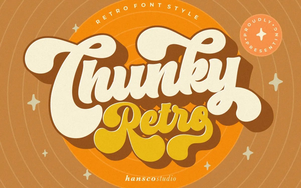
Chunky Retro Font sits squarely in the bold, rounded display tradition that pulls from mid-century signage and packaging lettering. The corners are softened rather than sharp, giving each letter a puffy, inflated look that reads as friendly rather than aggressive. Strokes are thick and consistent in weight, with little to no contrast, which is typical of the genre and part of what gives it that stamped, badge-like presence.
The rounding is the defining move here. Where a lot of chunky retro faces keep hard corners and rely on colour or texture for warmth, this one bakes the softness into the letterform itself. That makes it feel a touch more contemporary and less like a strict revival, closer to a modern illustrator’s take on a retro mood than an archival reproduction. It’s a design with a clear point of view, even if that point of view is not a particularly rare one in the current display-font market.
Character set and features
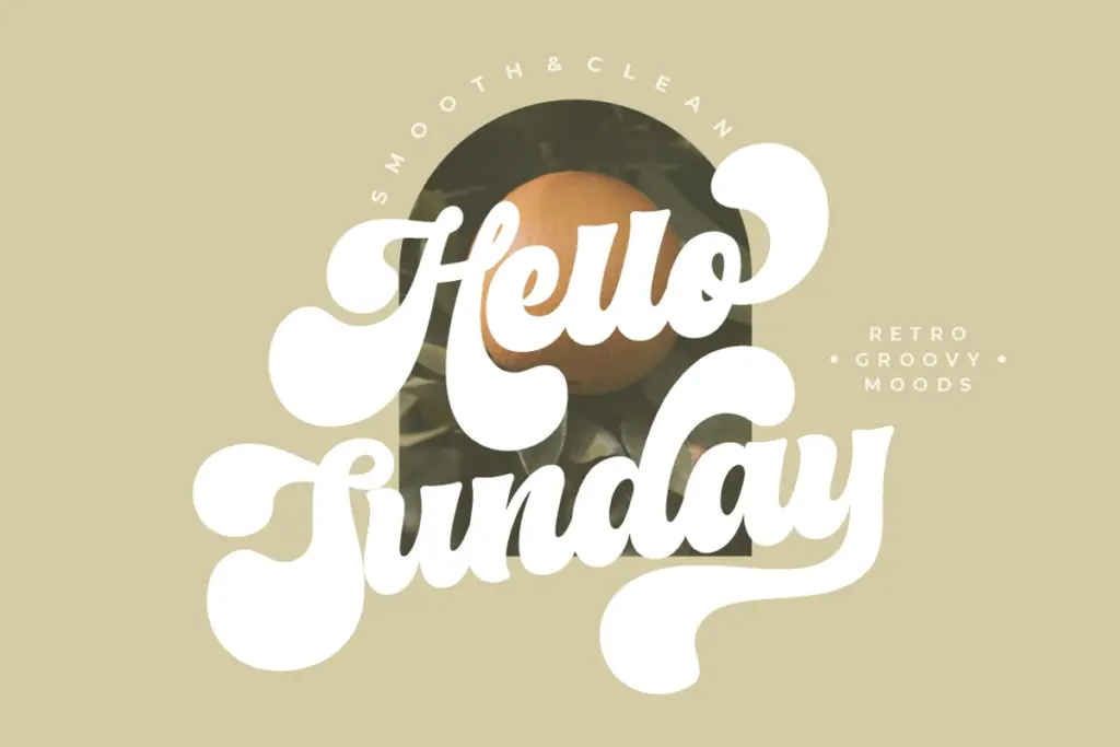
The set covers uppercase, lowercase, numerals and punctuation, plus multilingual support, so it’s usable well beyond a narrow English-only word or two. Alongside the base weight, the pack includes a companion shadow/outline style, which is the more useful of the extras: layering the shadow behind the solid letters gives you that dimensional, retro-poster depth without touching an effects panel.
Ligatures, alternates and swashes are also included, accessed through OpenType features rather than sitting on default keys. That means the font behaves best in software with proper glyph panel support — Illustrator, InDesign, Photoshop with OpenType enabled, CorelDraw — and less well in apps that flatten fonts down to their basic character map. If your workflow is mostly Canva or a lightweight editor, expect to see only the standard letters unless the alternates have been mapped to accessible characters.
Because the letterforms are so rounded and even in weight, legibility holds up fine at large sizes but starts to soften at small ones — the shapes blur into each other a little when the font drops below headline scale. This is a font built to be looked at, not read in a paragraph.
Use cases
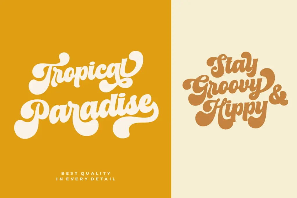
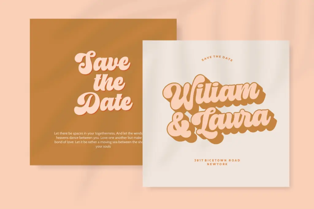
This is a headline and logotype font first. It suits short bursts of text: a brand name, a product label, a sticker, a t-shirt front, a poster headline. The rounded chunkiness gives it an approachable, slightly playful tone that works well for food and drink packaging, craft or maker brands, and youth-skewing apparel — anywhere a design wants warmth without leaning fully into handwriting or script territory.
The shadow layer earns its keep on posters and social graphics where you want a bit of dimensional punch without building it manually. It’s less suited to editorial or long-form work — body copy, running text, anything that needs to disappear into the background. Pair it with a plain sans or serif for supporting text, since this face wants to be the loud one in the room, not the quiet one.
What we liked, and what we didn’t
Strengths
- The shadow/outline companion adds dimensional depth without extra effects work.
- Consistent rounded corners give it a distinct, cohesive personality rather than a generic bold slab look.
- Multilingual and full punctuation support make it usable beyond English-only branding jobs.
Trade-offs
- Alternates and swashes require OpenType-aware software, so casual editors will only see the base letterforms.
- Legibility drops off quickly below headline size, limiting it strictly to short, large-scale text.
Chunky Retro Font does one thing — bold, rounded, retro-flavoured headlines — and does it competently, with a useful shadow layer thrown in. It won't surprise anyone who's shopped this corner of the display-font market before, and it's not built for anything smaller than a headline.
Verdict

Tantype reviews typefaces in depth — every font is tested in real branding, editorial and screen layouts before a word gets written. 555+ fonts reviewed and counting.