
Folkies Vantage: a distressed sans-and-script duo for retro signage work
Design style
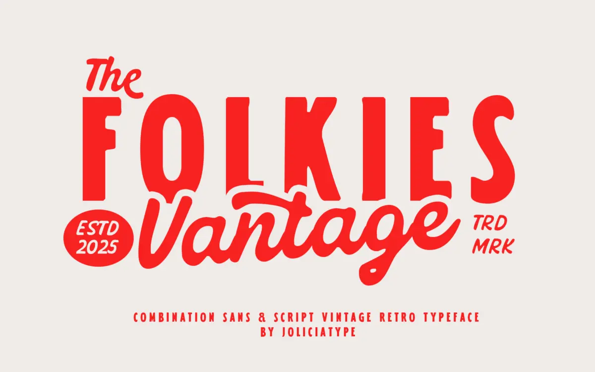
Folkies Vantage pairs two faces built around one idea: age. The sans half carries the weight of the pairing — sturdy, slightly uneven strokes, corners that don’t quite close cleanly, the kind of texture you’d expect from a hand-cut stencil or a worn rubber stamp. It’s not a geometric sans dressed up with a filter; the roughness sits in the letterforms themselves, so it reads as drawn rather than processed after the fact.
The script companion loosens things up. Strokes swing with more movement, connections are looser, and the overall rhythm feels closer to brush lettering than formal calligraphy. Set the two together and you get the contrast the duo is built on: the sans holds the line, the script breaks it. That tension is really the whole pitch here, and it works reasonably well as a design idea — it’s just not a subtle one.
Character set and features
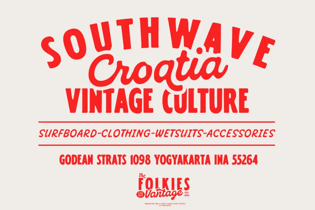
Both styles lean into texture — worn edges, broken strokes, ink-fill irregularities — which means every letter carries visible imperfection by design. That’s consistent throughout, which is good; nothing here suddenly turns clean or generic partway through the alphabet. The trade-off is that texture this heavy doesn’t scale down gracefully. At small sizes the rough edges start to compete with the letter shapes instead of supporting them, so this isn’t a font you reach for in a paragraph of body copy or a dense spec sheet.
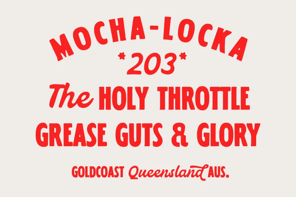
Used at the sizes it’s clearly built for — headlines, wordmarks, single lines of display type — the roughness reads as intentional character rather than noise. The pairing logic is simple enough to use without much thought: sans for structure, script for flourish, and the two combine into a single vintage voice rather than two unrelated fonts thrown together.
Use cases
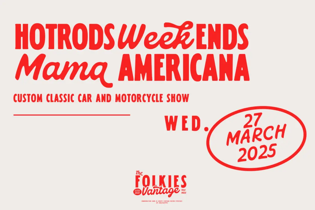
This is a font for surfaces that want to look handled — labels, packaging, café signage, t-shirt graphics, anything trading on a rustic or artisanal story. A denim brand, a small-batch coffee roaster, a motorcycle garage — the brief the seller describes is basically the correct use case, and it’s not wrong. Folkies Vantage does that job without much resistance.
It’s less useful outside that lane. Ask it to do quiet, contemporary branding and the texture fights you; ask it to hold a paragraph of running text and legibility drops off fast. Treat it as a display and logotype tool rather than a general-purpose typeface, and it earns its keep. Push it into UI, editorial body copy, or anything that needs to read cleanly at small sizes, and you’ll be fighting the very texture that makes it work everywhere else.
What we liked, and what we didn’t
Strengths
- The distressed texture is built into the letterforms, not a filter effect, so it holds up under scaling and printing.
- Sans and script halves genuinely complement each other rather than feeling like two separate purchases.
- Well suited to the rustic, artisanal branding niche it's aimed at — labels, signage, packaging.
Trade-offs
- Texture and roughness make it unreadable at small sizes or in long text.
- The heavy vintage-worn look limits it to a fairly narrow stylistic range; it won't adapt to cleaner or contemporary briefs.
Folkies Vantage does one job well: a rough, hand-worn sans paired with a looser script for retro branding work. It's convincing at display sizes and falls apart at small ones, so it belongs in logos and labels, not paragraphs.
Verdict

Tantype reviews typefaces in depth — every font is tested in real branding, editorial and screen layouts before a word gets written. 555+ fonts reviewed and counting.