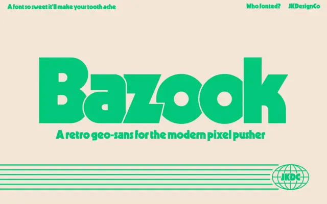
Bazook: an ultra-bold geometric sans built for 80s-flavoured headlines
Design style Bazook is a single-weight display sans that leans hard into the geometric-sans-gone-heavy tradition of Kabel and Geo 231,…
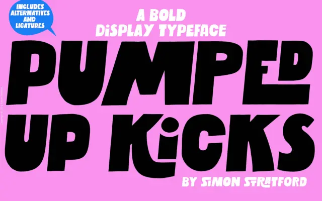
Design style Pumped Up Kicks is a bold sans-serif display face built around irregularity. The letterforms are thick, blocky, and…
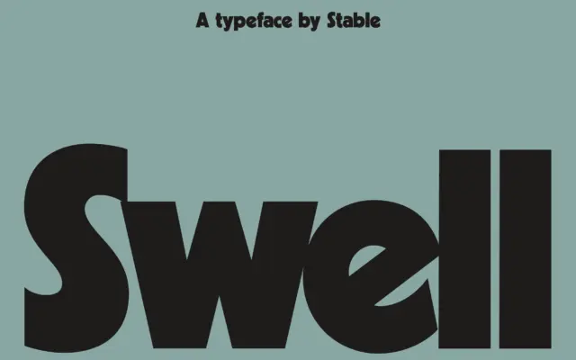
Design style Swell sits in the lineage of chunky geometric sans faces like Kabel Black, but it doesn’t just reissue…
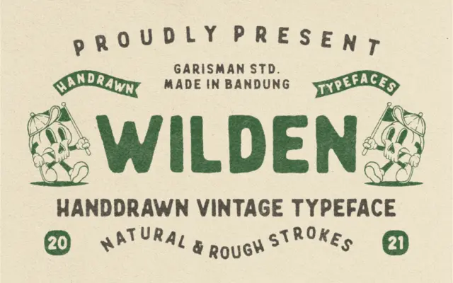
Design style Wilden reads as a handdrawn display letter built for a worn, printed-badge look rather than a general text…
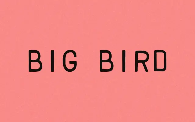
Design style Big Bird belongs to the stamp-and-seal school of hand-drawn lettering: the kind of face that looks like it…
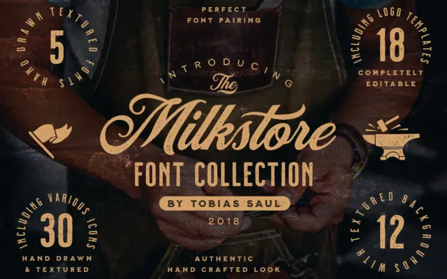
Design style Milkstore reads as a sign-painter’s alphabet run through a wall of old brick. The five styles inside the…
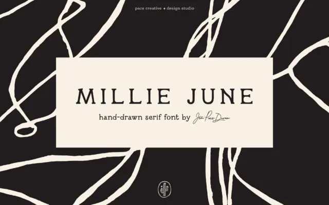
Design style Millie June sits in that crowded space where hand lettering meets serif structure, but it earns its place…
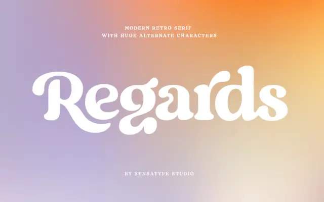
Design style Regards sits in that well-populated corner of type design where a serif skeleton gets bent toward something warmer…
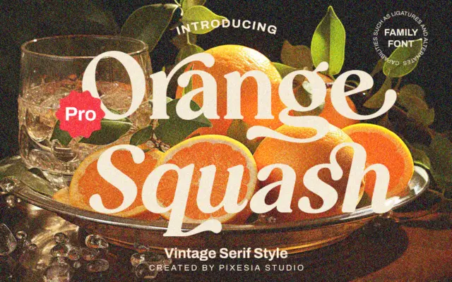
Design style Orange Squash Pro leans into the chunky, slightly retro serif look that’s become shorthand for 70s-inflected branding —…