
Nostalgia: an inky connecting script for wedding and vintage-styled work
Design style
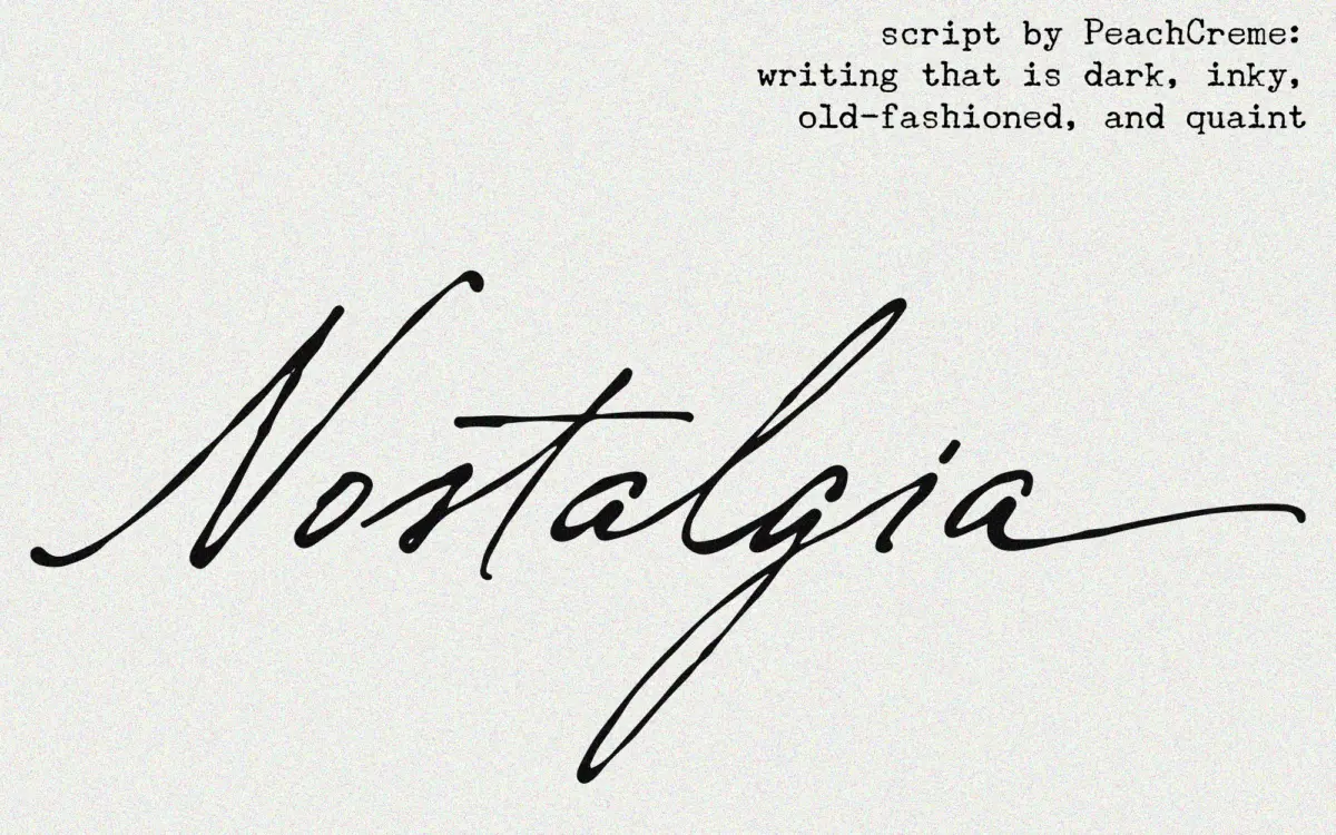
Nostalgia belongs to the crowded family of connecting scripts built to imitate a fountain pen or dip nib rather than a formal calligraphy hand. The letters lean forward with a steady, unhurried slant, and the joins between lowercase characters are continuous rather than broken, so words read as a single inked gesture instead of a row of separate glyphs. The stroke has a slight ink-trap darkening at the joins, which reinforces the handwritten premise without tipping into a distressed or grunge look.
What separates it from a generic script is the swash treatment on entry and exit strokes. Ascenders and descenders finish with a small flourish rather than a plain taper, and this is where the ‘vintage’ claim earns its keep — the curls sit closer to older engraved invitation lettering than to modern brush lettering. It is a quieter, more restrained style of script: no exaggerated loops, no calligraphic contrast swings, just a consistent, slightly heavy stroke moving across the baseline.
Character set and features
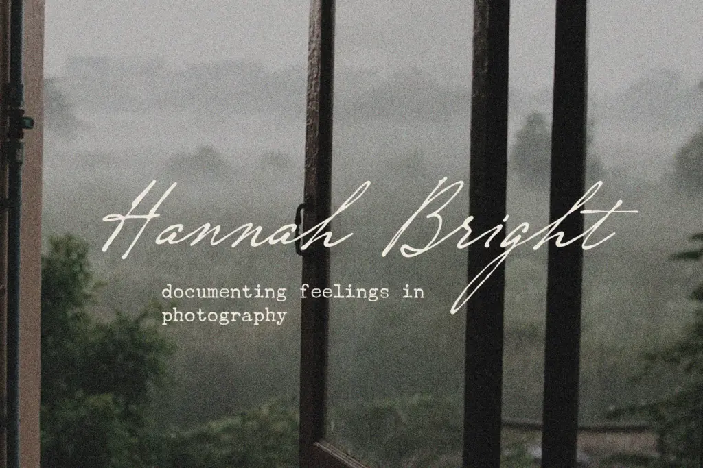
The set covers the standard letters, numerals and punctuation, which is enough for setting names, dates and short lines of copy but won’t stretch to multilingual or extended typographic work. Because it’s a connecting script, spacing is doing a lot of the work here — kerning between certain pairs needs a light touch, and like most scripts of this construction, it rewards typing whole words rather than stacking individual letters with manual tracking adjustments.
The lowercase is the strongest part of the set: the swashed entries and exits are genuinely well drawn and give the font its character. Numerals are plainer and read more like a supporting cast than a feature. There’s no sign of contextual alternates or a second stylistic set, so what you see in the specimen is what you get — there isn’t a mechanism here for varying repeated letters within a word, which connecting scripts often rely on to avoid looking mechanical in longer passages.
Use cases
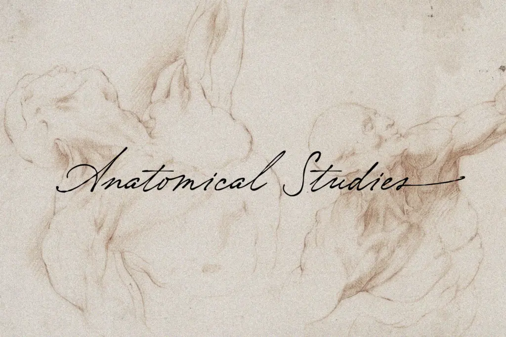
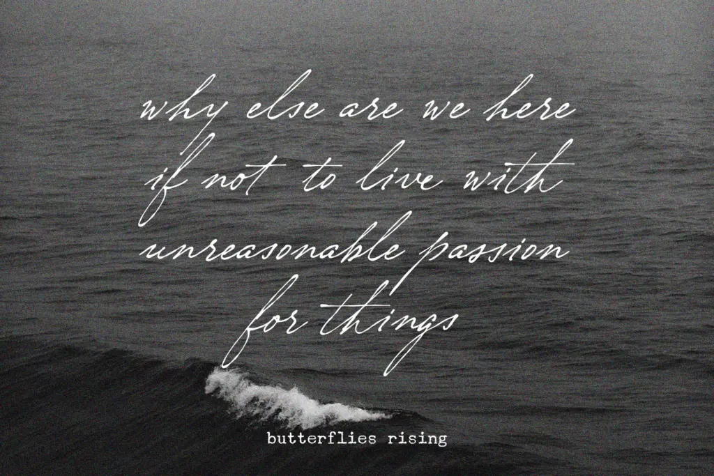
This is a font for short, ceremonial lines rather than paragraphs: a couple’s names on an invitation, a date line, a monogram, a single word on packaging or a title card. At those lengths the connecting joins and swashes read cleanly and the vintage feel comes through without strain. Push it into body copy or a full sentence of dense text and the joins start to compete with each other, legibility drops, and the handwritten charm turns into visual noise.
It suits wedding stationery, save-the-dates, and feminine-leaning branding where a soft, traditional tone is wanted — florists, boutique packaging, greeting cards, that kind of brief. Paired with a plain sans or serif for supporting text, it can carry a headline role in a logo lockup or editorial title without needing much else to prop it up. It is not the font to reach for if the job needs heavy customisation, multiple weights, or a script that still performs at small sizes on a busy label; for that, a font with alternates and a more engineered spacing system will hold up better.
What we liked, and what we didn’t
Strengths
- Swashed lowercase entry and exit strokes give it real vintage character rather than generic script polish
- Continuous joins read as a single inked gesture, well suited to short ceremonial lines
- Restrained stroke contrast keeps it legible at invitation and title sizes
Trade-offs
- No stylistic alternates or contextual swaps, so repeated letters in a word can look mechanical
- Basic character set limits it to short-copy roles rather than body text or multilingual work
Nostalgia is a competent, well-drawn connecting script with genuine vintage character in its swashes, best kept to short lines like names and dates. It doesn't offer the alternates or extended glyph set that would let it stretch further, so treat it as a headline specialist rather than an all-purpose script.
Verdict

Tantype reviews typefaces in depth — every font is tested in real branding, editorial and screen layouts before a word gets written. 555+ fonts reviewed and counting.