
Pieno: a hand-drawn bold display font for playful branding
Design style
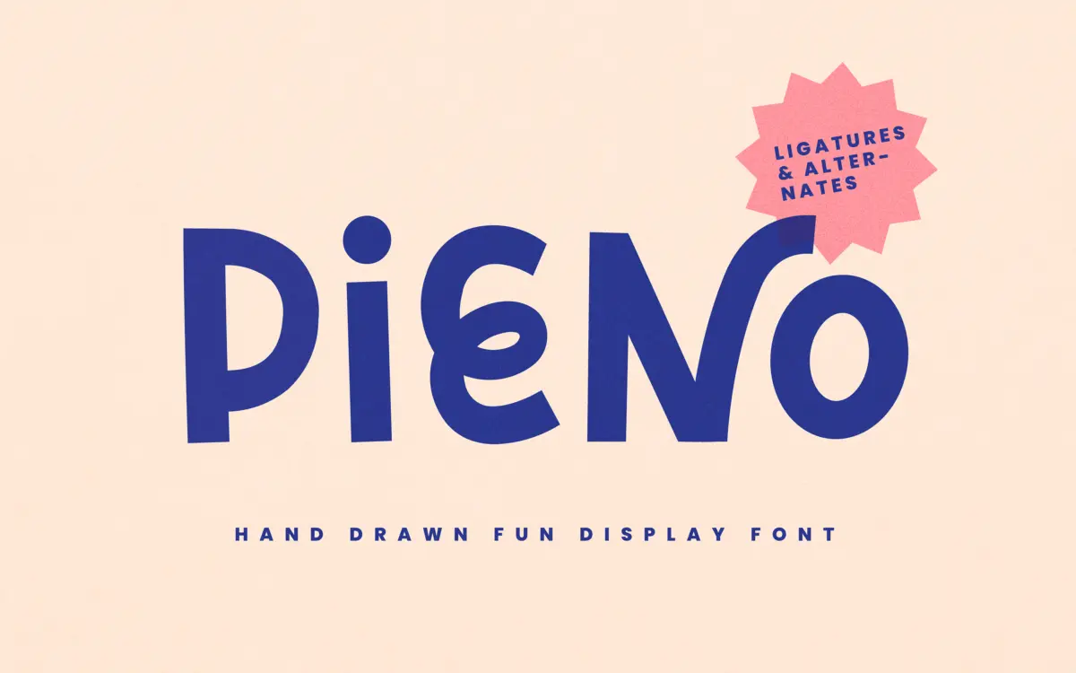
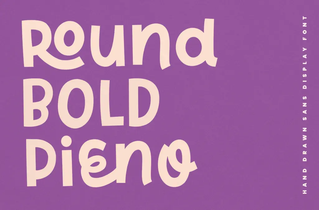
Pieno is a bold, hand-drawn display face with a mid-century wink to it. The strokes are thick and rounded, with terminals that bulge slightly rather than tapering to a clean point, giving the letters a slightly inflated, bouncy feel. There’s an obvious hand behind it — the curves aren’t mechanically consistent, and that irregularity is the point. It reads as friendly and a bit cheeky rather than tightly engineered.
The retro reference shows up in the letter proportions more than in any specific decade’s signage style — wide bowls, short ascenders, a general squatness that recalls hand-painted lettering rather than metal type. It’s not trying to be historically accurate, and it doesn’t need to be. As a display face it’s confident about being loud: this is not a typeface that wants to sit quietly in a paragraph.
Character set and features
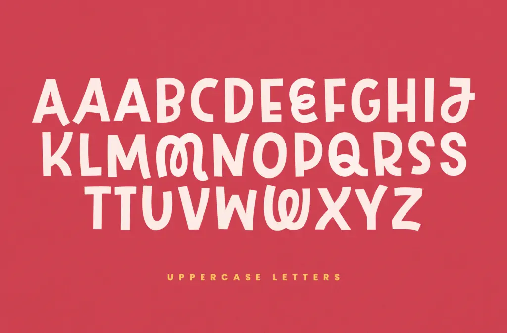
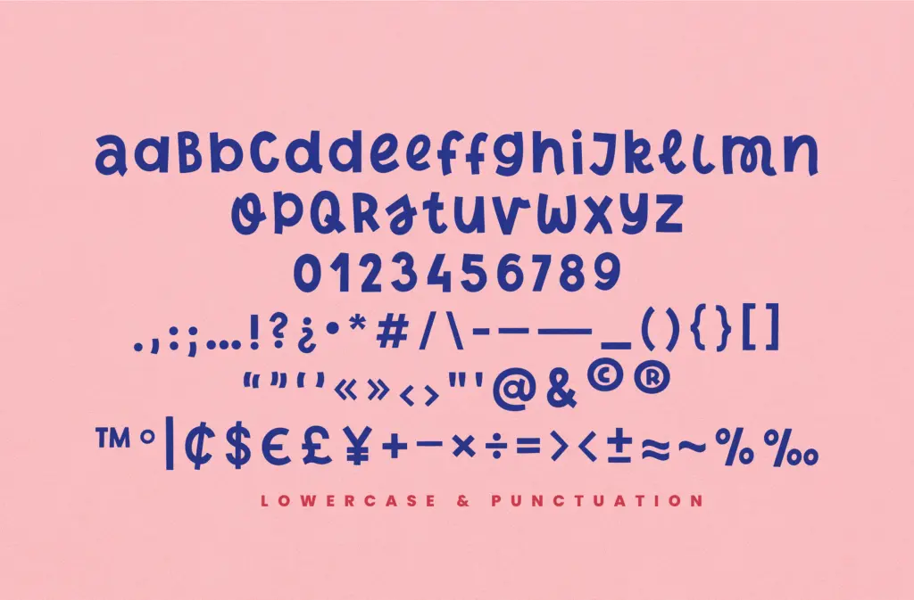
The alternates are the most useful part of the package. They ship as a separate file (PienoAlt) rather than through OpenType access, which is a slightly clumsy way to deliver stylistic variation — you have to install two fonts and switch between them rather than toggling a feature — but it does mean the alternates work in tools that don’t support OpenType alternates natively, which is presumably the point. Mixing letterforms from both files lets you break up repeated letters in a wordmark, which matters a lot in a face this characterful, since two identical bouncy ‘o’s sitting next to each other can start to look like a mistake rather than a style.
The seller notes accented characters for wider language coverage, which is worth knowing if you’re setting anything beyond basic English. Kerning is described as balanced, and in practice the letters do sit close enough to keep the bounce feeling cohesive rather than gappy — a real risk with hand-drawn faces where every letter has its own slightly different width and angle.
Use cases
Pieno belongs in short bursts: logotypes, single-word packaging call-outs, menu headers, poster titles, the top line of a social graphic. It has the kind of personality that reads well at large sizes for a few words and starts to feel exhausting across a full sentence, let alone a paragraph. This is standard for a display face of this type, not a flaw specific to Pieno, but it’s worth being clear-eyed about before you reach for it as a body-adjacent font.
It suits brands that want warmth without going fully whimsical or childish — food and beverage packaging, small-batch product labels, café signage, event branding for anything that isn’t trying to look formal. Pair it with a plain, restrained sans or serif for supporting text, since the character work here does the talking and needs quiet neighbours. If your brand needs polish and restraint, look elsewhere; if it needs a bit of handmade charm up front, this does that job well.
What we liked, and what we didn’t
Strengths
- Rounded, hand-drawn terminals give it real warmth without tipping into childish territory
- Separate alternate file lets you break up repeated letters for more natural-looking wordmarks
- Kerning holds the bounce together instead of letting it read as messy
Trade-offs
- Alternates require installing and switching between two font files rather than a single OpenType toggle
- Character and rhythm that make it work at display size make it tiring in longer text
Pieno is a charming, well-drawn display face that does exactly one job — short, punchy, characterful headlines — and does it with genuine warmth. The alternate-file approach to variation is a workaround rather than a solution, and it's not a face you'll reach for outside display contexts, but within that lane it delivers.
Verdict

Tantype reviews typefaces in depth — every font is tested in real branding, editorial and screen layouts before a word gets written. 555+ fonts reviewed and counting.