
Coastal: a hand-crafted sans for beachy, unfussy branding work
Design style
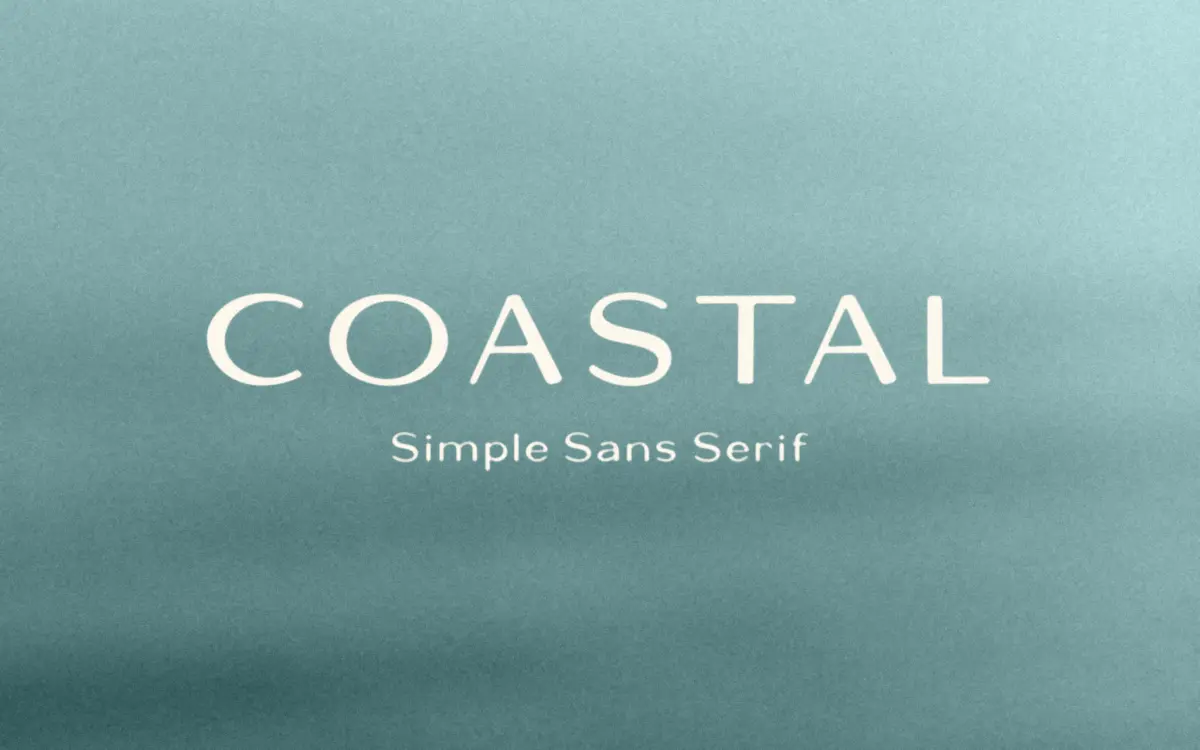
Coastal is a sans serif with a hand-built feel rather than a strict grid-drawn one. The strokes carry slight variation in weight and the curves aren’t perfectly symmetrical, which gives it the look of lettering that was inked first and vectorised second. Designer Lauren Kilbane, working under the Bruised Goods name, has kept the letterforms wide and open, with generous counters and a relaxed x-height that reads as casual rather than corporate.
The overall mood sits somewhere between mid-century signage and a beach town shopfront. It isn’t trying to be a workhorse text face. It’s a display letterform with just enough restraint to avoid looking novelty. Terminals are blunt, not pointed, and the few slight asymmetries between letters — an ‘a’ that leans differently than the ‘e’ — keep it from feeling stamped out of a template. That’s the appeal and also the limit: this is a font with a specific personality, not a neutral tool.
Character set and features
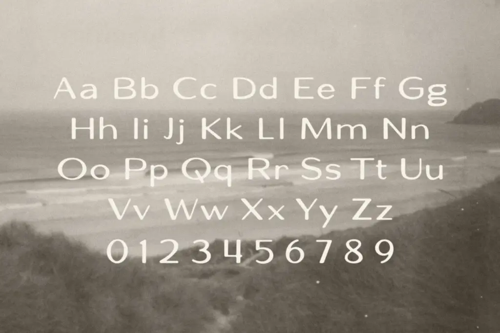
The set covers uppercase and lowercase, standard English alphanumerics, currency symbols, and standard punctuation. There’s no mention of alternates, ligatures, or extended language support, so this is a straightforward single-style font rather than a family with swash variants to dig through. That keeps things simple but also means designers who want built-in flexibility — alternate letterforms for repeated characters, say — will need to fake it manually or lean on a second display face for accents.
Because the weight is fairly consistent and on the heavier side, Coastal reads best set large. At small sizes the slight organic wobble in the strokes starts to blur into the counters, and the open apertures that look charming at headline size lose their crispness. This isn’t a font for footnotes or body copy; it’s built for scale.
Use cases
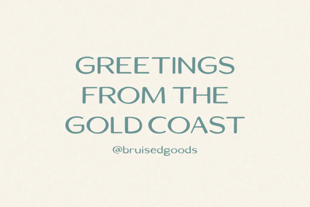
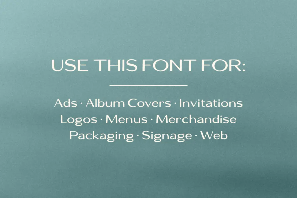
Given its handmade warmth and generous proportions, Coastal fits logo marks, packaging headers, apparel graphics, and signage where a friendly, slightly retro sans is wanted over something sharp or geometric. It has an obvious home in hospitality and lifestyle branding — cafés, surf shops, seasonal product lines — anywhere the brief calls for approachable rather than polished. It also works for editorial headlines or social graphics where a single bold word needs presence without shouting in all caps only.
It’s less suited to anything requiring a full type system: annual reports, dense UI, or long-form web copy will expose its display-only nature quickly. Pair it with a plain, quiet body font for anything beyond a headline or two, since Coastal isn’t drawn to do that job itself. Used within its lane — short words, big sizes, casual context — it does what it sets out to do without overreaching.
What we liked, and what we didn’t
Strengths
- Warm, slightly irregular strokes give it a hand-built rather than templated feel
- Wide, open letterforms make single words and short headlines feel confident at large sizes
- Straightforward character set makes it easy to drop into logo and packaging work without fuss
Trade-offs
- No alternate characters or ligatures to add variation across repeated letters
- Loses crispness at small sizes, so it's unsuitable for body text or fine print
Coastal is a display sans with genuine hand-drawn charm, best used large and sparingly. It brings personality to logos, packaging, and signage but won't stretch to body copy or dense layouts. A solid, specific tool rather than a flexible system.
Verdict

Tantype reviews typefaces in depth — every font is tested in real branding, editorial and screen layouts before a word gets written. 555+ fonts reviewed and counting.