
Super Curious: a hand-drawn unicase font with vintage print texture
Design style
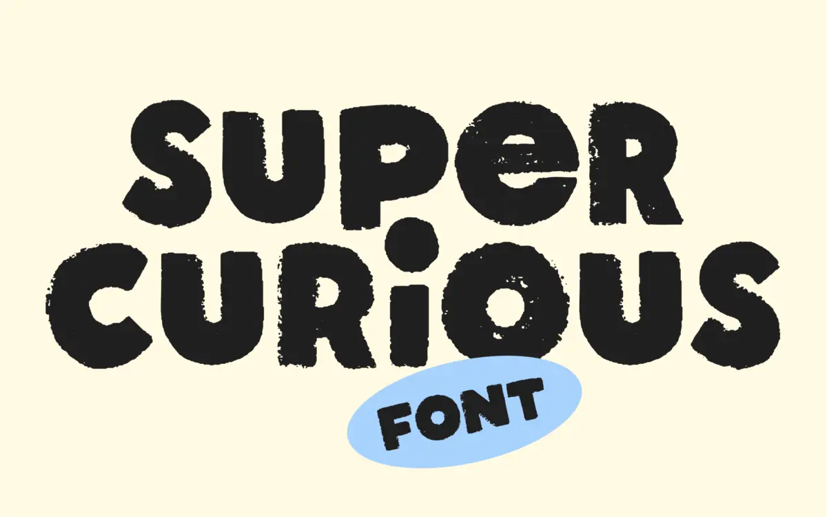
Super Curious sits at the crossroads of hand-lettering and old print work. The letters are unicase, meaning there is no real distinction between capitals and lowercase — just one drawn alphabet with a consistent scale, which is common in hand-lettered display faces but worth knowing before you plan a layout that depends on case contrast for hierarchy.
The texture is the point here. Strokes wobble slightly, terminals aren’t uniform, and the whole thing reads like it was inked and then run through a worn plate or an old photocopier. That’s clearly intentional — the brief describes it as inspired by imperfect vintage printing — and it comes through in the letter construction rather than as an applied filter. The forms themselves have rounded, slightly bouncy proportions, which keeps the texture from tipping into illegibility or grunge-poster territory. It reads as friendly and handmade rather than distressed and aggressive.
Character set and features
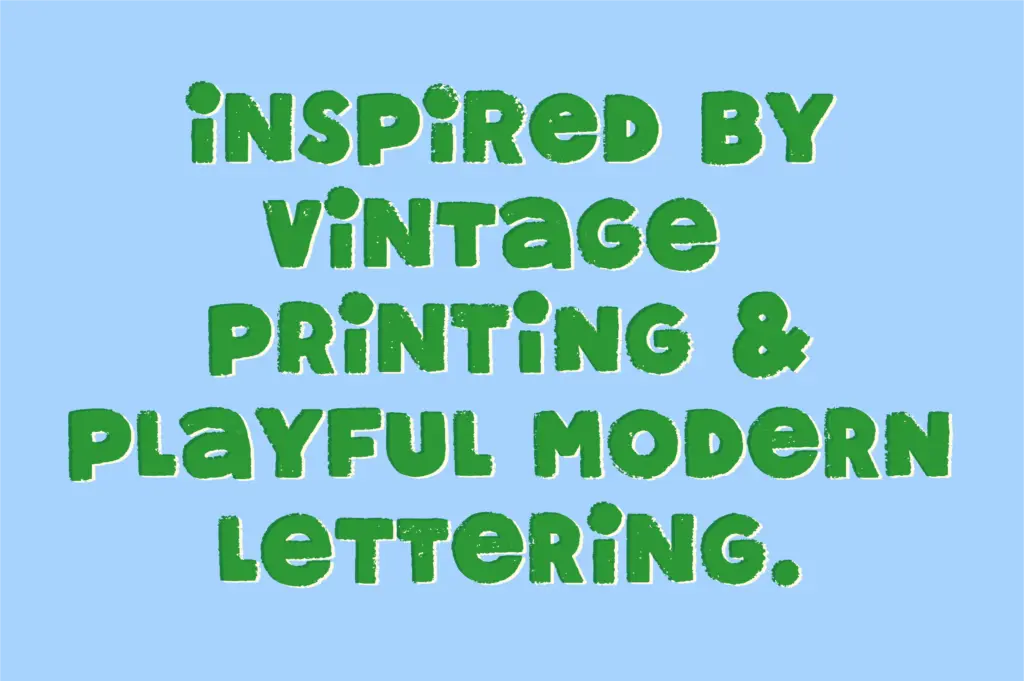
The set covers A–Z, numerals, punctuation and symbols, all drawn in the same unicase style. Beyond the base characters, there are alternates and ligatures, which matter more here than in most display fonts because they’re doing the job of breaking up repetition. A hand-lettered face with only one version of each letter starts to look mechanical the moment you type more than a word or two — the alternates exist specifically to stop that from happening, letting you swap in a different curve on repeated letters within a word or headline.
That said, this is a single style file with no weight range and no separate italic — what you see is what you get. There’s also no mention of extended language support, so if your project needs accented characters beyond a basic Latin set, check the glyph list before committing. The unicase structure also means you’ll need to build hierarchy through size, color or spacing rather than through mixed-case contrast, which is a real constraint for anything beyond short headlines.
Use cases
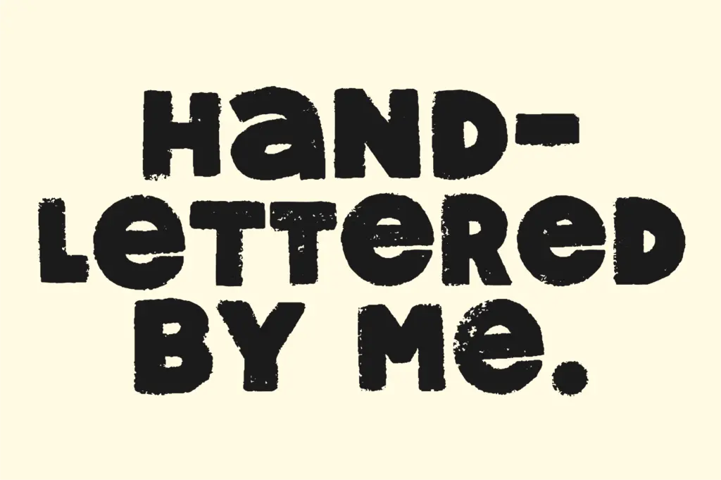
This is a display font, not a text face, and it doesn’t pretend otherwise. At the sizes it’s built for — logotypes, packaging call-outs, sticker designs, quote graphics, short titles — the texture and irregularity read as charm rather than noise. Set it at body copy sizes and the wobble in the strokes starts working against you; letters lose their distinctness and the texture becomes visual static rather than character.
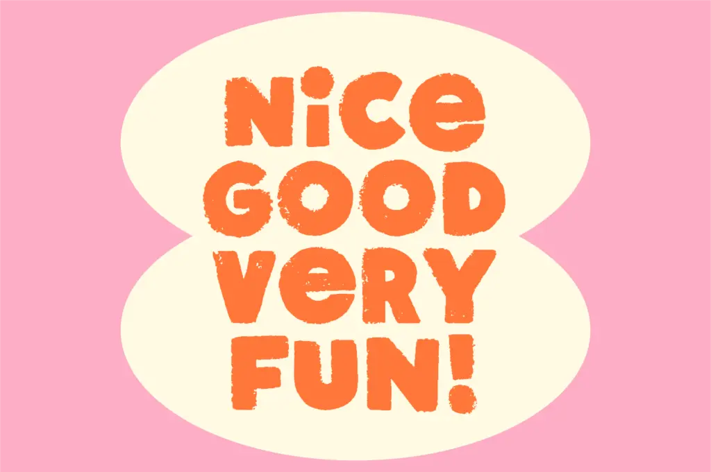
It suits brands and projects that want a handmade, slightly retro warmth: farmers’ market packaging, craft goods, small-batch product labels, greeting cards, playful event signage. It’s less suited to anything requiring a polished, corporate finish, or to long-form editorial layouts where unicase and heavy texture would fight against reading comfort. Used sparingly — a few words at large size, paired with a plainer supporting typeface for anything that needs to actually be read at length — it does its job well. Pushed into paragraphs or fine print, it will fight you.
What we liked, and what we didn’t
Strengths
- Alternates and ligatures genuinely reduce repetition in hand-lettered words
- Texture is built into the letterforms rather than applied as a surface effect
- Rounded, bouncy proportions keep it legible despite the distressed finish
Trade-offs
- Unicase design removes the option of case-based hierarchy in layouts
- Single style with no weight or italic options limits its range across a project
Super Curious is a charming, texture-heavy display font that does one job well: short, handmade-feeling headlines and logotypes with vintage print character. Its unicase structure and lack of a weight range limit how far it can stretch, so treat it as a specialist accent font rather than a workhorse.
Verdict

Tantype reviews typefaces in depth — every font is tested in real branding, editorial and screen layouts before a word gets written. 555+ fonts reviewed and counting.