
Soerip: a handdrawn Victorian-street display face for vintage branding
Design style
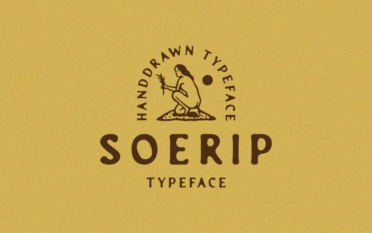
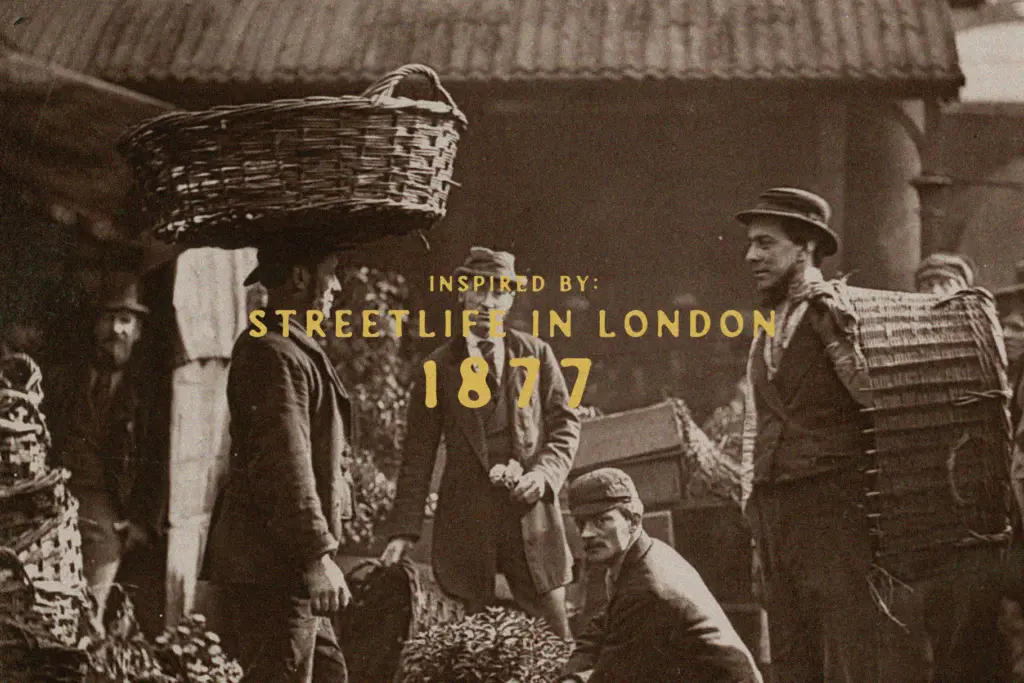
Soerip takes its cue from London street life in 1877, and it reads like the kind of lettering you’d find hand-painted above a shopfront or scratched onto a market crate. The strokes have the slight wobble and inconsistency of a brush or nib worked by hand rather than a ruler, and that irregularity is the whole point. Letters lean into each other unevenly, terminals taper off at odd angles, and the baseline drifts just enough to feel human rather than templated.
This is not a font built on geometric discipline. It’s built on gesture. Ascenders and descenders swing with some flourish, and the overall rhythm feels closer to sign-painting than typesetting. That gives it real personality at display sizes, but it also means the letterforms don’t sit quietly in a paragraph — they want room to be looked at individually, not scanned as continuous text.
Character set and features
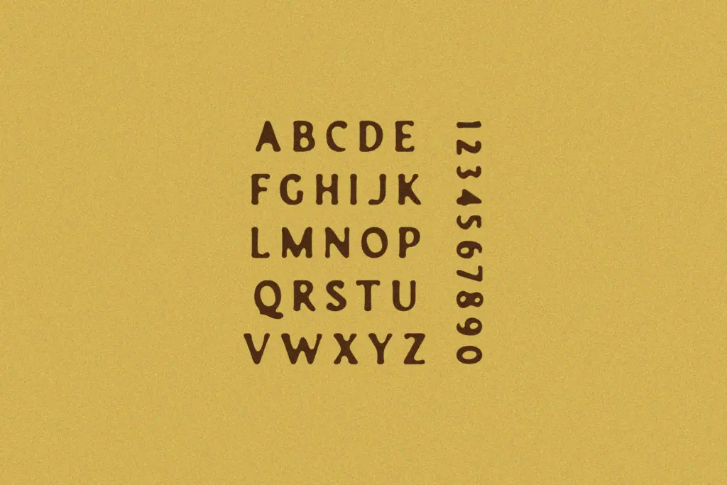
As a handdrawn display face, Soerip’s strength is in its texture rather than its technical range. The letters carry the kind of imperfection that’s hard to fake digitally — thick-to-thin transitions that don’t follow a mechanical pattern, and joins between strokes that look drawn rather than calculated. That irregularity is deliberate and it’s the reason the font has any character at all.
What the brief doesn’t tell us matters here too. There’s no indication of extended language support, alternate character sets, or a range of weights, so designers should treat this as a single-purpose display tool rather than a flexible family. If you need small caps, ligatures, or multiple weights to build out a full brand system, Soerip on its own won’t get you there — you’ll be pairing it with something more structured for supporting text.
Use cases
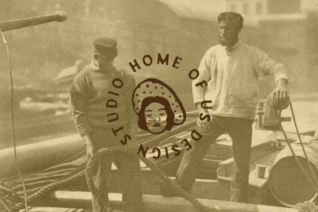
Soerip earns its keep at large sizes: headlines, logotypes, packaging labels, posters, and anywhere you want a Victorian street-market feel without reaching for a generic distressed serif. It suits craft breweries, heritage food packaging, vintage-themed event posters, and any branding project that wants to evoke a specific period rather than a generic sense of
What we liked, and what we didn’t
Strengths
- The irregular, hand-painted stroke quality gives it convincing period texture at large sizes.
- Strong fit for vintage and heritage branding without leaning on generic distressed effects.
- Works well as a standalone display or logotype element without needing heavy styling.
Trade-offs
- No indication of multiple weights or an extended character set, limiting flexibility across a full brand system.
- The handdrawn irregularity that gives it charm at display sizes makes it unreliable for anything approaching body copy.
Soerip is a competent handdrawn display face with real period character, best suited to headlines, logos and packaging rather than body text. It doesn't try to be a flexible family, and it shouldn't be judged as one — but that narrow focus is also its limit.
Verdict

Tantype reviews typefaces in depth — every font is tested in real branding, editorial and screen layouts before a word gets written. 555+ fonts reviewed and counting.