
Jalisco & Marlowe: a western display duo for artisan branding and labels
Design style
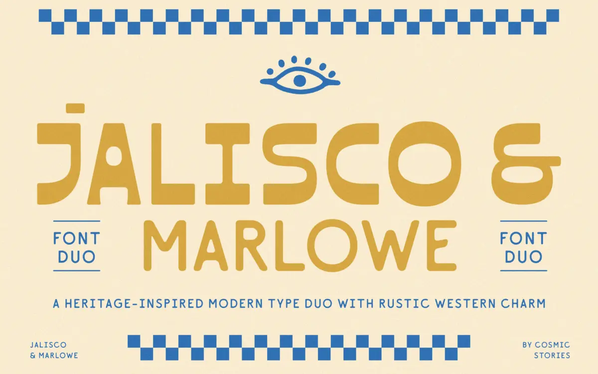
Jalisco is the headline act here, a bold all-caps display face that leans on high-contrast strokes and a rhythm borrowed from old sign painting and western letterforms. It’s a sans, but it doesn’t read like one at first glance — the contrast between thick and thin strokes does the work a serif would normally do, giving it that hand-painted, saloon-sign feel without actually carrying serifs. The rhythm is deliberately uneven in places, which reads as handcrafted rather than sloppy, though it means Jalisco needs room to breathe. Marlowe, the companion sans, is the quieter half: rounded terminals, soft geometry, no pretensions to western flavour. It’s built to sit underneath Jalisco without competing with it, which is exactly what a companion face should do.
The pairing works because the two faces don’t try to occupy the same register. Jalisco supplies personality and weight; Marlowe supplies calm and readability. That division of labour is the strongest design decision in the set.

Character set and features
Jalisco carries a set of discretionary ligatures and stylistic alternates, which matter more than they might on a subtler face — swapping a letterform here and there is often what separates a label that looks custom-drawn from one that looks like it was typed. The alternates give enough variation to break up repeated letters in short words like brand names, which is exactly where all-caps display faces usually get monotonous. Multilingual support across Western, Central and Eastern European character sets is a genuine practical plus if you’re working for a client base outside the English-speaking market — it’s not a flashy feature but it saves headaches down the line.
Marlowe’s job is to stay out of the way, and it mostly does. It’s legible at smaller sizes, which is the whole point of a companion face, though it doesn’t have much character of its own to speak of — it’s a support player, not a face you’d reach for on its own merits.
Use cases
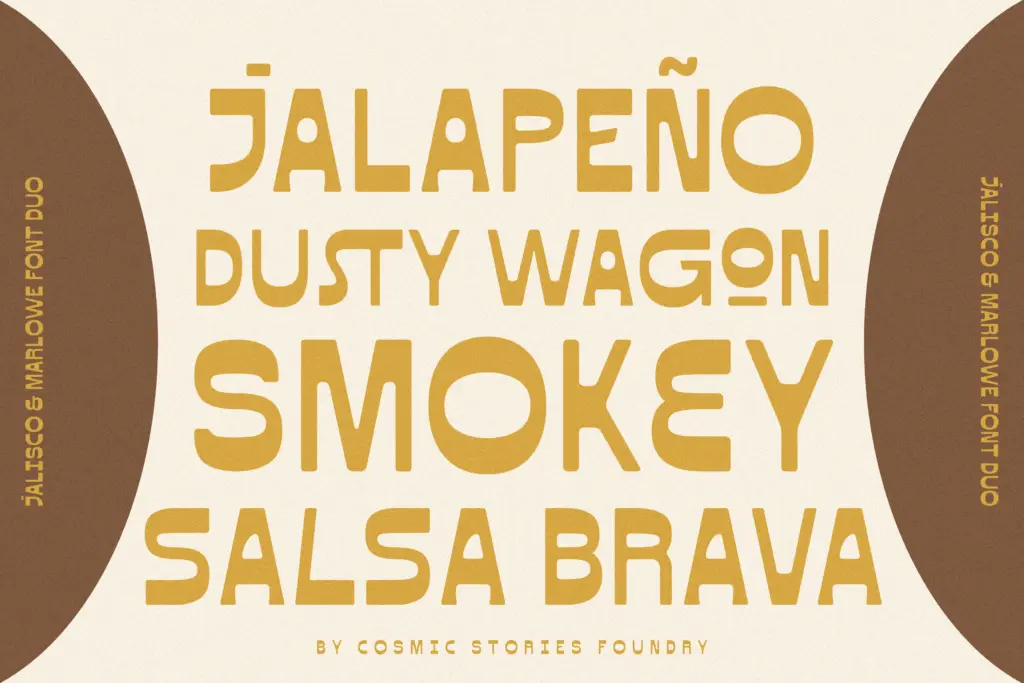
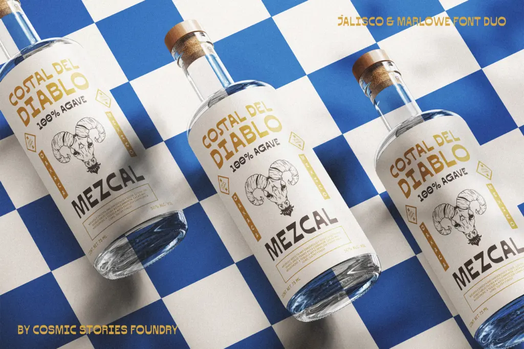
This duo is built for a fairly specific lane: craft beverage labels, boutique packaging, rustic or western-flavoured branding, and any project that wants a sun-bleached, artisanal look without going full cowboy-kitsch. Jalisco on its own works well as a wordmark or a short headline — a beer label, a market stall sign, a menu header. Push it into long copy and the contrast and rhythm that make it interesting at display size start to work against readability; it’s not built for paragraphs, and it shouldn’t be asked to do that job.
Marlowe picks up where Jalisco leaves off — body copy, subheads, ingredient lists, the practical text a label or package still needs. Used together they cover a full packaging or branding system without requiring a third typeface for the small print.
Outside that lane, the fit gets narrower. A tech startup or a minimalist editorial spread has no real use for Jalisco’s western signalling, and Marlowe alone is pleasant but unremarkable enough that it wouldn’t be a first choice divorced from its partner. Buyers should go in knowing this is a themed set, not a general-purpose family — which is fine, as long as the theme matches the brief.
What we liked, and what we didn’t
Strengths
- Jalisco's stylistic alternates and ligatures give short wordmarks genuine variation instead of repetitive letterforms
- The contrast-driven, sign-painted feel of Jalisco reads as crafted rather than gimmicky at display sizes
- Multilingual character support across European languages adds practical reach beyond English-only branding
Trade-offs
- Jalisco's rhythm and contrast that work at display size become fatiguing in anything longer than a few words
- Marlowe is a competent but fairly generic companion sans with little character of its own outside the pairing
Jalisco & Marlowe is a themed pairing that does one job well: western-flavoured, artisanal branding and packaging. Jalisco carries the personality with real craft in its contrast and alternates, while Marlowe quietly handles the small print. It's not a general-purpose family, and buyers should know that going in, but within its lane it's a solid, well-considered set.
Verdict

Tantype reviews typefaces in depth — every font is tested in real branding, editorial and screen layouts before a word gets written. 555+ fonts reviewed and counting.