
Sweet Lemonade: a tall retro sans built for ligature-heavy logotypes
Design style
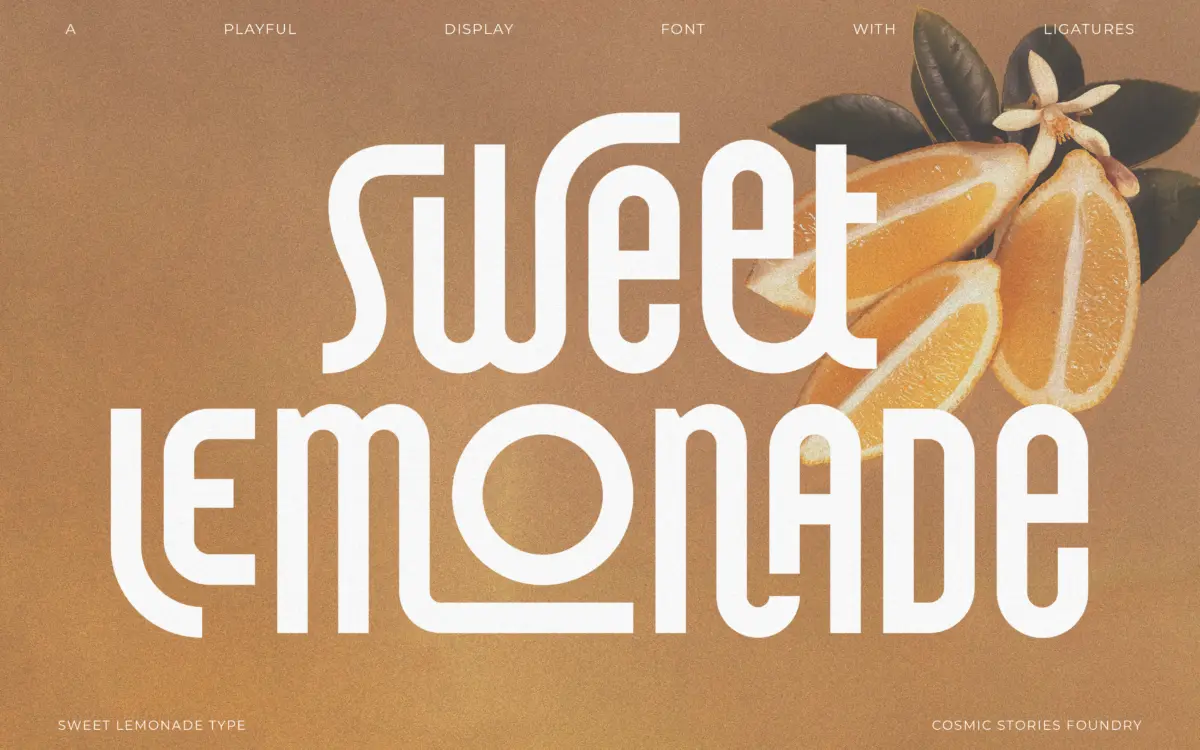
Sweet Lemonade is a condensed, tall-set sans with a retro lean rather than a full period pastiche. The letters are narrow and upright, with a bounce that comes less from slant and more from small inconsistencies in curve and terminal treatment — a rounded stroke end here, a flat one there. It reads as a display face built around a mood board of mid-century packaging and hand-lettered signage, translated into something clean enough to sit in a vector file without looking like a scan.
The x-height is generous relative to the cap height, which keeps lowercase-heavy settings from feeling too spindly despite the narrow proportions. Weight is on the heavier side throughout, so the face holds its own at small display sizes even where the condensed width would normally start to choke the counters. It’s not a subtle typeface. It wants attention, and the drawing is confident about that rather than apologetic.
Character set and features
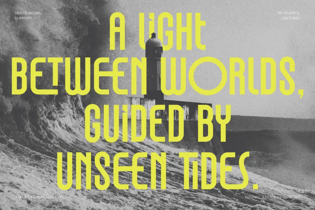
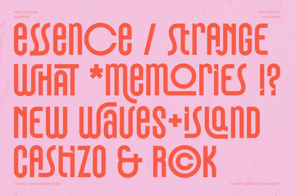
The headline feature is the ligature set — 125-plus of them, which is a genuinely large number for a display font and suggests the designer thought hard about common letter pairings rather than bolting on a handful of decorative swashes. In practice this means the face can produce connected, flowing wordmarks without the designer having to hand-kern every join, which is the whole point of a ligature-driven font: it does the flourish work so you don’t have to fake it in Illustrator.
The trade-off is that ligatures this extensive only pay off if you actually access them through OpenType features, and a font like this lives or dies on whether the software you’re using supports discretionary ligatures properly. In a basic text box in Canva or an app without OpenType support, you’ll get the base letterforms and none of the personality that’s supposedly the selling point. That’s worth knowing before you commit a brand identity to it.
Multilingual support across Western, Central and Eastern European character sets is a genuine practical plus — it means the font isn’t limited to English-only branding work, which matters more than it sounds for anyone doing European client work. Format coverage (OTF, TTF, WOFF, WOFF2) covers both print and web use without extra conversion.
Use cases
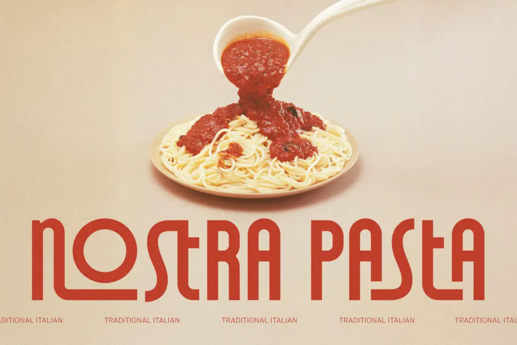
This is a logotype and headline font first, and everything else second. Short words, brand names, packaging headers, poster titles — situations where you’re setting three to eight characters and want them to feel considered rather than typed. The ligatures are most useful here, where you can hand-pick which connections to trigger and adjust spacing around them.
It is not a font for body copy, subheads longer than a few words, or anything that needs to sit quietly in a paragraph. The condensed width and heavy weight get fatiguing fast in longer strings, and the personality that makes it work as a logotype becomes noise at sentence length. Treat it as a single-purpose display tool: reach for it when you need one confident, retro-flavoured word on a label or a header, not when you need a flexible family that scales across a whole layout.
What we liked, and what we didn’t
Strengths
- Large, genuinely useful ligature set for building custom logotype connections
- Heavy weight keeps the narrow letterforms legible at small display sizes
- Multilingual character support extends it beyond English-only branding work
Trade-offs
- Ligature benefits disappear in software without proper OpenType feature support
- Condensed proportions and heavy personality make it unsuitable for anything beyond short headline text
Sweet Lemonade is a confident, tall condensed display sans whose real asset is its large ligature set, useful for building connected, characterful logotypes. It's a one-job typeface — great for short branding marks and headlines, poor for anything longer — and its best feature only shows up if your software actually supports OpenType ligatures.
Verdict

Tantype reviews typefaces in depth — every font is tested in real branding, editorial and screen layouts before a word gets written. 555+ fonts reviewed and counting.