Sans Serif
3.6
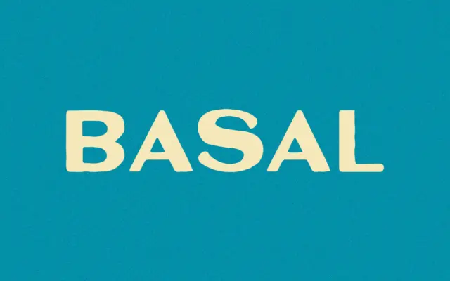
Basal: a bold, bottle-inspired sans for rugged, stripped-back branding
Design style Basal is a bold sans with a blunt, condensed-adjacent posture that reads more like a stencil-plate mark than…
 Tantype

Sans serif fonts do the modern heavy lifting: clean lines, screen-friendly clarity and versatility from interfaces to signage. Browse our sans serif reviews — geometric, grotesque and humanist faces — each with a verdict, use cases and a download link.
Design style Basal is a bold sans with a blunt, condensed-adjacent posture that reads more like a stencil-plate mark than…
Tantype
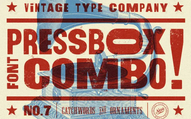
Design style PressBox belongs to the well-worn tradition of American wood-type revival: thick, confident sans-serif letterforms that lean on the…
Tantype
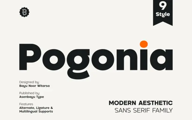
Design style Pogonia sits in the well-populated territory between geometric construction and humanist warmth, a combination that has become the…
Tantype
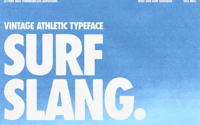
Design style Surf Slang is a bold, condensed sans built for shouting rather than reading. The letterforms are tall and…
Tantype
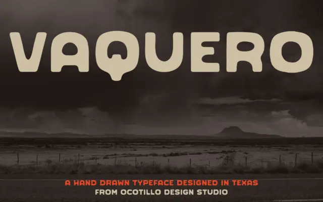
Design style Vaquero sits in that stretch of the display market where sans serif construction meets frontier signage. The letters…
Tantype
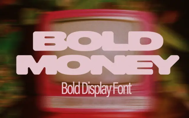
Design style Bold Money is a display-only, all-caps typeface built around one idea: letters that appear to be dripping or…
Tantype
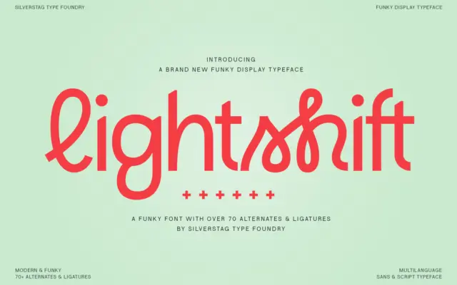
Design style Lightshift sits in that crowded corner of type design where sans-serif geometry gets loosened up with script-style connections.…
Tantype
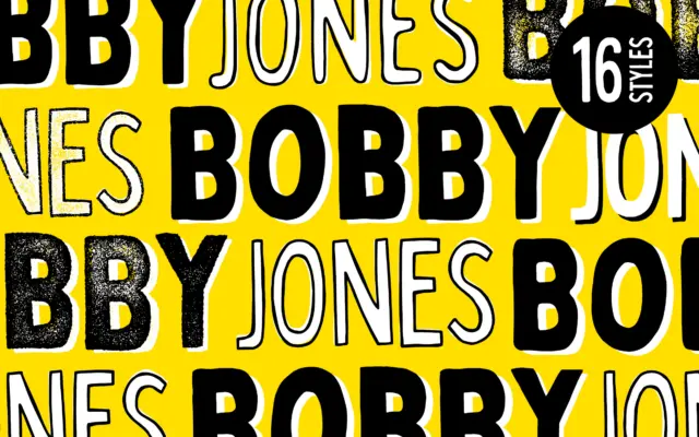
Design style Bobby Jones is a chunky, hand-built sans built on the idea that imperfection is the point. The strokes…
Tantype
Design style Qualy is a geometric sans reduced to its bare structural bones. Circles read as circles, verticals are dead…
Tantype