
Thorn & Thistle Sans: a hand-drawn sans with three finishes for rustic branding
Design style
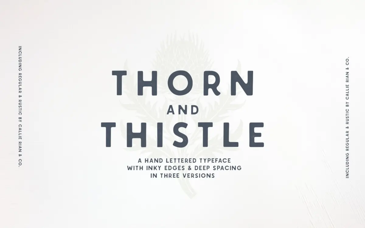
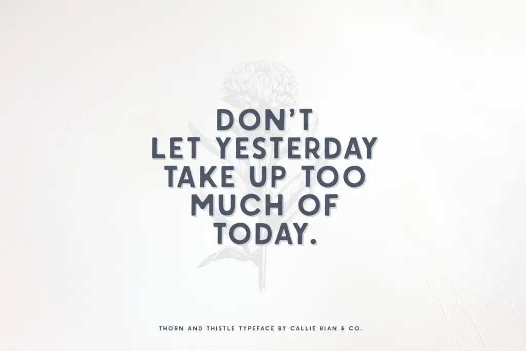
Thorn & Thistle is a hand-drawn sans with a deliberately imperfect hand. The baseline wavers slightly, corners round and catch ink, and strokes thicken and thin in a way that reads as drawn rather than constructed. It comes in three versions: Regular, which keeps the roughness subtle and controlled; Rustic, which pushes the eroded, textured edge further so letters look worn or stamped; and Shadowed, which adds a drop or layered shadow for a dimensional, signage-like effect.
This is a family built around a single mood — weathered, handmade, a little rough around the edges — rather than one offering range through weight or width variation. There’s no indication of a bold or light cut, so what you see across the three versions is the same letterform treated three different ways. That’s a reasonable approach for a display face with a specific brief, but it means the family does one job well rather than several jobs adequately.
Character set and features
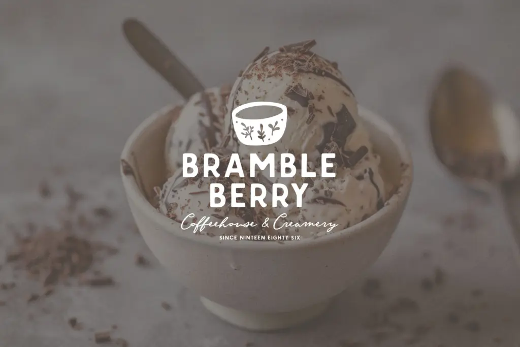
The set covers Western European language support, so accented characters for French, German, Spanish and similar are included, which matters if you’re working across European markets. Beyond that, the brief doesn’t specify ligatures, alternates, or stylistic sets, so I’d treat this as a straightforward character set without the swash or alternate-letter flexibility some hand-lettered faces offer.
The inclusion of a separate Vectors file in AI and EPS is worth noting — these are illustration elements rather than font glyphs, useful for anyone building labels, badges, or packaging where a few decorative marks round out the typography. Because the letterforms are hand-drawn, edges are irregular by design; the seller notes the Regular version is compatible with cutting machines like Circuit or Silhouette, but advises against trying to cut the Rustic version, which gives a sense of how much more broken-up that cut is at the edges.
Use cases
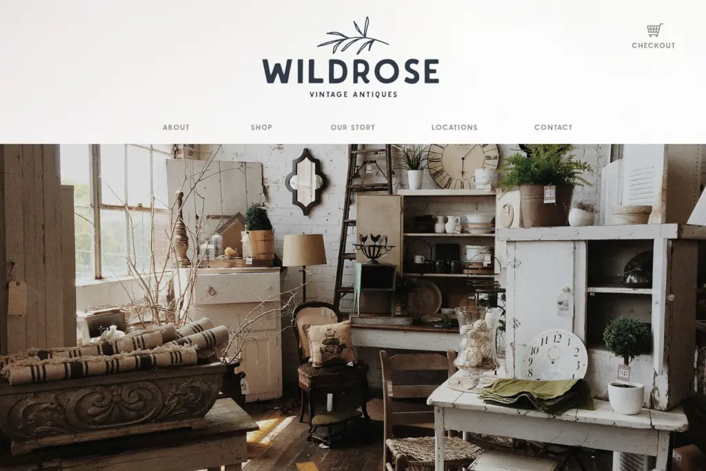
At headline and display sizes — logos, packaging fronts, posters, magazine mastheads — the texture and hand-drawn wobble read as intentional and give the kind of rustic, handmade warmth that clean geometric sans faces can’t fake. The Shadowed version in particular suits badge-style branding: craft goods, farm-to-table packaging, outdoor and western-adjacent brands, anything leaning into a worn, authentic feel rather than polish.
It is not a text face. The irregular edges and drawn quality that work at large sizes will blur and lose definition in paragraph-length copy, so don’t expect to set body text in it. Pair it with a clean, neutral sans or serif for supporting text and reserve Thorn & Thistle for the words that need presence — a product name, a headline, a logotype. Used that way, across its three versions, it gives a project enough textural variety to avoid feeling like it’s reusing the same asset twice.
What we liked, and what we didn’t
Strengths
- Three distinct finishes (Regular, Rustic, Shadowed) give real textural variety from one letterform.
- Western European language support extends its use beyond English-only branding work.
- Bundled vector illustration files add decorative options beyond the typeface itself.
Trade-offs
- No weight or width variation, so the family is limited to one mood rather than a flexible system.
- The irregular, hand-drawn edges make it unsuitable for anything beyond short, large-scale display text.
Thorn & Thistle does one thing — rustic, handmade display lettering — across three related finishes, and does it with a consistent, controlled hand. It's not built for text setting or for projects needing a range of weights, but for logos, packaging and headline work with a worn, craft feel, it delivers exactly what it promises.
Verdict

Tantype reviews typefaces in depth — every font is tested in real branding, editorial and screen layouts before a word gets written. 555+ fonts reviewed and counting.