
Poina: an all-caps ligature sans for beauty and fashion branding
Design style
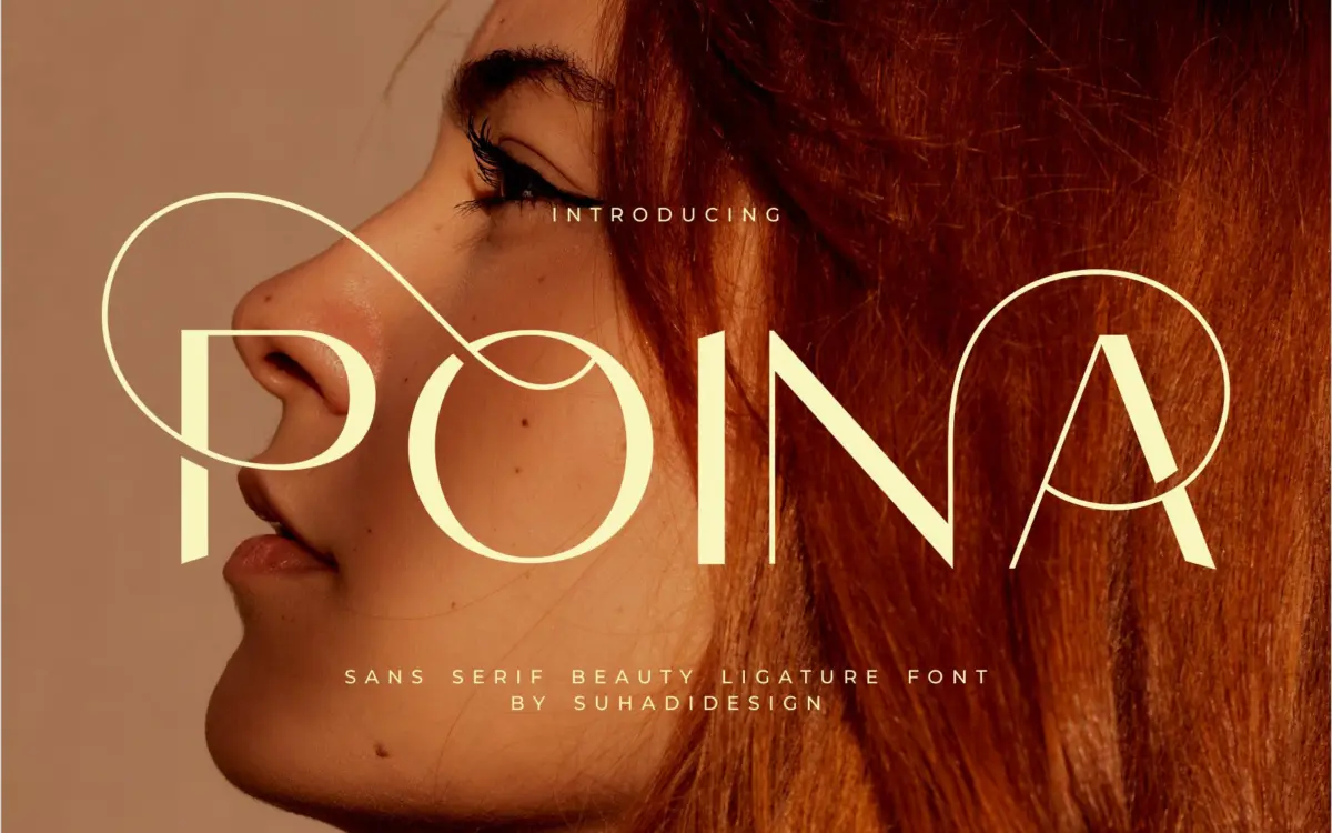
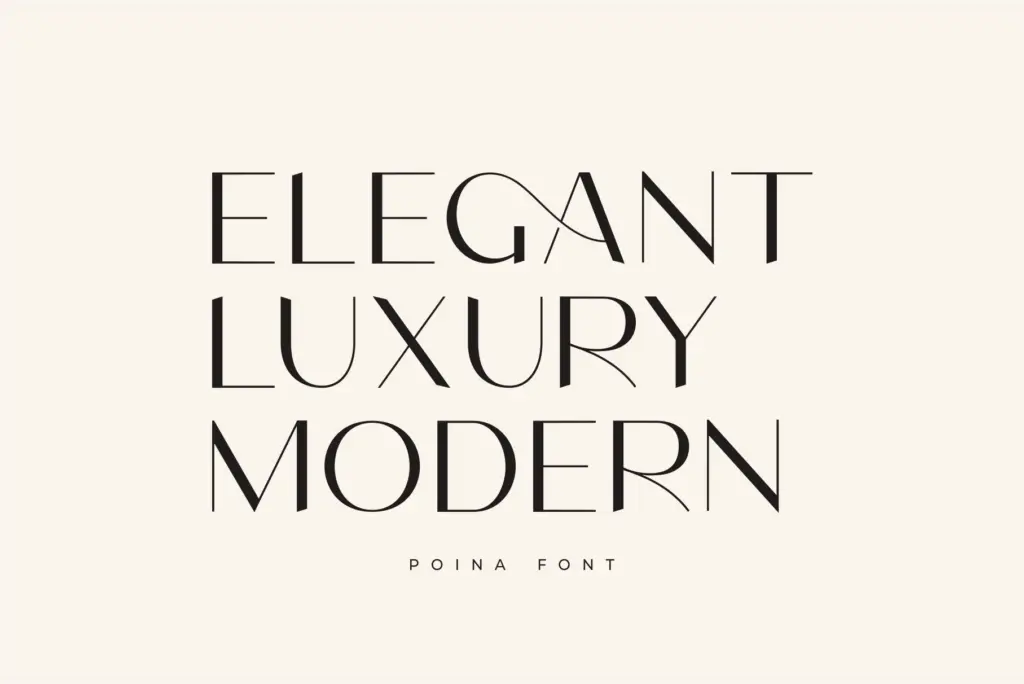
Poina is a display sans built around a single case. There’s no lowercase here — every letter is drawn as a capital, and the personality of the font lives in how those capitals connect. Strokes are even in weight with a light touch of taper at the joins, which keeps the overall texture calm rather than mechanical. The counters are open, the letters are set fairly wide, and the ligatures do the work of softening what would otherwise be a rigid, blocky rhythm.
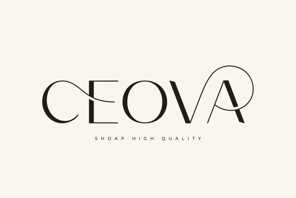
The ligature pairs are the actual selling point. Instead of just kerning letters closer, Poina swaps in connected forms for common combinations, so a word reads less like stacked capitals and more like a single continuous mark. This is the same trick you see in a lot of beauty and fashion branding lettering right now — capitals that behave like a logotype rather than a paragraph font. It’s a style choice, not an accident, and it’s drawn with a reasonably steady hand: the joins don’t look tacked on, and the weight stays consistent through the ligature transitions, which is where a lot of fonts in this genre fall apart.
Character set and features
The set covers full capitals, numerals, and standard punctuation, with multilingual support extending the character range beyond basic Latin. The ligature set is the feature that needs a competent hand at the keyboard — these substitutions typically need to be triggered through OpenType features in software that supports them, so anyone pasting text into a program without ligature support will just get plain capitals with no connections. Worth checking your workflow before committing a layout to it.
Because there’s no lowercase, there’s no true text-setting mode to fall back on. Everything set in Poina reads as a headline, a name, or a mark — which is exactly the intended use, but it does mean the font can’t flex into body copy or long-form captions the way a font with a full weight range and lowercase set could. It’s a specialist tool, and it knows it.
Use cases
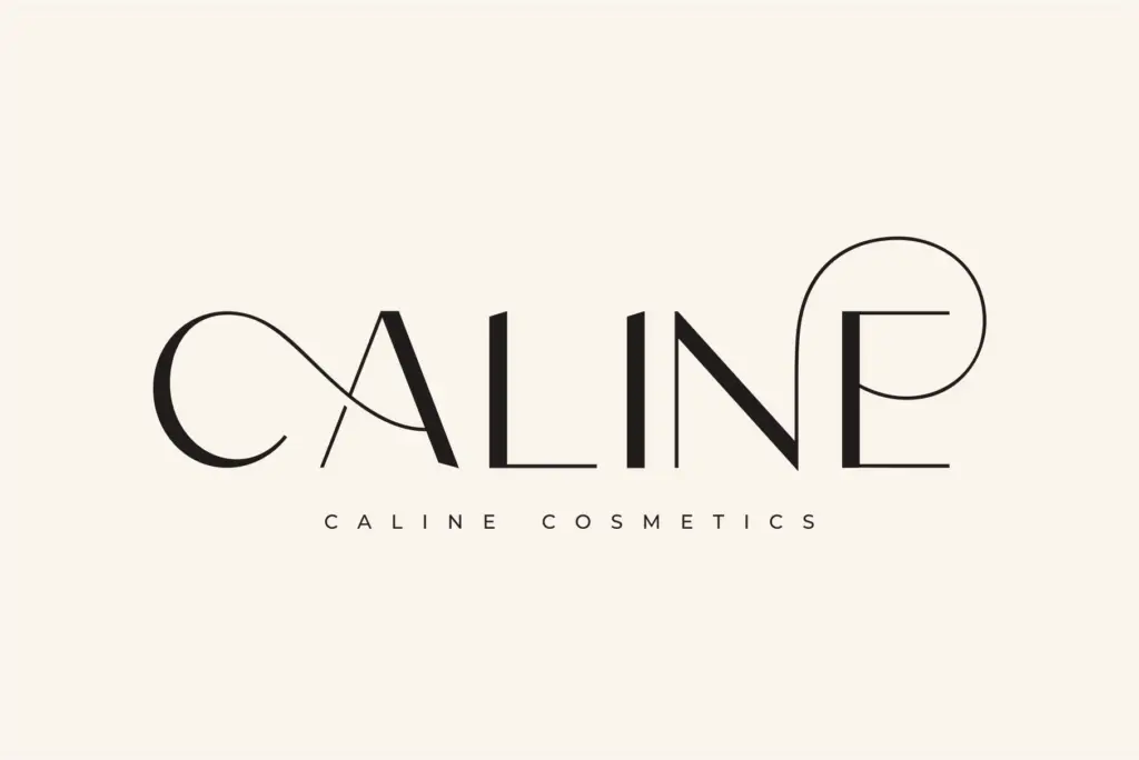
This is a font for short strings: a brand name, a product label, a monogram, a one-line headline on a beauty or fashion landing page. The ligatures make it especially suited to wordmarks where the whole name needs to read as one connected shape — packaging for cosmetics, perfume labels, boutique clothing tags, that kind of thing. It also does reasonable work as an Instagram-post headline or a magazine cover line, where a short burst of styled capitals is the whole job.
It’s less useful anywhere you need paragraphs, lists, or mixed-case emphasis — invitations with running text, editorial body copy, anything that needs a lowercase to feel natural. Pair it with a plain sans or serif for supporting text rather than asking it to do double duty. Used within its lane — short, branded, capital-only lockups — it does what it sets out to do without overcomplicating the job.
What we liked, and what we didn’t
Strengths
- Ligature joins are drawn evenly, without the weight wobble common in this genre.
- Wide, open capitals give it a confident presence as a standalone wordmark.
- Well suited to short-format branding: labels, tags, monograms, social headlines.
Trade-offs
- No lowercase means it can't function as a body or caption font.
- Ligature effects depend on OpenType support, so results vary by software.
Poina is a competent, single-purpose display font: capitals-only, ligature-driven, built for short branded strings rather than paragraphs. It does the wordmark job it's designed for cleanly, but the lack of a lowercase and the reliance on OpenType ligature support narrow its practical range considerably.
Verdict

Tantype reviews typefaces in depth — every font is tested in real branding, editorial and screen layouts before a word gets written. 555+ fonts reviewed and counting.