
TBJ Orcherum: a sans with ligature flourishes for logotype work
Design style
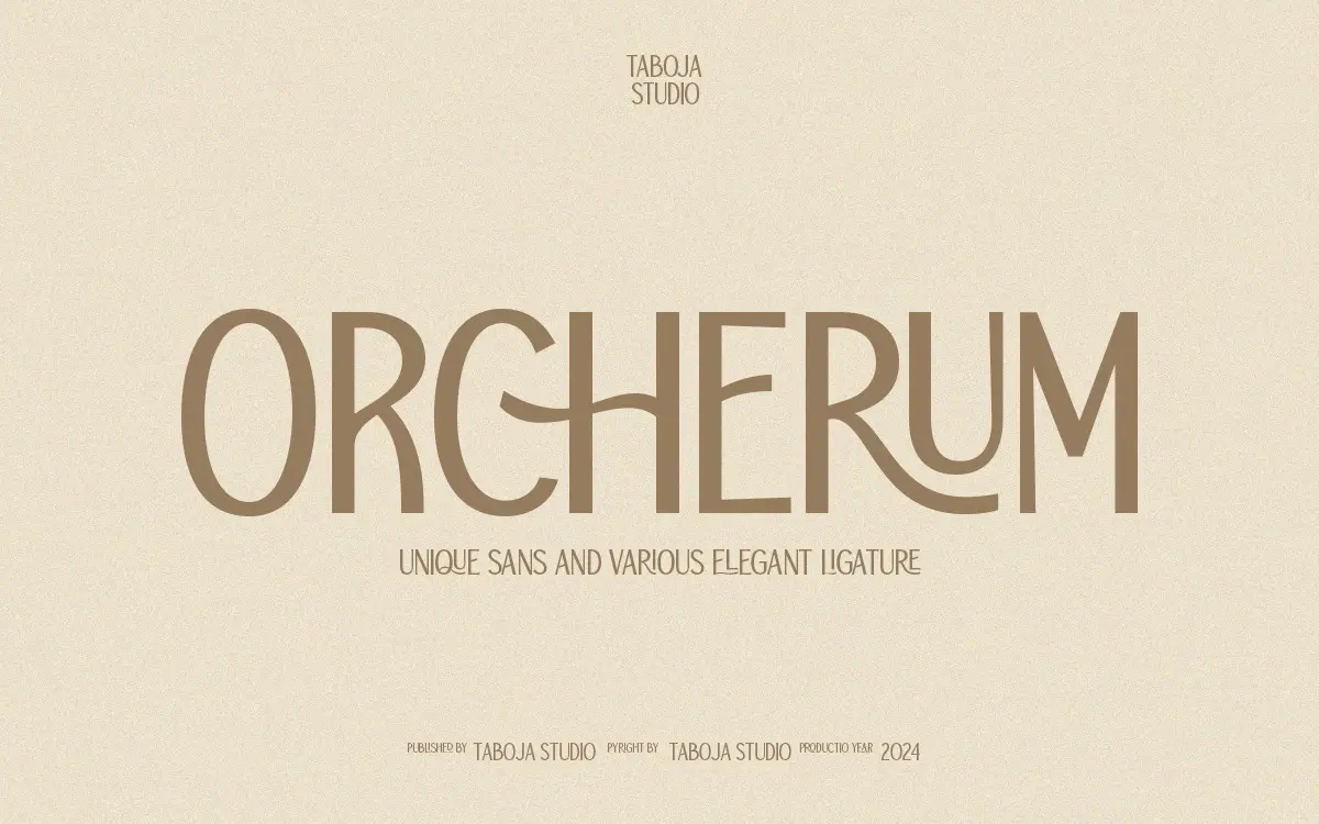
TBJ Orcherum sits in a category of sans serifs that borrow gestures from script and serif traditions to give a plain skeleton some personality. The core letterforms are fairly conventional geometric sans shapes — even stroke weight, low contrast, rounded terminals — but the design earns its keep through the connecting ligatures and alternate characters layered on top. Where it departs from a standard grotesque is in the joins: certain letter pairs link with a small swash or curved bridge, which gives set words a handwritten cadence even though the underlying letters are upright and mechanical.
This split personality is the whole pitch. On its own, a single letter of Orcherum reads as unremarkable sans construction. In combination, using the ligature set, it starts to look closer to a monoline script pretending to be a sans. That’s a legitimate design idea, but it means the typeface’s identity lives almost entirely in its OpenType features rather than in the base letterforms. Turn the ligatures off and you’re left with a font that’s pleasant but forgettable.
Character set and features
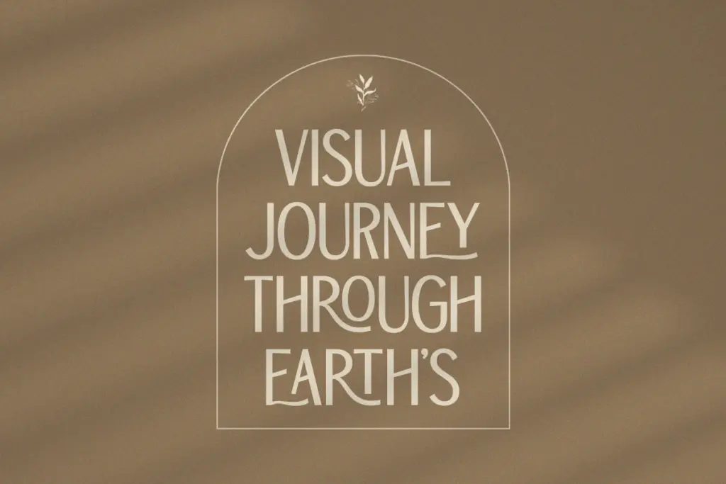
The family includes uppercase and lowercase, numerals and punctuation, accented characters for wider language coverage, and a set of alternates and ligatures accessed through OpenType features or a glyphs panel. It’s PUA-encoded, which is the usual workaround for getting non-standard glyphs to display in apps that don’t fully support OpenType — useful, but it also means you’re dependent on software that exposes those panels. Word processors and basic design tools generally won’t get you there; you need Illustrator, InDesign, Photoshop or CorelDraw to see the alternates and ligatures Orcherum was actually built to showcase.
That’s a real constraint worth flagging before you buy. If your workflow is mostly Canva, PowerPoint, or a CMS text field, you’ll likely end up with the plain default glyphs and none of the ligature work that justifies the font’s name. Anyone comfortable in a proper design app will have no trouble accessing the extras, but it does mean the typeface rewards a specific kind of user.
Use cases
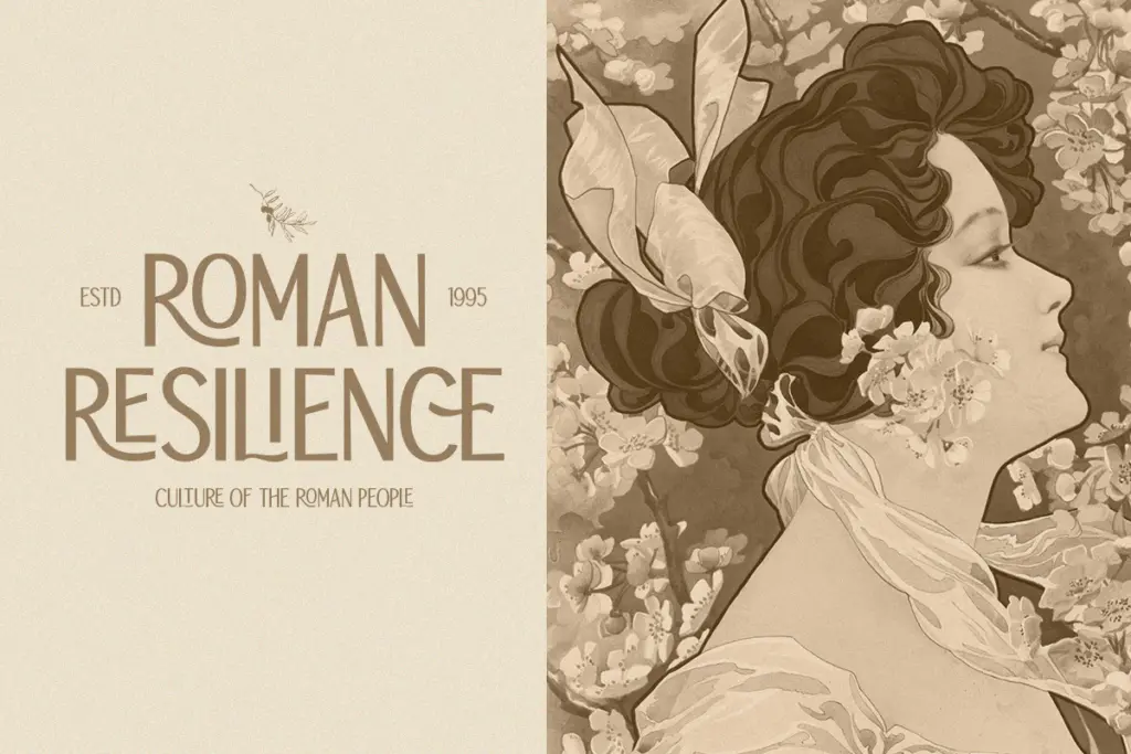
Orcherum is built for short-form, high-visibility text: logotypes, wordmarks, headline treatments on packaging, title cards, poster type. The ligatures do the most work at larger sizes where a viewer can actually register the connecting strokes; shrink it down to body copy and those details either disappear or start to look like noise. This is not a font for paragraphs — there’s no indication it was built with reading comfort at small sizes in mind, and the alternates would be wasted there anyway.
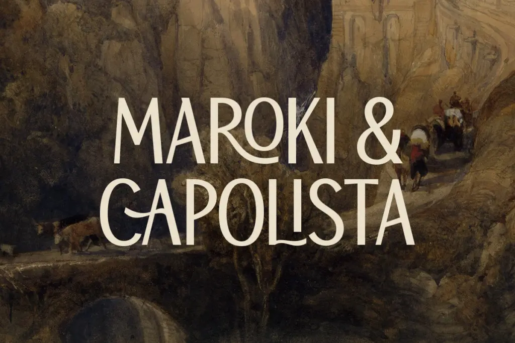
Where it’s strongest is in branding contexts where a client wants something between a script and a sans — softer than a pure geometric wordmark, but without committing to full cursive connection. Social graphics, editorial mastheads, and short display lines for print collateral are reasonable homes for it. It’s less suited to anything requiring long-form setting, dense multilingual text at small point sizes, or contexts where the software can’t expose OpenType alternates — in those situations you’re just buying a plain sans.
What we liked, and what we didn’t
Strengths
- Ligatures and alternates give an otherwise plain sans a distinct handwritten-connector look at display sizes
- Accented characters and multilingual support broaden its use beyond English-only branding work
- Clear, even base letterforms that hold up fine as a fallback sans when features aren't needed
Trade-offs
- The design's personality depends almost entirely on OpenType features, so software without a glyphs panel shows only a generic base font
- Not built for small-size or paragraph setting, limiting it to headline and logotype use
TBJ Orcherum is a competent geometric sans whose real appeal lives entirely in its ligature and alternate glyphs, which need a proper OpenType-aware app to access. It's a solid pick for short logotypes and display headlines but offers little once you're setting body copy or working in software without a glyphs panel.
Verdict

Tantype reviews typefaces in depth — every font is tested in real branding, editorial and screen layouts before a word gets written. 555+ fonts reviewed and counting.