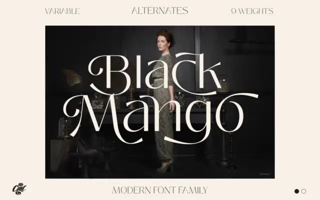
Black Mango: a 9-weight sans built for branding and web work
Design style Black Mango is a low-contrast grotesque-leaning sans that plays it straight rather than chasing personality. The letterforms are…
Sans serif fonts do the modern heavy lifting: clean lines, screen-friendly clarity and versatility from interfaces to signage. Browse our sans serif reviews — geometric, grotesque and humanist faces — each with a verdict, use cases and a download link.
Design style Black Mango is a low-contrast grotesque-leaning sans that plays it straight rather than chasing personality. The letterforms are…
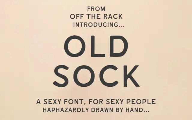
Design style Old Sock is a hand-drawn sans built around the wobble of old painted shopfronts and weathered signwriting. The…
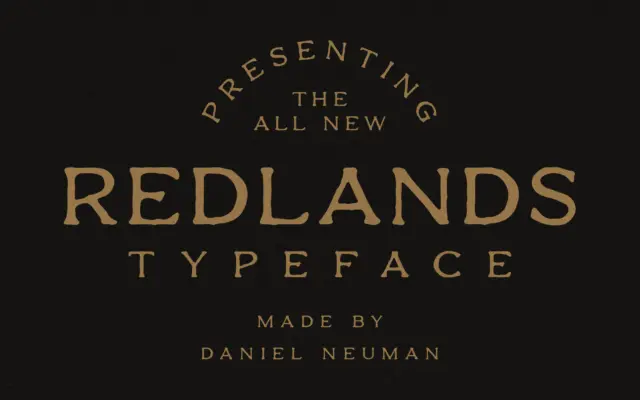
Design style Redlands is a display sans with a frontier-badge attitude, built as a duo: a Regular cut with smooth,…
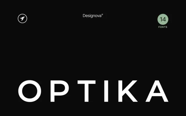
Design style Optika sits squarely in the grotesque-revival lane that has dominated branding work for the past decade: tight apertures,…
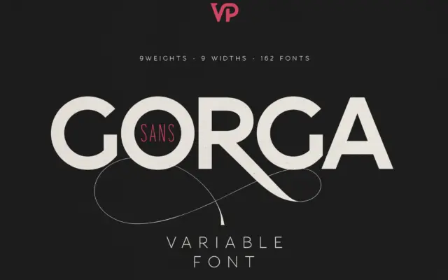
Design style Gorga Sans sits in familiar territory for a large-scale grotesque system: even stroke contrast, closed apertures, a fairly…
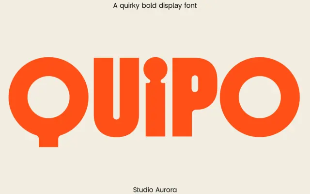
Design style Quipo is a chunky display sans built for close-up impact. The strokes are thick and rounded, with corners…
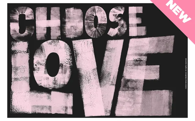
Design style Choose Love is a bold sans built from cardboard cutouts and an ink brayer, then scanned and turned…
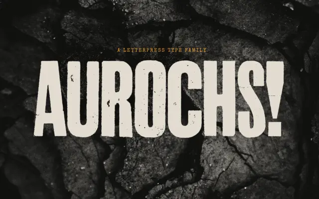
Design style Aurochs is a display sans drawn from scans of old letterpress and woodblock capitals, and it wears that…
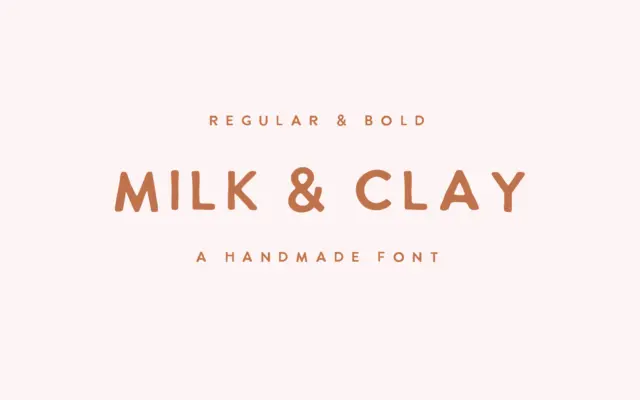
Design style Milk & Clay sits in the loose, hand-drawn sans category that’s become a staple of small-brand branding: unjoined…