
Clio: A Restrained Display Sans for Clean, Elegant Branding

Design style
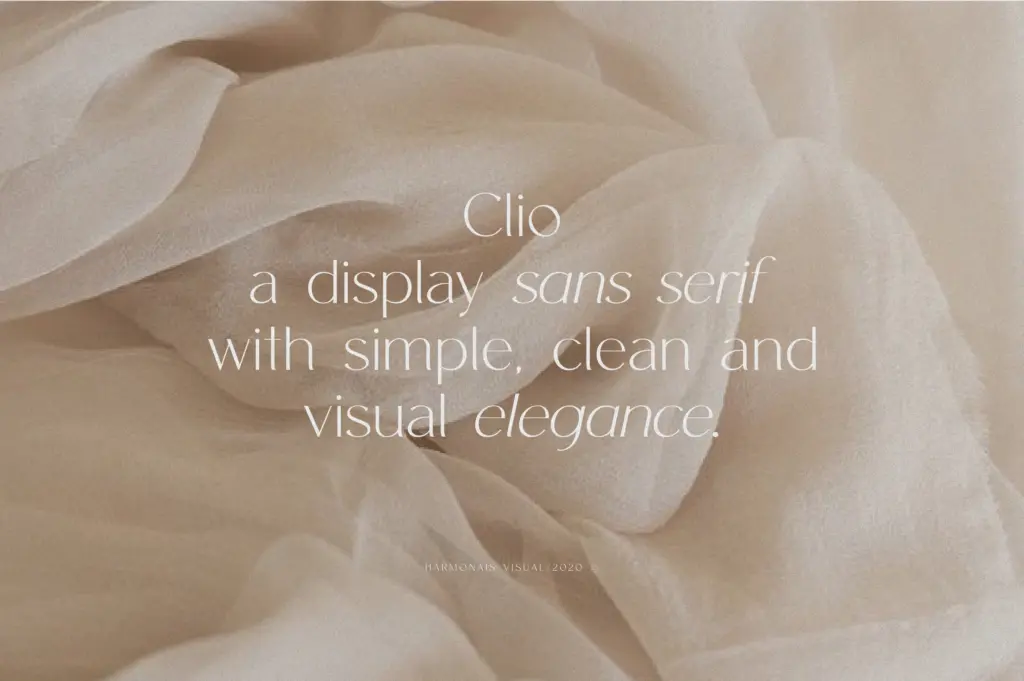
Clio is a display sans built around restraint. The letterforms favour low contrast, even stroke weight, and a narrow set of proportions that keep the whole alphabet visually quiet. There’s nothing eccentric in the skeleton — no exaggerated ascenders, no flared terminals — which is exactly the point. This is a typeface designed to sit back and let layout and whitespace do the talking.
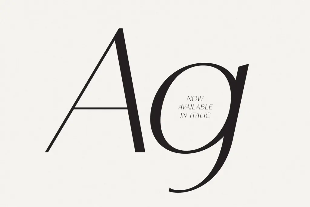
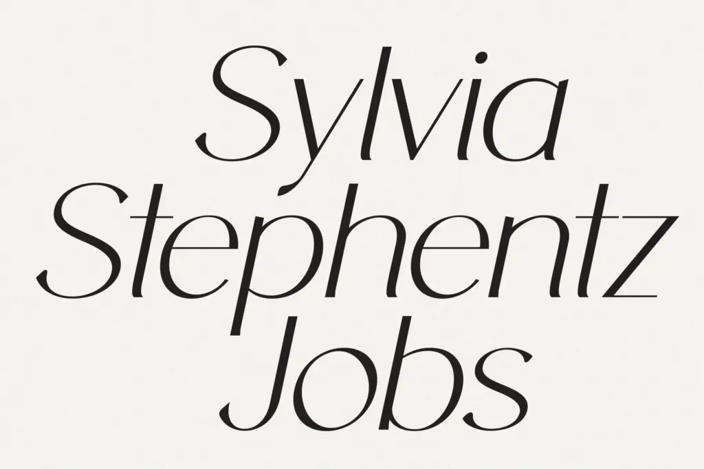
Where it earns its keep is in the details that don’t announce themselves at first glance: the slight narrowing of counters, the consistent x-height, the way curves meet stems without any visible correction. It reads as considered rather than default. The italic, added in a later update alongside a remastered regular, leans more cursive than a simple oblique, giving the family a second register for contrast without introducing a different voice entirely.
The trade-off is that Clio doesn’t have a strong signature. Put it next to a dozen other clean geometric-adjacent sans faces at a glance and it won’t immediately separate itself. That’s a fair price for versatility, but designers looking for a display face with a distinct personality of its own may find it too well-behaved.
Character set and features
The set covers the Latin alphabet with support described as spanning European languages, so accented characters for most Western and Central European languages should be present, though buyers with less common diacritic needs should check the glyph set directly. Standard ligatures are included, and the seller notes these need an OpenType-aware application — Illustrator’s Glyphs panel is specifically called out — to access the full set, which is a reasonable heads-up for anyone expecting ligatures to fire automatically in every app.
Spacing is even enough that tracking adjustments are minimal at display sizes, and the ligatures function more as a finishing touch than a structural feature — useful for a wordmark or a title treatment, less relevant for body copy. There’s no mention of small caps, alternates, or an extended weight range, so treat this as a two-style family (regular and italic) rather than a full system.
Use cases
Clio’s natural home is short-form, display-scale type: logotypes, headline treatments, packaging lockups, editorial mastheads. Its clean geometry and even colour make it a dependable choice for lifestyle branding, minimalist packaging, and magazine titling where the goal is legibility with a touch of polish rather than typographic drama.
It’s less suited to long-form text. Without a range of weights or optical sizes, setting body copy in Clio will feel thin and undifferentiated at small sizes — this is a headline tool, not a text family. For a logo, a title card, or a short line of packaging copy, it does its job cleanly and gets out of the way, which for a lot of branding work is precisely what’s needed.
What we liked, and what we didn’t
Strengths
- Even, low-contrast letterforms that keep layouts calm and legible at display sizes
- Italic companion adds a useful secondary register without breaking the family's voice
- Standard ligatures give logotypes and short headlines a finished, connected feel
Trade-offs
- Only two styles are included, so there's no depth for larger typographic systems
- The design is clean but not distinctive, making it easy to overlook next to similar sans faces
Clio is a competent, quiet display sans that does its job in logos and headlines without drawing attention to itself. It lacks a strong personality and a broader weight range, so it won't be the right choice for projects needing typographic range or drama, but for clean lifestyle branding it's dependable.
Verdict

Tantype reviews typefaces in depth — every font is tested in real branding, editorial and screen layouts before a word gets written. 555+ fonts reviewed and counting.