
Sink: a bold retro sans with softened edges for headlines and packaging
Design style
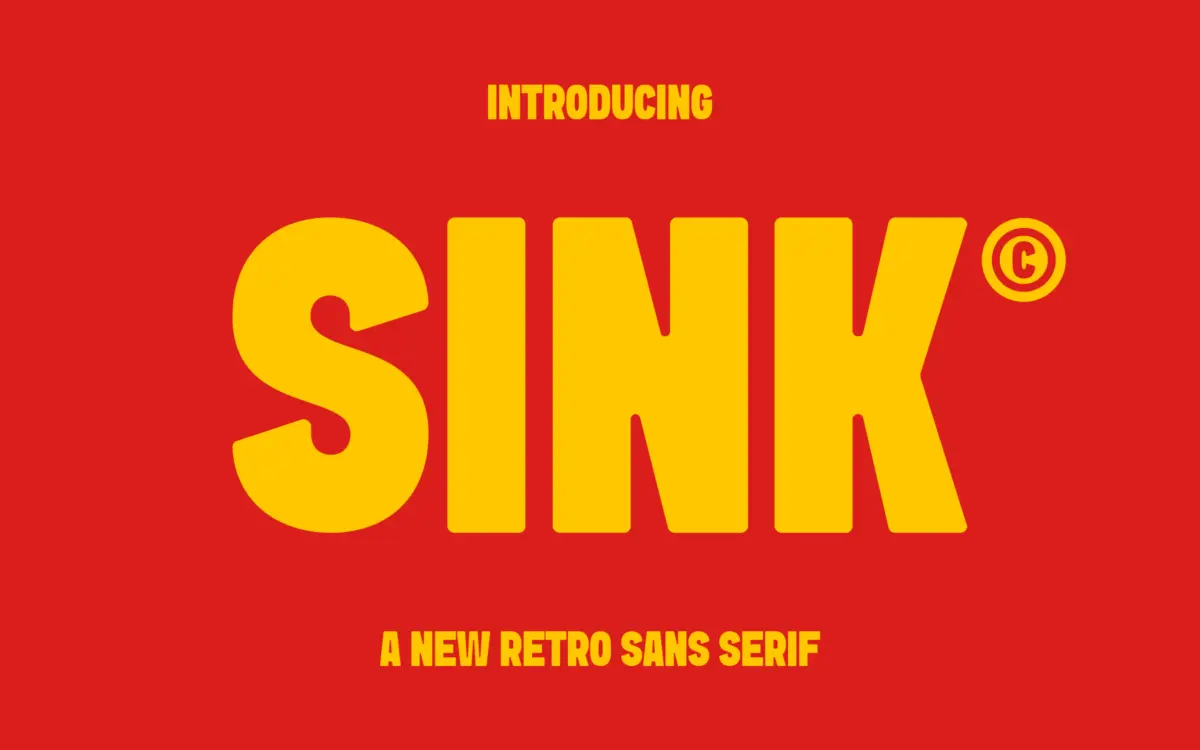
Sink is a heavyweight sans with its roots in mid-century signage lettering. The strokes are thick and even, built for presence rather than nuance, but the corners are eased off just enough to keep the letterforms from feeling industrial. That rounding is the font’s main personality trait: it softens what would otherwise be a fairly blunt, utilitarian structure and gives it some warmth. There’s a slight retro inflection in the proportions — wider counters, a squarer bowl on the O, a sturdy G — that reads as vintage without tipping into pastiche. It’s not trying to quote a specific decade; it’s borrowing a general feeling of confidence from old packaging and signage type and translating it into something that still sits comfortably in a current layout.
Character set and features
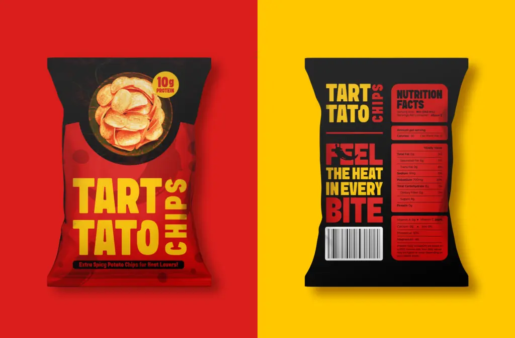
As a single bold weight, Sink is built to do one job well rather than flex across a family. The letterforms are consistent in stroke weight throughout, which gives set text a steady, almost architectural rhythm when used at display sizes. Spacing is generous enough that the heavy strokes don’t collide, which matters a lot at this weight — cramped tracking would have made the rounded corners disappear into each other. Lowercase and uppercase both carry the same rounded-corner treatment, so mixed-case headlines keep a unified texture rather than feeling like two different ideas stitched together. There’s nothing here in the way of alternates, ligatures or an italic companion — this is a font that commits to one voice and doesn’t try to be a toolkit. Numerals follow the same bold, rounded treatment, which is useful if you’re setting prices, dates or packaging specs and want them to match the headline weight rather than look borrowed from elsewhere.
Use cases
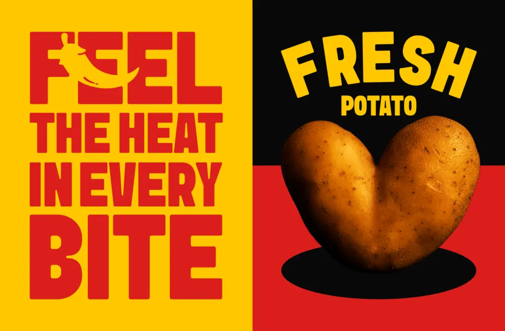
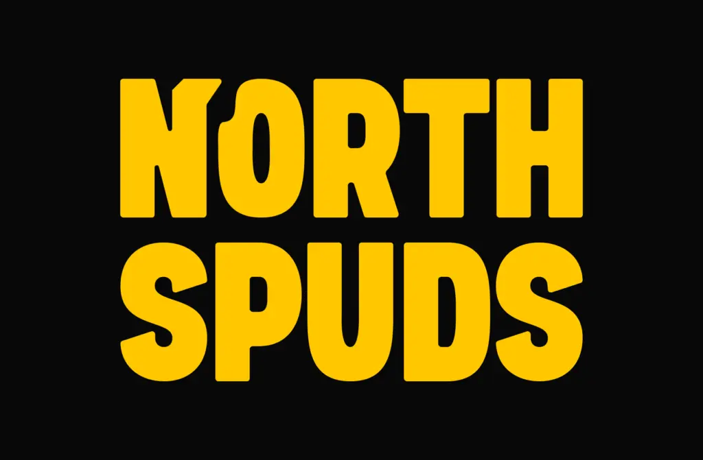
Sink is built for moments where type needs to carry the whole message at a glance: a product name on a box, a masthead, a poster headline, a logotype that wants some heft without turning cold and mechanical. The rounded corners make it friendlier than a straight geometric bold, which suits food and beverage packaging, craft or small-batch branding, and any project reaching for a retro-but-not-nostalgic tone. It’s less suited to body copy or anything that needs to run small — the weight and spacing are tuned for impact, not for paragraphs, and at caption size the rounded details just blur into the overall bulk. Treat it as a headline tool: pair it with a plainer, lighter-weight text face for supporting copy, and let Sink do the job of stopping someone’s eye. Used that way, in short bursts at generous sizes, it earns its keep.
What we liked, and what we didn’t
Strengths
- The rounded corners give a heavy sans real warmth without softening its impact
- Even stroke weight and generous spacing keep bold text from clogging at display sizes
- Numerals and letterforms share one consistent treatment, useful for packaging and price callouts
Trade-offs
- Single weight with no italic or alternates limits it to headline and logotype work
- Not built for small sizes or body text — detail gets lost below display scale
Sink is a solid, single-purpose display sans with a clear point of view: bold, rounded, retro-leaning. It does headline and packaging work well but offers little beyond that one register.
Verdict

Tantype reviews typefaces in depth — every font is tested in real branding, editorial and screen layouts before a word gets written. 555+ fonts reviewed and counting.