Sans Serif
3.6
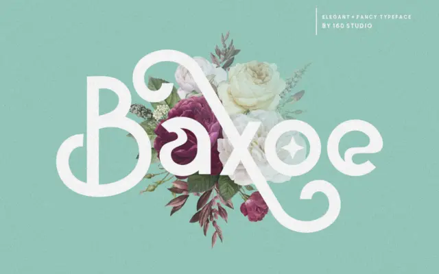
Baxoe: a curling sans with alternates for label and quote work
Design style Baxoe sits in an odd but interesting corner of the sans serif category. The skeleton is simple and…
 Tantype

Sans serif fonts do the modern heavy lifting: clean lines, screen-friendly clarity and versatility from interfaces to signage. Browse our sans serif reviews — geometric, grotesque and humanist faces — each with a verdict, use cases and a download link.
Design style Baxoe sits in an odd but interesting corner of the sans serif category. The skeleton is simple and…
Tantype
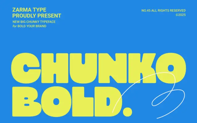
Design style Chunko Bold sits in the current wave of oversized geometric sans faces built for one job: filling space…
Tantype
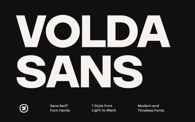
Design style Volda Sans sits in the well-populated middle ground of contemporary grotesques: even stroke modulation, a slightly tightened x-height,…
Tantype
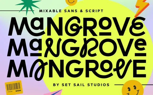
Design style Mangrove is built around a simple idea: a rounded, slightly quirky sans sitting next to a loose, swash-heavy…
Tantype
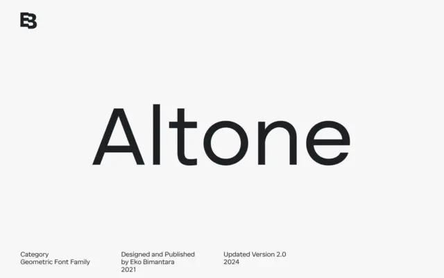
Design style Altone sits closer to grotesque territory than to the geometric-purist camp its category label suggests. The seller draws…
Tantype
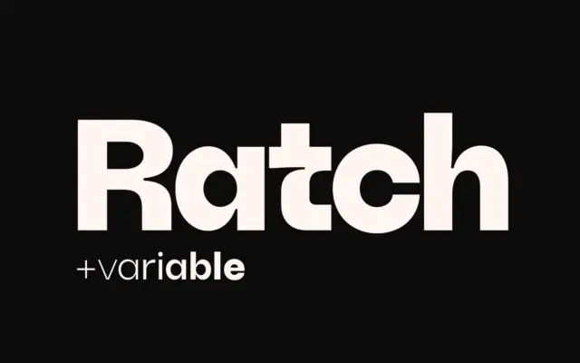
Design style Ratch sits in familiar geometric grotesk territory but doesn’t stay quietly there. The circular bowls, near-monolinear strokes, and…
Tantype
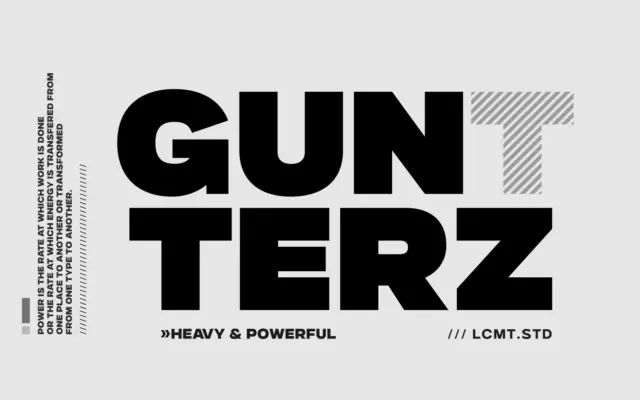
Design style Gunterz sits squarely in the geometric-heavy sans tradition: tight, near-circular counters, blunt terminals, and a construction that reads…
Tantype
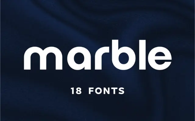
Design style Marble sits in the geometric-minimalist camp of sans serifs, the family of letterforms built from near-perfect circles and…
Tantype
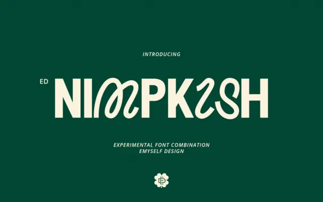
Design style ED Nimpkish is built on a single, slightly odd premise: the uppercase and lowercase don’t belong to the…
Tantype