
Modulus Pro: a rounded sans built for logotypes and display work
Design style
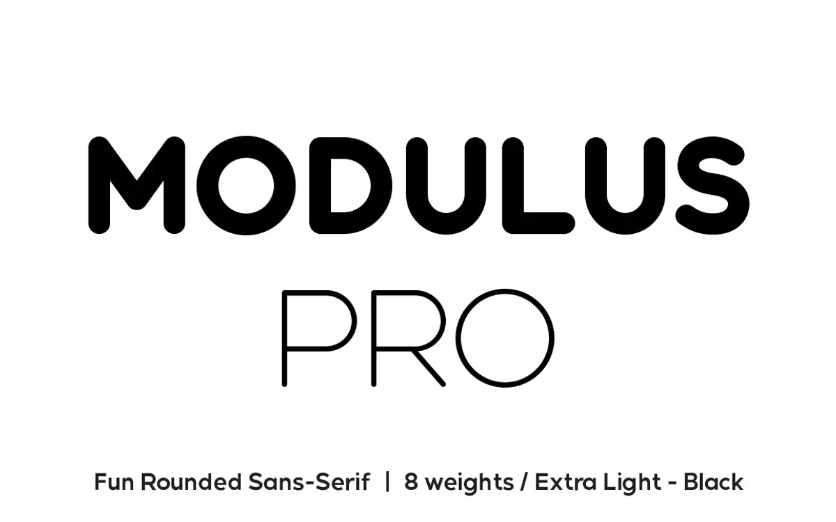
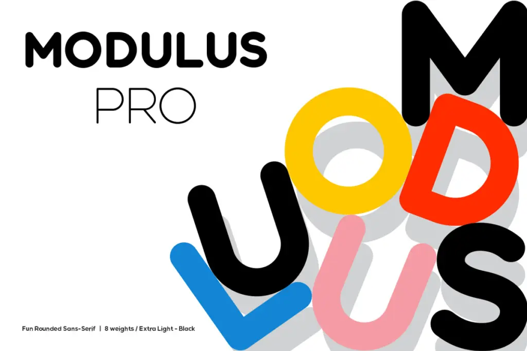
Modulus Pro is a rounded sans that keeps its curves tight rather than soft. That’s the thing worth noting first: a lot of rounded sans families read as friendly to the point of blandness, but Modulus Pro holds a bit of tension in the terminals and a slightly squared quality to the counters that keeps it from going saccharine. It sits somewhere between a geometric grotesk and a display face, and the family spans eight weights from Extra-Light to Black, so the personality shifts a good deal across the range. The lighter weights are calm and fairly neutral; the heavier ones get chunky enough that the rounding becomes the dominant visual feature rather than a detail.
The construction is even across the weights, which matters more than it sounds like it should. Stroke joins stay consistent, and the overall rhythm of the letters doesn’t wobble as you move up the weight scale. It’s a face built for surface impact rather than typographic subtlety, and it does that job competently.
Character set and features
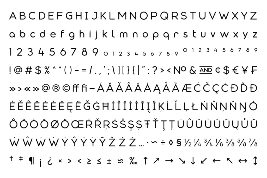
The glyph set is broad, covering more language territory than the original Modulus, and the family includes stylistic alternates across a number of letters — enough to let you swap in a different lowercase a, g, or terminal shape and change the tone of a wordmark without leaving the font. Ligatures are included too, which combine with the alternates to give you real room to hand-tune a logotype rather than just setting it and hoping.
This is where Modulus Pro is clearly aimed: not at long-form reading but at controlled, deliberate letter-by-letter arrangement. The alternates are the reason to buy it over a plainer rounded sans. Used sparingly they add character; used across a whole paragraph they’ll fight each other, so restraint is the operative skill here, not the font’s.
Use cases
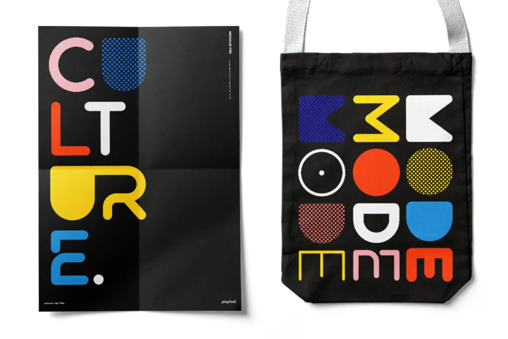
Logotypes and short branding marks are the obvious home for this — the alternates and ligatures exist specifically to let you customise a name into something that isn’t just off-the-shelf. Editorial headlines and poster type also suit it well, particularly at the bolder end of the weight range, where the rounding reads as confident rather than cute. The lighter weights can do double duty in subheads or short supporting copy, though they’re not the reason to buy this family.
Where it gets shakier is body text. At small sizes, the rounded terminals and tighter counters start to soften into each other, and the face loses the crispness that makes it work at display size. This isn’t a paragraph-setting typeface, and treating it as one will disappoint. Similarly, if a project needs restraint and consistency across dozens of instances — a design system, a UI — the sheer number of alternates becomes a liability rather than an asset, since someone has to make (and document) all those stylistic decisions. For branding, packaging lockups, and poster headlines, though, it’s a genuinely useful tool, and one with enough weight range to cover most display jobs on its own.
What we liked, and what we didn’t
Strengths
- Eight consistent weights give real range from restrained to heavy display work
- Stylistic alternates and ligatures allow genuine customisation of logotypes
- Rounded forms carry a bit of edge rather than falling into generic friendliness
Trade-offs
- Loses definition at small text sizes, so it isn't suited to body copy
- Large alternate set requires editorial discipline or it can look inconsistent across a project
Modulus Pro is a well-constructed rounded sans aimed squarely at branding and display work, with enough alternates and weight range to let designers customise logotypes rather than just set them. It isn't built for body copy and loses crispness at small sizes, but for headlines, posters and wordmarks it's a solid, characterful option.
Verdict

Tantype reviews typefaces in depth — every font is tested in real branding, editorial and screen layouts before a word gets written. 555+ fonts reviewed and counting.