
Typewriter Fonts: 12 Best Typewriter Fonts, From Courier-Clean to Inky and Worn
A typewriter font copies the look of text struck through an inked ribbon: every letter in the same width, short blunt serifs and, in the textured ones, the smudges of a real machine. Some are clean digital versions of office faces like Courier; others are scanned from old Olivetti and Remington typewriters.
Our top three are Olivetti Lettera for a worn, inky document look, Remington 1912 Typewriter Font for letters scanned from a real 1912 machine, and 403 Obrinda for a clean monospaced serif family. Below are 12 picks, split into distressed and clean styles.
Every font in the main list is a commercial font sold on Creative Market. Six legitimate free typewriter fonts, including Courier Prime and Special Elite, are further down.
Browse typewriter fonts on Creative Market Commercial fonts: prices are set per licence on each listing
What is a typewriter font?
A typewriter font is a typeface designed to look like text from a mechanical or electric typewriter. Most are monospaced, so every character takes the same width, and most use a sturdy slab serif with even strokes. Distressed versions add ribbon ink, faded strikes and slightly misaligned letters.
A typewriter moves the carriage the same distance after every key, so its type had to fit a fixed grid: wide i and l with long serifs, squeezed m and w, and an even, blocky page.
Monospacing: why every letter is the same width
In a monospaced (fixed-pitch) font, a full stop takes as much room as a capital W. As Microsoft’s notes on Courier New put it, every letter is the same width, so numbers and letters line up vertically. Not every “typewriter font” is monospaced, though. ITC American Typewriter and the free Special Elite are proportional, which reads more smoothly but looks less like a real typed page.
Pica vs Elite: typewriter pitch
Typewriters were sold by pitch, the number of characters per inch. In the words of Wikipedia’s article on typewriter pitch, “the most widespread fonts in typewriters are 10 and 12 pitch, called Pica and Elite, respectively,” both with six lines per vertical inch. Pica is larger; Elite fits more on a line. Both describe spacing, not one design. To identify an old document, count the characters in one inch: ten means Pica, twelve means Elite.
Courier font: the typewriter font most people mean
When people ask what the typewriter font is called, the answer is usually Courier. Howard “Bud” Kettler designed it for IBM; Wikipedia’s Courier article notes that sources differ on whether it was published in 1955 or 1956, and that it was nearly released as “Messenger.” IBM did not trademark the name, so many companies made their own Courier. Microsoft says it became “the most common office typeface” on IBM’s Selectric, launched on 31 July 1961 with swappable type elements, so one machine could switch between Courier, Prestige Elite (Clayton Smith, IBM, 1953) and other faces.
Courier New is Monotype’s digital version. It was introduced as a system font with Windows 3.1 and has shipped with every Windows release since, which is why almost everyone already has a typewriter font. Screenplays are still set in 12-point Courier or a close variant.
American Typewriter and other proportional versions
ITC American Typewriter was drawn by Joel Kaden and Tony Stan for International Typeface Corporation in 1974. It keeps the rounded slab serifs of typewriter type but gives each letter its own width; the I ♥ NY logo uses a modified version. Apple lists it among the fonts included with macOS Tahoe.
Clean vs distressed typewriter fonts
Clean typewriter fonts (Courier New, Courier Prime, 403 Obrinda) have smooth outlines and work for body text, forms and small print. Distressed ones (Olivetti Lettera, Remington 1912, Special Elite) carry ink spread and broken edges. They look convincing in headlines, labels and packaging, but the texture turns muddy at small sizes and repeats visibly in long paragraphs unless the font rotates alternates. If you want the sturdy slab feel without the fixed width, see our guides to Rockwell and Clarendon.
The best typewriter fonts at a glance
| Font | Best for | Styles | Desktop price* |
|---|---|---|---|
| Olivetti Lettera | Inky, worn document look | 1 style + 20 word glyphs | $17 |
| Remington 1912 Typewriter Font | Authentic antique typing | Regular, Bold | $18 |
| 403 Obrinda | Clean monospaced text and branding | 10 styles + variable | $44 |
| Special Elite Pro | Editorial work with small caps | 1 style | $29 |
| Office Typewriter | Photo-real text in Adobe apps | Regular, Bold, Underline, Misprints | $18 |
| Typewriter TM | Long distressed text | 1 style, 3 rotating sets | $29 |
| Copy Dept. | Experimental posters, Cyrillic | 8 styles | $32 |
| Typewriter (Monogram) | Budget clean text | Regular, Bold | $15 |
| Heaven Mono | Modern monospaced serif | Regular, Italic | $19 |
| Marjolaine | Fashion and editorial logos | 1 style + ligatures | $29 |
| Vintage Serif & Antique Script | Book-themed designs | 2 fonts | $18 |
| Handmade Typewriter & Rustic Script | Farmhouse packaging | 2 fonts | $22 |
*One-seat desktop licence on Creative Market, checked October 2026.
How we chose these fonts
We started from Creative Market’s typewriter category, its typewriter fonts blog post and the typewriter fonts tantype has reviewed. Each listing was checked live on 16–17 October 2026 for an active Add to cart button and the regular one-seat Desktop price (sale prices are not listed). We kept fonts that genuinely look typed, balanced clean and distressed styles, and weighed styles, glyph and language coverage, licence terms, buyer ratings where shown, and value.
Best typewriter fonts on Creative Market
Picks 1–7 are distressed or textured, 8–10 are clean, and 11–12 pair a typewriter font with a script.
1. Olivetti Lettera: worn ribbon texture
David Phillips of Komet & Flicker based Olivetti Lettera on the Olivetti Lettera 35 portable typewriter and kept the uneven ink, broken outlines and stubby serifs of real typing. The listing includes Western and Central European characters, two styles of ready-made fractions and 20 connecting word glyphs, picked from the Glyphs panel in Illustrator or Photoshop. There is one style and no bold, so pair it with a clean font for long text. Use it for book covers and “found document” layouts.
See Olivetti Lettera on Creative Market · Read our Olivetti Lettera review
2. Remington 1912 Typewriter Font: scanned from a real machine
Vincit Design Co. (Drew Wilson and Josiah Goldsmith) made this font from their own 1912 Remington. According to the listing, each character was typed and scanned to keep the wear of a machine over a century old, and a Bold was added to show how the type might have looked with a fresh ribbon. You get Regular and Bold as OTF files; language support isn’t detailed, so check the character map if you need accents. It suits period posters and antique-themed stationery.
See Remington 1912 Typewriter Font on Creative Market
3. 403 Obrinda: a clean monospaced serif family
403 Type Foundry calls Obrinda “a tribute to the golden age of typewriters, reimagined for the digital frontier.” It is a monospaced serif in five weights and ten styles, plus a variable font, in OTF, TTF, WOFF and WOFF2. Most typewriter fonts come in one or two weights, so this range is rare. Set menus, code samples or tables on its fixed grid. See the listing for current pricing.
See 403 Obrinda on Creative Market
4. Special Elite Pro: the free favourite, with extras
Special Elite Pro, by Jim Lyles and Brian J. Bonislawsky for Stiggy & Sands, recreates the Special Elite Type No. NR6 keyset with the same inky grunge as the free Special Elite on Google Fonts. The price buys typesetting features: small caps, inferiors and superiors for fractions, tabular, proportional and oldstyle figures, and alternates that turn capitals into small caps. That suits editorial layouts and book interiors; for basic letters, try the free version below.
See Special Elite Pro on Creative Market
5. Office Typewriter: photo-real SVG type
Ana Parracho of Ana’s Fonts built Office Typewriter as an OpenType-SVG font, so each glyph is a detailed image of a typed letter rather than a flat outline. Every character has three variations swapped in by contextual alternates, and you get Regular and Bold, an Underline version, and a Misprints font with doodles and circles. The listing names Photoshop CC 2017 and Illustrator CC 2018 or later for the SVG version; vector versions are included for other apps.
See Office Typewriter on Creative Market
6. Typewriter TM – Distressed Typer: no repeated letters
The weak point of most distressed typewriter fonts is repetition: type “letter” and both t’s are identical. Type Mania’s Typewriter TM rotates three stylistic sets automatically, so neighbouring letters wear differently. It comes as OTF, TTF and WOFF2 and covers Basic Latin, Western and Central European and Pan African Latin. That suits longer distressed passages, such as a typed letter on a poster.
See Typewriter TM on Creative Market
7. Copy Dept.: an archive in eight states of decay
Nadezhda Spasibenko’s Copy Dept., released in September 2026, is “an experimental typewriter font family inspired by old editorial archives, carbon copies.” Its eight styles start clean (Regular, Thin) and degrade through Ink, Bleed, Melt, Distort Melt and Dissolve to an Outline, with 292 glyphs each covering Latin and Cyrillic. Mix styles in one headline to suggest a fading carbon copy. It is new, with no reviews yet.
See Copy Dept. on Creative Market
8. Typewriter by Monogram: clean and inexpensive
Monogram’s Typewriter is the plainest and cheapest pick. The listing calls it “a classic mechanical typewriter font” crafted “for a clean look,” in Regular and Bold, with 187 glyphs including accents, as OTF and TTF. With no texture, it stays sharp at small sizes, prints cleanly on labels and suits cutting machines, where distressed edges would create hundreds of tiny cuts.
See Typewriter Font on Creative Market
9. Heaven Mono: a modern monospaced serif
Ragam Kata doesn’t sell Heaven Mono as a typewriter font; the listing calls it “a modern monospace serif typeface that blends technical precision with refined elegance.” It has the fixed widths and small serifs of typewriter type with sharper, contemporary details, plus a true Italic, which many typewriter fonts lack. Files come as OTF, TTF and WOFF, with multilingual support. It suits packaging, captions and UI mock-ups that want a quiet typewriter nod.
See Heaven Mono on Creative Market · Read our Heaven Mono review
10. Marjolaine: a typewriter serif for fashion
CarmineType describes Marjolaine as “a graceful serif with a typewriter soul” that “sits between a delicate slab and a typewriter-inspired style.” It is proportional, and its slightly condensed letters read more like a fashion magazine than an office memo. The single Regular style comes with 55 or more ligatures and alternates (the listing gives two figures) and covers Western, Central and Southeastern European languages, in OTF, TTF, WOFF and WOFF2. Use it for logos and beauty packaging where Courier would feel too plain.
See Marjolaine on Creative Market · Read our Marjolaine review
11. Vintage Serif & Antique Script: typed caption, handwritten note
Lara Mai of Laras Wonderland pairs Encyclopedia, “a vintage typewriter-style serif,” with Vintage Novel, a sloped handwritten script. Both carry a texture “almost like they’ve just been written with wet ink on craft paper.” Set a title in the script and the details in the typewriter serif, and the result looks like an annotated page from an old book. Language support isn’t detailed. It suits book-themed branding and literary invitations.
See Vintage Serif & Antique Script on Creative Market · Read our Vintage Novel & Encyclopedia review
12. Handmade Typewriter & Rustic Script: farmhouse typewriter
Also from Laras Wonderland, this duo combines Little Typewriter, a typewriter serif with what the listing calls a muddy ink effect, and SundriedLinen, a script with a rope-like texture. The typewriter half is subtle enough for a few lines of text; the script is for short phrases. The mood is farmhouse rather than office, aimed at packaging and wedding stationery. The distressing is part of the outlines and can’t be switched off, so plan a clean font for small print.
See Handmade Typewriter & Rustic Script on Creative Market · Read our Handmade Typewriter review
How to choose a typewriter font
- Clean or distressed: for documents, forms and small print, pick a clean font. Keep distressed fonts for headlines and short text, and choose rotating alternates (Typewriter TM, Office Typewriter) if the text runs long.
- Monospaced or not: if text must line up in columns or imitate a real typed page, choose a monospaced font. For logos and long reading, a proportional font like Marjolaine sets more evenly.
- Era: slightly irregular Pica-style type says 1920s–1950s office; crisp Courier says Selectric and screenplays. For wider retro work see our best vintage fonts, and for photocopied zine looks our best 90s fonts.
- Pairing: typewriter text sits well under a bold condensed sans or heavy slab headline, as in many layouts in our best poster fonts guide. Avoid two textured fonts unless they come as a duo.
How to get a typewriter font in Word
You already have one: Courier New ships with Windows, and Apple’s font list shows macOS includes Courier New and American Typewriter. Select your text and choose Courier New at 12 points. To make it Word’s default on Windows, Microsoft’s help page says: Home, Font dialog box launcher (Ctrl+D), choose font and size, Set As Default, “All documents based on the Normal template,” then OK. On a Mac, use Format > Font > Font, then Default.
To use a font you bought, double-click the file and choose Install (Windows) or Install in Font Book (Mac), per Microsoft’s custom fonts guide. The font only shows on computers where it is installed, so share a PDF.
Typewriter fonts in Google Docs and Canva
Google Docs can’t install your own fonts, but it can add Google Fonts: open the font menu, choose More fonts and search for Courier Prime, Special Elite or Cutive Mono (GCFGlobal’s guide shows the steps). In Canva, Pro, Teams, Business, Education and Nonprofits accounts can upload purchased fonts to a Brand Kit. Canva’s upload help page accepts OTF, TTF and WOFF files licensed for embedding but not variable fonts, so upload 403 Obrinda’s static files.
Free typewriter fonts
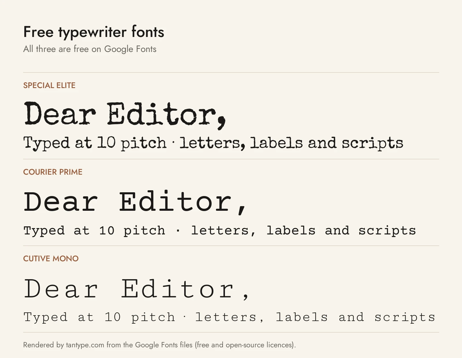
These six fonts are free for personal and commercial use under open licences. Many “free” typewriter fonts on download sites are personal-use demos.
- Special Elite by Astigmatic mimics the Smith Corona Special Elite Type No. NR6 and Remington Noiseless typewriters, with “a little bit of inked up grunge.” It is the free base of pick 4, without the small caps and figures, and it is proportional rather than monospaced.
- Courier Prime by Alan Dague-Greene was commissioned by screenwriter John August as a Courier replacement. August’s January 2013 announcement explains it keeps Courier’s metrics, so page counts don’t change, with crisper serifs. It has Regular, Bold and real italics, and is clean where most paid picks are textured.
- Cutive Mono by Vernon Adams is based on classic typewriter faces, “in particular the faces of IBM’s ‘Executive,’ and the older ‘Smith-Premier.'” One monospaced style with a lighter, older feel than Courier Prime.
- IBM Plex Mono is part of IBM’s open-source type family, designed by Mike Abbink with Bold Monday: a monospaced sans in seven weights with italics. No serifs, but the same fixed rhythm.
- Compagnon from Velvetyne Type Foundry has five styles, drawn in 2018 by designers at EESAB-Rennes from specimens in the Typewriter Database, each reflecting a different period of typewriter type.
- TeX Gyre Cursor from the GUST e-foundry is based on URW’s Nimbus Mono L and, in GUST’s words, “can be used as a replacement for a well-known Courier typeface.” Four styles, regular to bold italic.
| Font | Source | Licence | Commercial use |
|---|---|---|---|
| Special Elite | Google Fonts | Apache License 2.0 | Yes |
| Courier Prime | Google Fonts | SIL Open Font License 1.1 | Yes |
| Cutive Mono | Google Fonts | SIL Open Font License 1.1 | Yes |
| IBM Plex Mono | IBM (GitHub), Google Fonts | SIL Open Font License 1.1 | Yes |
| Compagnon | Velvetyne | SIL Open Font License 1.1 | Yes |
| TeX Gyre Cursor | GUST e-foundry | GUST Font License (LPPL 1.3c) | Yes |
Licensing: personal vs commercial use
Creative Market sells fonts under four licence types, set out on its font licence page:
- Desktop: unlimited personal and commercial projects, including products, packaging, social media and ads. On websites and in games the font may only appear as images. Buy one seat per user.
- Webfont: embed the font on sites you own or control, within the pageview limit you choose.
- App: embed the font in one app or game so users can’t extract it.
- E-pub: use the font in one ebook.
Print-on-demand use is forbidden whenever the end user is not the licensee, so a tool where customers type their own text on a mug isn’t covered. A font can be part of a logo only if it is modified and isn’t the dominant element, and a registered trademark must disclaim the font. Terms change, so read the current licence. This is general information, not legal advice.
Typewriter font FAQ
What is the typewriter font called?
Usually Courier, designed by Howard “Bud” Kettler for IBM in the mid-1950s; on computers it is usually Courier New. Other typewriter faces include Prestige Elite and the proportional ITC American Typewriter.
What font do typewriters use?
Monospaced fonts, usually slab serifs, in Pica (10 characters per inch) or Elite (12) pitch. Each maker cut its own designs, and IBM’s Selectric let typists swap between Courier, Prestige Elite and others. To match the font in typewriter documents, check the pitch and serif shapes rather than looking for one name.
What font looks like or resembles a typewriter?
Courier New, which ships with Windows, Office and macOS, is the closest font you already have; set it at 12 points in Word. Courier Prime is a free, more refined version and Special Elite a free inky one. Among paid fonts, Olivetti Lettera and Remington 1912 look most like real typed pages.
Is there a typewriter font in Google Docs?
Yes. Open the font menu, choose More fonts and add Courier Prime, Special Elite or Cutive Mono. They are free Google Fonts and stay in your font menu once added.
What is the difference between Courier and Courier New?
Courier is the 1950s IBM design; Courier New is Monotype’s digital version, introduced with Windows 3.1. Because IBM never trademarked the name, several companies made their own Courier, and macOS still keeps one as a document-support font.
Are typewriter font generators real fonts?
No. Most “typewriter font generator” sites either show an image preview or swap your letters for look-alike characters from Unicode’s Mathematical Alphanumeric Symbols block, which includes monospace letters. Unicode recommends against using them in place of styling, and they can show as boxes on some devices. They are fine for a social bio; for documents, logos or print, install a real font.
Is there a free typewriter font for commercial use?
Yes. Special Elite, Courier Prime, Cutive Mono, IBM Plex Mono, Compagnon and TeX Gyre Cursor all allow commercial use under open licences. You can use them in logos and products; you just can’t sell the font files.
