
Handmade Typewriter & Rustic Script: a cottagecore duo for rustic branding
Design style
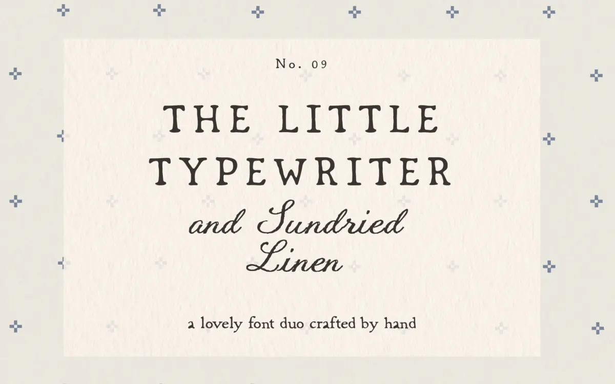
This is a two-font pairing built around a single idea: worn, ink-pressed authenticity. Little Typewriter is the serif half, drawn to mimic an old mechanical typewriter with uneven ribbon pressure baked into the letterforms rather than applied as a filter. Strokes wobble slightly off their baseline, ink pools thicker at some joins than others, and the overall texture reads as printed rather than digital. SundriedLinen, the script companion, leans looser and more casual, with a rope-like texture running through its strokes that gives it a woven, fibrous quality rather than the smooth ribbon of a typical script.
Neither font is trying to be neutral. Both commit fully to a distressed, handcrafted look, which means the design decisions are consistent but also inflexible — you either want that cottage, farmhouse, linen-and-twine mood or you don’t. There’s no clean-typewriter option hiding underneath the texture.
Character set and features
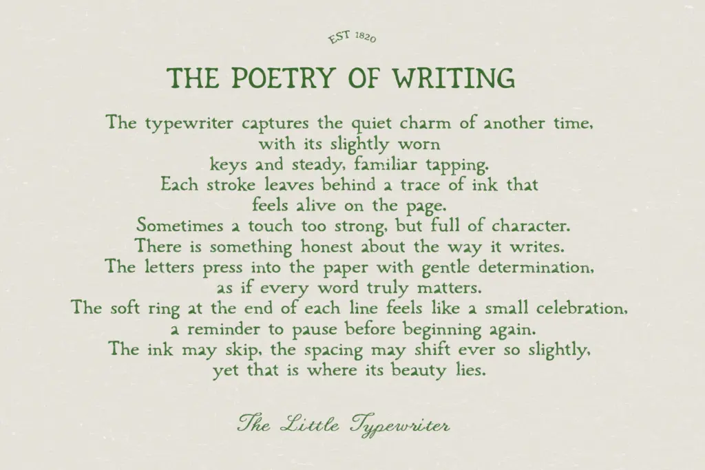
The serif carries the structural weight of the pair: it’s the one doing the reading-heavy work, so its distressing is kept subtle enough that paragraphs of text stay legible, even if the texture is clearly there under scrutiny. The script is looser and more ornamental, better suited to short phrases than full sentences — its irregular baseline and knotted texture start to work against readability once you push it into body copy.
The pairing logic itself is straightforward: serif for structure, script for warmth, and the texture is what ties them together rather than any shared skeleton. That’s a reasonable strategy for a duo aimed at mood boards and packaging rather than long-form typesetting. Don’t expect this pair to double as a workhorse text family — the ink-bleed effect is baked in, so there’s no clean fallback version if a client wants a crisper mark later.
Use cases
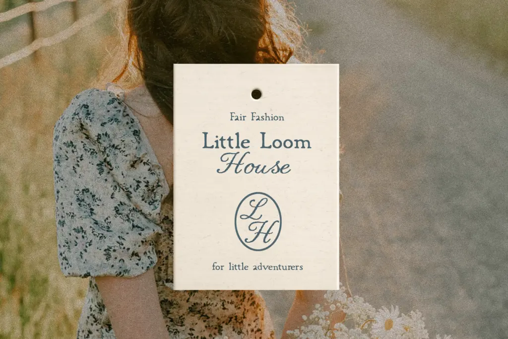
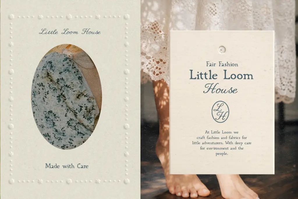
This duo is aimed squarely at brands leaning into rustic, cottagecore, or farmhouse aesthetics — think small-batch food packaging, natural skincare labels, market stall signage, wedding stationery with a homespun feel, or editorial spreads about countryside living. The typewriter serif works well for short paragraphs on packaging or invitation inserts, where the distressed texture adds tactile warmth without undermining comprehension. The script is best kept to headlines, monograms, or a signature line — a word or two rather than a sentence.
It’s not a fit for anything that needs to read as contemporary, minimal, or corporate. The ink-bleed texture is specific and recognisable, so it will date visually if the cottagecore trend cools, and it competes for attention with other textured elements on a layout — pair it with plain backgrounds and restrained colour rather than more pattern. Used within its lane, though, it does what it sets out to do: it looks handmade, not templated.
What we liked, and what we didn’t
Strengths
- The ink-bleed texture on the serif is subtle enough to keep paragraphs legible
- The script's rope-like texture gives it a distinct woven quality rather than a generic handwritten look
- Serif and script are clearly differentiated in role, structure versus warmth
Trade-offs
- The baked-in distressing means no clean fallback version exists if a project later needs a crisper mark
- The script's loose baseline limits it to short phrases rather than sustained text
A committed, well-executed take on distressed cottage typography that does one mood convincingly. It's not built for flexibility or long-form text, but for packaging, wedding stationery, and rustic branding it delivers a genuine handmade texture rather than a generic vintage filter.
Verdict

Tantype reviews typefaces in depth — every font is tested in real branding, editorial and screen layouts before a word gets written. 555+ fonts reviewed and counting.