
Marjolaine: a typewriter-slab serif for editorial branding with attitude
Design style
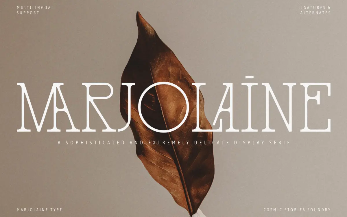
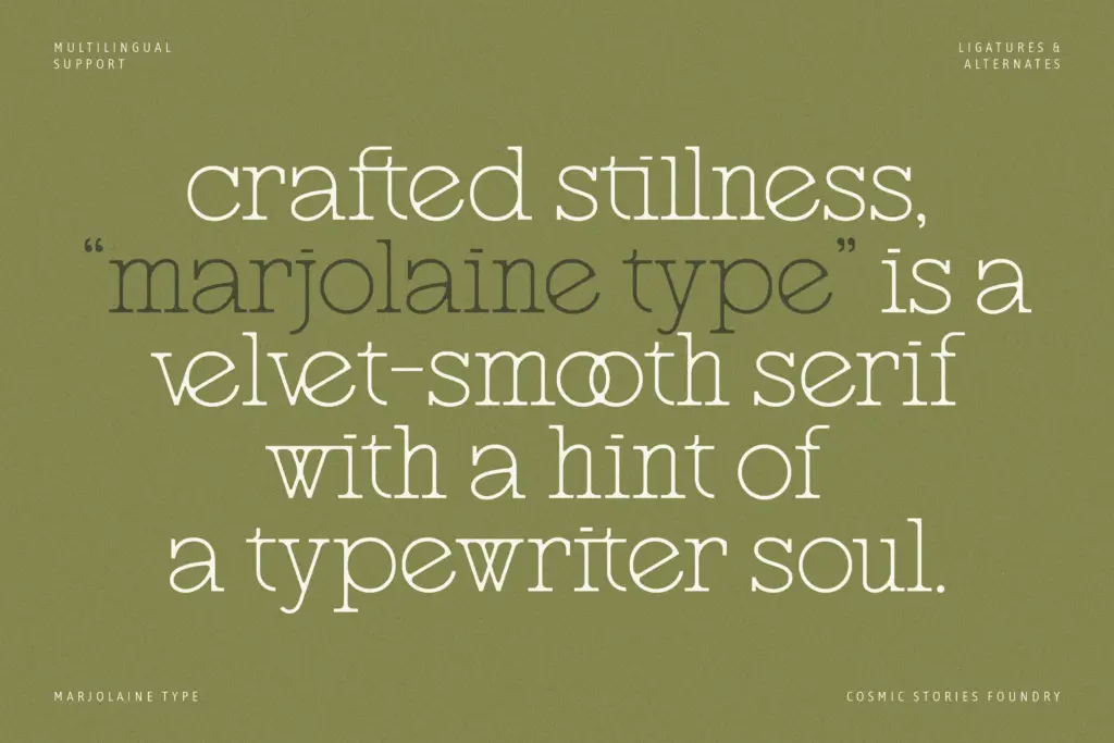
Marjolaine works a narrow seam between two references that don’t usually meet: the delicate slab serif and the mechanical typewriter face. The result reads as a serif with soft, understated slabs and a faint metallic snap to its rhythm, as if a fashion editorial typeface had been run through an old Selectric. The proportions lean tall and slightly condensed, which gives the letterforms an upright, poised quality rather than the looser warmth you’d get from a humanist slab.
The curves are where the personality lives. Bowls on letters like a, e, and g are drawn with a light contraction rather than a full round, and the terminals close in with a small, deliberate flick instead of trailing off. It keeps the face from feeling stiff even though the overall structure is quite geometric. Stroke contrast is modest — enough to give it some elegance under a headline, not enough to make it fragile in small settings. It’s a design that knows what it wants to be: composed, a little clipped, not trying to charm you with flourish.
Character set and features
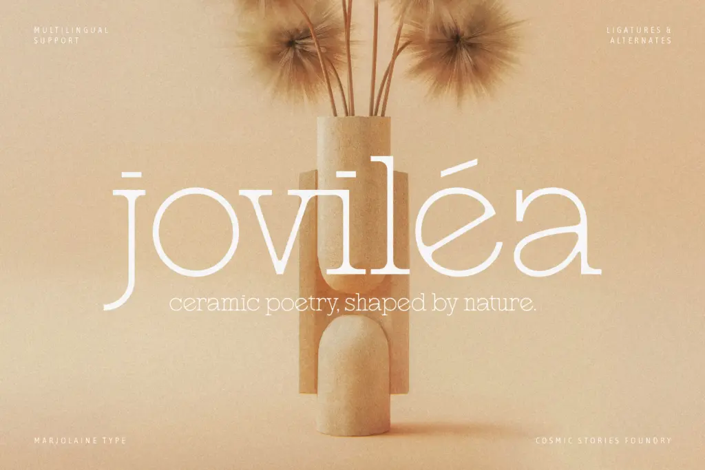
The set includes a substantial run of ligatures — the brief cites around 58 — along with alternate letterforms that soften or reshape a handful of characters. These are genuinely useful rather than decorative: several ligatures resolve awkward pairings that a typewriter-inflected serif tends to produce, particularly around ascenders and descenders crowding each other at tight tracking. The alternates give you a way to dial the character up or down depending on whether the job wants restraint or personality.
Language coverage extends across Western, Central, and Southeastern European character sets, which matters more than it sounds for a typeface pitched at fashion and luxury branding — those briefs often need diacritics to hold their shape under scrutiny, and here they do. Only the Regular weight is included, so there’s no bold or italic partner to build a hierarchy with type alone; whatever contrast you need has to come from size, spacing, or a second typeface entirely.
Use cases
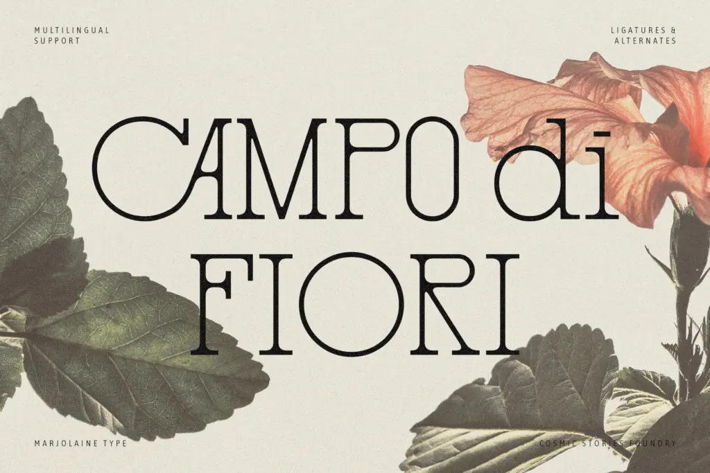
Marjolaine is built for headline-scale and short-copy work: logotypes, mastheads, packaging call-outs, invitation lettering, the kind of setting where a handful of words carry the whole visual weight. The subtle slab and typewriter cadence give it an editorial, slightly detached tone that suits fashion and beauty branding better than anything warm or domestic. It photographs well large — foil-stamped on stationery, printed across a garment tag, set wide on a web hero.
At body-text sizes it gets more demanding. The condensed proportions and the ligature-heavy design mean it needs generous line spacing and careful tracking to avoid feeling cramped in paragraphs, and without a bold weight, long-form use will strain against anyone needing real typographic hierarchy. Treat it as a display and branding face with just enough range to hold a short paragraph, not as a workhorse text serif.
What we liked, and what we didn’t
Strengths
- The slab-meets-typewriter concept is drawn with restraint rather than novelty.
- 58 ligatures and alternates solve real spacing problems, not just decorative ones.
- Multilingual diacritic support holds up well for European-language branding work.
Trade-offs
- Only a Regular weight is included, so building hierarchy requires pairing or heavy size contrast.
- Condensed proportions and tight ligature pairs get cramped in longer paragraph settings.
Marjolaine is a distinctive display serif with a genuine point of view, built for logotypes and short editorial copy rather than paragraphs. The ligature set and multilingual support add real utility, but the single weight and condensed rhythm limit how far it can stretch.
Verdict

Tantype reviews typefaces in depth — every font is tested in real branding, editorial and screen layouts before a word gets written. 555+ fonts reviewed and counting.