
Upstate: A Collegiate Slab Serif for Athletic and Varsity Branding
Design style
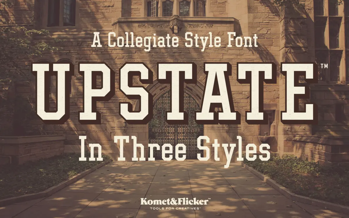
Upstate is built on the vocabulary of mid-century athletic lettering: thick slab serifs, squared-off proportions, and a slight forward lean that gives the letters a sense of motion without tipping into italic territory. The strokes are heavy and confident, closer to a block letterform than a text slab, which puts it firmly in the collegiate and varsity tradition rather than anywhere near a book-text slab like Rockwell or Clarendon.
The angularity is the defining trait. Curves are flattened where they can be, corners are kept sharp, and the serifs read as structural rather than decorative. It’s a font that wants to be carved into a letterman jacket or stitched onto felt, and the drawing commits to that reference point rather than softening it for broader use. There’s no pretense of neutrality here — it has a strong point of view and doesn’t apologise for it.
Character set and features
The family comes in three styles: a solid Regular, a Shadow Outline, and a two-layer Shadow Base plus Shadow Fill combination that builds a drop-shadow effect when stacked. That layering approach is the most useful part of the package for anyone doing badge or crest work, since it saves manually offsetting a duplicate layer in your design software. The shadow styles are clearly the point of the release — the Regular alone is fine but unremarkable, and the shadow combination is where the collegiate character actually comes through.
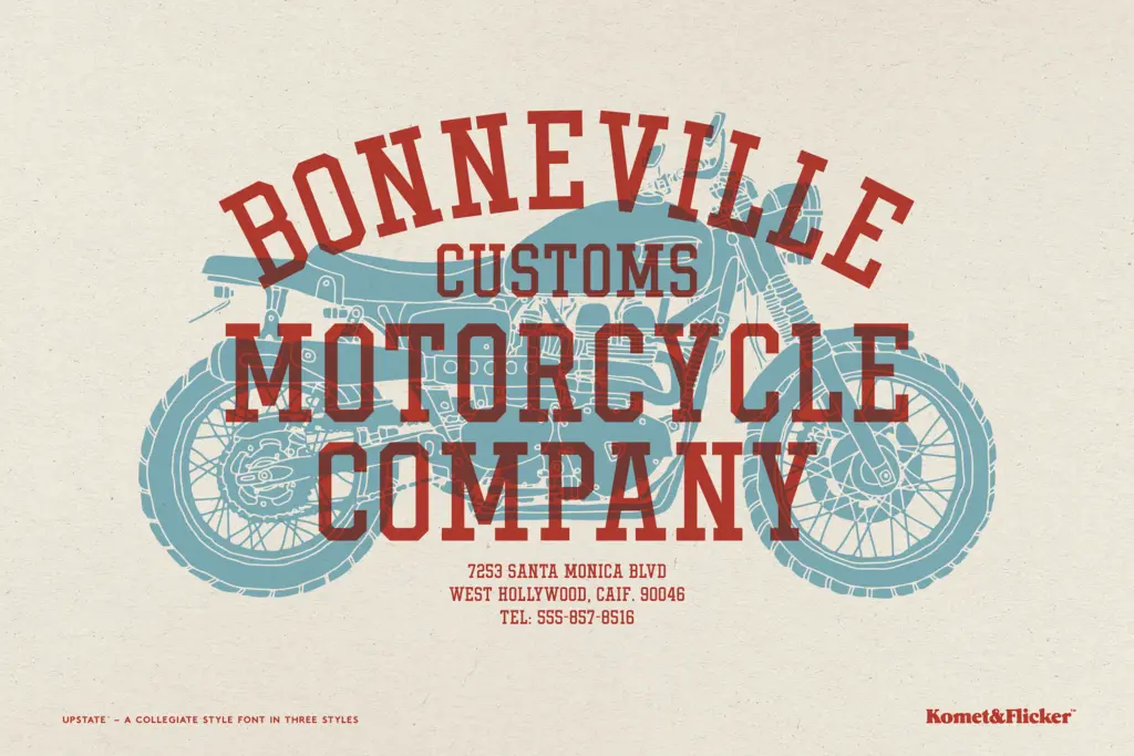
Character coverage is upper and lowercase A–Z, numerals, punctuation, select symbols, and a limited set of European accented characters. That’s enough for headline work in English and a handful of other Latin-script languages, but anyone needing full diacritic coverage for Central or Eastern European languages will hit gaps. There’s no mention of alternates, ligatures, or small caps, and the lowercase — while present — feels like an afterthought next to a design so clearly built around capitals. Most collegiate lettering lives in all-caps anyway, so this isn’t a fatal flaw, but it does mean the lowercase doesn’t carry the same conviction as the uppercase.
Use cases
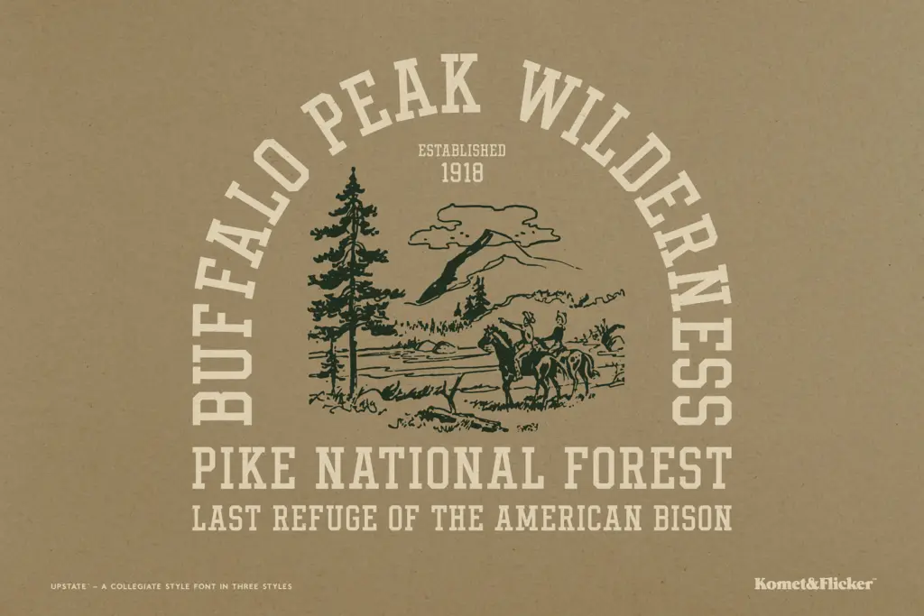
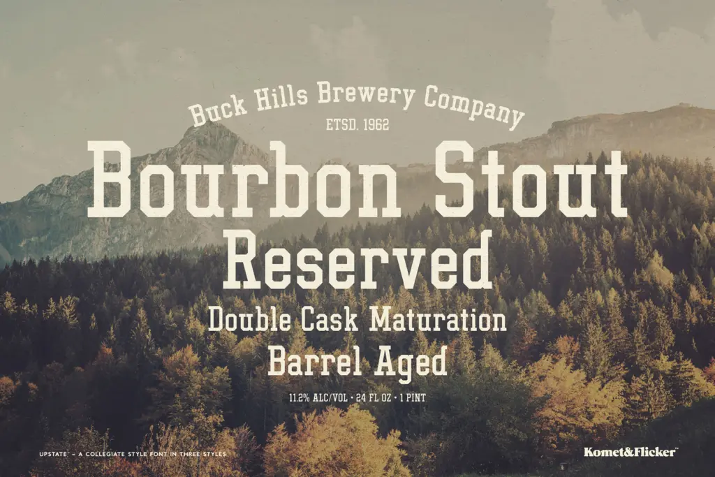
This is a font for team names, event posters, badge logos, apparel graphics, and anything else that wants to borrow the visual language of school athletics or old-fashioned campus branding. The shadow layering makes it particularly suited to patch and emblem design, where that stacked-depth look is expected. It also works for retail and packaging projects chasing an Americana or old-west adjacent nostalgia, since the heavy slab serifs carry that mood without much extra styling.
It is not a body text font and shouldn’t be asked to be one — the strokes are too heavy and the letterforms too tight at small sizes to hold up in a paragraph. It’s also a poor fit for anything requiring restraint or subtlety; the design has one register, loud and collegiate, and doesn’t flex much beyond it. Used at headline size, on a jersey number, or inside a crest, it does its job cleanly.
What we liked, and what we didn’t
Strengths
- The two-layer shadow build saves manual offset work for badge and emblem design
- Angular, squared-off slab serifs commit fully to the athletic lettering reference
- Reads cleanly at large display sizes on posters, jerseys, and logos
Trade-offs
- Lowercase feels secondary to a design clearly built around capitals
- Limited European character support and no visible alternates or ligatures
Upstate does one job well: it looks like classic collegiate athletic lettering, and the shadow-layer construction makes badge and crest work easier than building the effect by hand. It won't stretch into text use or subtle branding, and the character set is basic, but for varsity, sports, and retro Americana projects it delivers exactly what it promises.
Verdict

Tantype reviews typefaces in depth — every font is tested in real branding, editorial and screen layouts before a word gets written. 555+ fonts reviewed and counting.