
Vintage Novel & Encyclopedia: a hand-inked script and typewriter serif duo
Design style
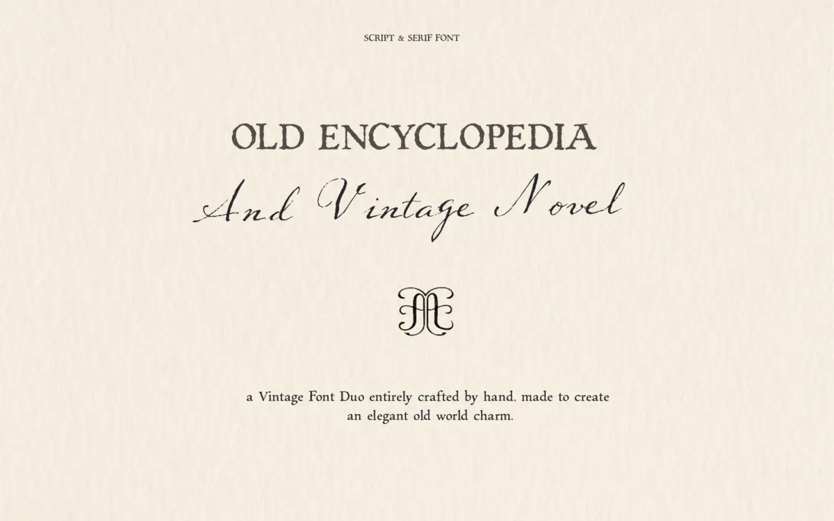
This is a two-font pairing built around a single idea: paper that has been written on, not printed on. Vintage Novel is the script half, a loose, sloped hand with irregular joins and a visible ink-and-nib texture running through the strokes. It doesn’t try to be a formal calligraphic script — the letters wobble slightly, the baseline drifts, and there’s a deliberate roughness to the stroke edges that reads as fountain pen on absorbent paper rather than a smooth brush script.
Encyclopedia, the serif partner, leans into a typewriter feel: fairly even stroke widths, blunt serifs, and the same worn, slightly inked texture applied to a more upright, mechanical letter structure. Where Vintage Novel is expressive, Encyclopedia is deadpan — it reads like the caption typed underneath a handwritten note. Together they suggest an old letter, a field journal, or a secondhand book rather than anything polished. That’s the whole pitch, and it’s consistent from A to Z: nothing here looks new.
Character set and features
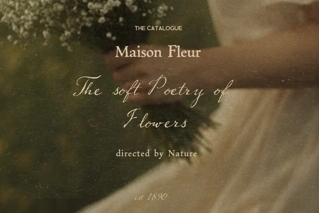
Both fonts cover the standard Latin alphabet with the antique texture applied consistently across upper and lowercase, so the duo doesn’t fall apart when you type a full sentence — the ink noise stays even rather than clumping in places. The script’s irregularity does mean tight tracking can start to look cluttered; give it room to breathe and the wobble reads as character instead of noise.
Because the texture is baked into the outlines rather than applied as a separate layer, you don’t get the flexibility of turning it off — what you see is what you get, at whatever weight of grunge the designer drew. That’s fine for the intended vintage look, but worth knowing if a client later asks for a cleaner version of the same design; you’d be swapping fonts, not adjusting a setting. There’s no indication here of extended language support, alternate glyphs, or ligature sets beyond the basic character range, so treat this as a straightforward display pairing rather than a feature-rich family.
Use cases
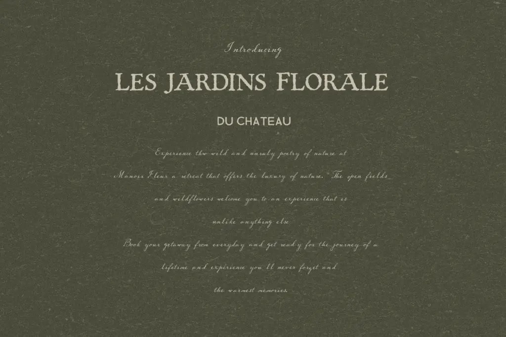
The obvious home is anything trading on nostalgia: book covers and interior title pages, letterpress-style invitations, packaging for jam, coffee, or craft goods, and branding for shops that want to feel handed-down rather than founded last year. Wedding stationery works too, particularly for couples going for a heritage or countryside look rather than modern minimalism — the script suits an invitation’s flowing line, Encyclopedia the details underneath.
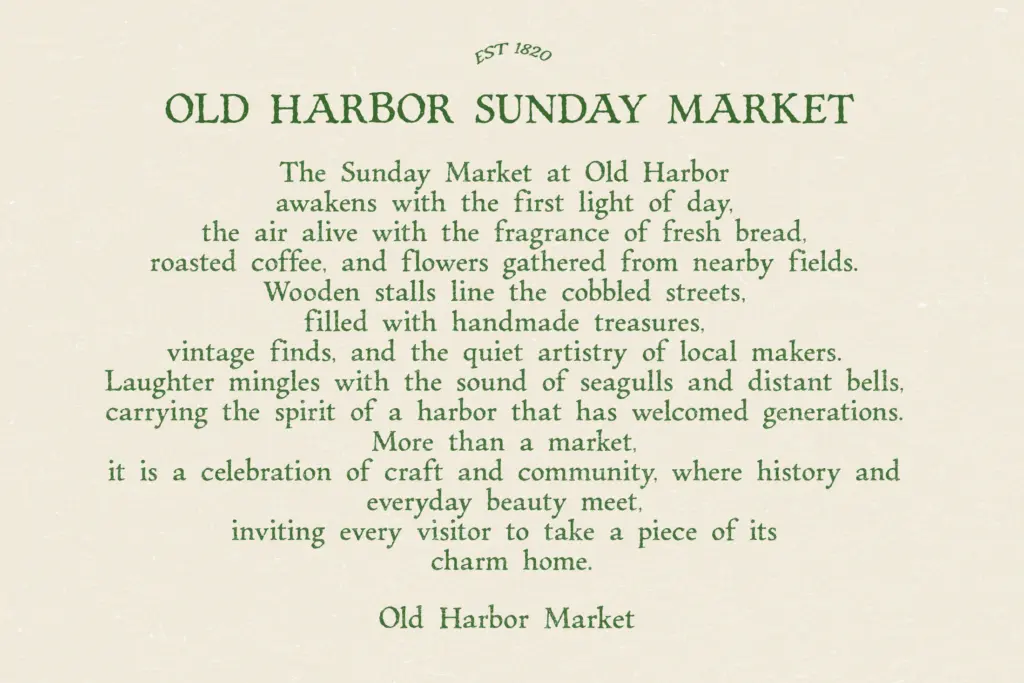
It’s less suited to anything that needs to read cleanly at small sizes or in dense blocks of text — the ink texture and irregular script strokes lose definition below a certain point, so keep it to headlines, short lines, and display moments rather than body copy. It also won’t sit comfortably in a brand system that needs to flex across many touchpoints at consistent weight; this is a mood font, and moods don’t scale infinitely. Used where it’s meant to be used — a short line, generous space, warm paper tones around it — it does its job without complaint.
What we liked, and what we didn’t
Strengths
- The script and serif share a consistent ink texture that keeps the pairing cohesive
- Blunt typewriter-style serif offers a plain-spoken contrast to the looser script
- Suits packaging, book covers and heritage branding without extra styling
Trade-offs
- Baked-in grunge texture can't be dialled back for cleaner applications
- Legibility drops at small sizes or tight tracking, limiting it to display use
A well-matched pair for heritage branding and book-inspired design work, with a consistent inked texture that does the nostalgia job convincingly. It's a mood font rather than a workhorse, and it asks to be used at display sizes with room to breathe.
Verdict

Tantype reviews typefaces in depth — every font is tested in real branding, editorial and screen layouts before a word gets written. 555+ fonts reviewed and counting.